Ever wonder how some LinkedIn posts seem to leap off the screen and grab your attention? The secret isn't some hidden feature; it's often just clever formatting. Since LinkedIn doesn't have a built-in 'bold' button, smart creators are using a simple copy-and-paste trick with Unicode text generators to make their key phrases pop.
This one small change can totally transform how your posts are received.
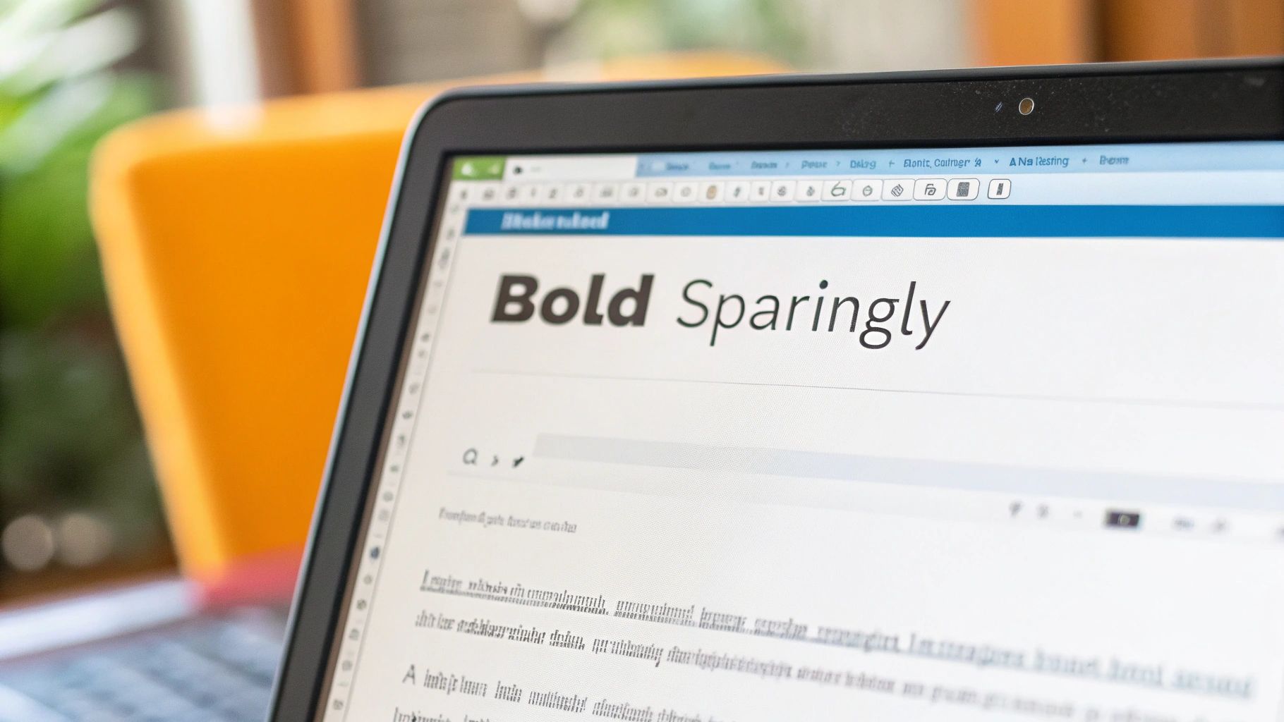
Why Bolding Text on LinkedIn Is a Game Changer
Let's be real: the LinkedIn feed is a crowded place. Getting someone to hit the brakes on their scroll and actually read your content is half the battle. A giant, unbroken block of text? That just looks like work, especially on a phone.
This is where strategic formatting, like knowing how to bold text in a LinkedIn post, gives you a serious edge. It’s not just about making things look pretty; it's about guiding your reader's eye.
When you bold a phrase, you're creating a visual hierarchy. You're essentially telling your audience, "Hey, pay attention to this part!" before they even read the words. It’s perfect for highlighting a shocking statistic, a powerful quote, or your main call-to-action, ensuring your most important points land every single time.
The Impact on Mobile Users
This visual guidance is even more crucial on mobile. Think about it—a staggering 70% of LinkedIn usage happens on phones and tablets. On those small screens, unformatted text looks like an intimidating wall that people are hardwired to scroll right past.
In fact, one analysis showed that well-formatted posts can get up to 300% more engagement than plain text. That’s a massive difference. You can dig into more data on LinkedIn post formatting insights over at FidForward.
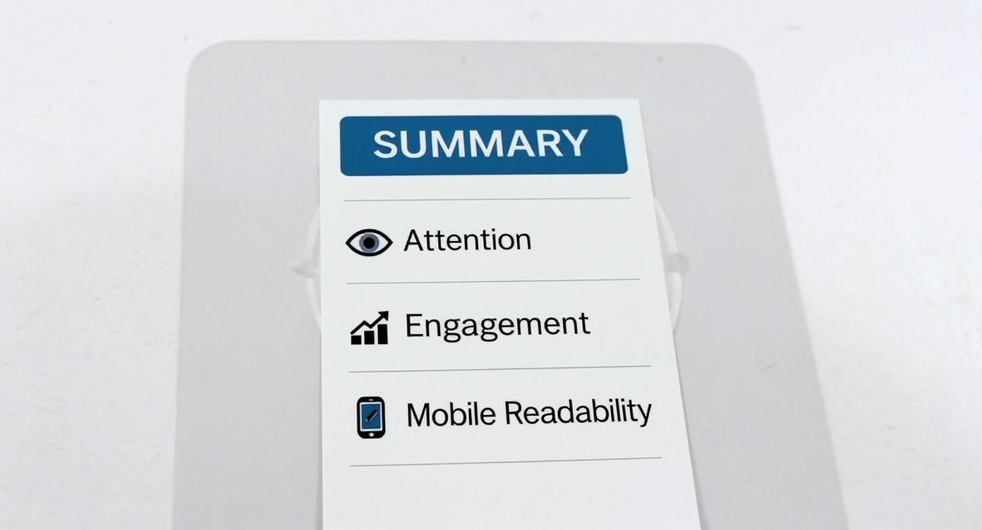
By breaking up your text and highlighting key info, you make your content scannable and easy to digest. This simple change can dramatically increase the time someone spends on your post, which is a huge signal to the algorithm that your content is valuable.
It’s More Than Just Looks
At the end of the day, thoughtful formatting shows you respect your reader's time. It proves you’ve put in the effort to make your message clear, accessible, and easy to understand.
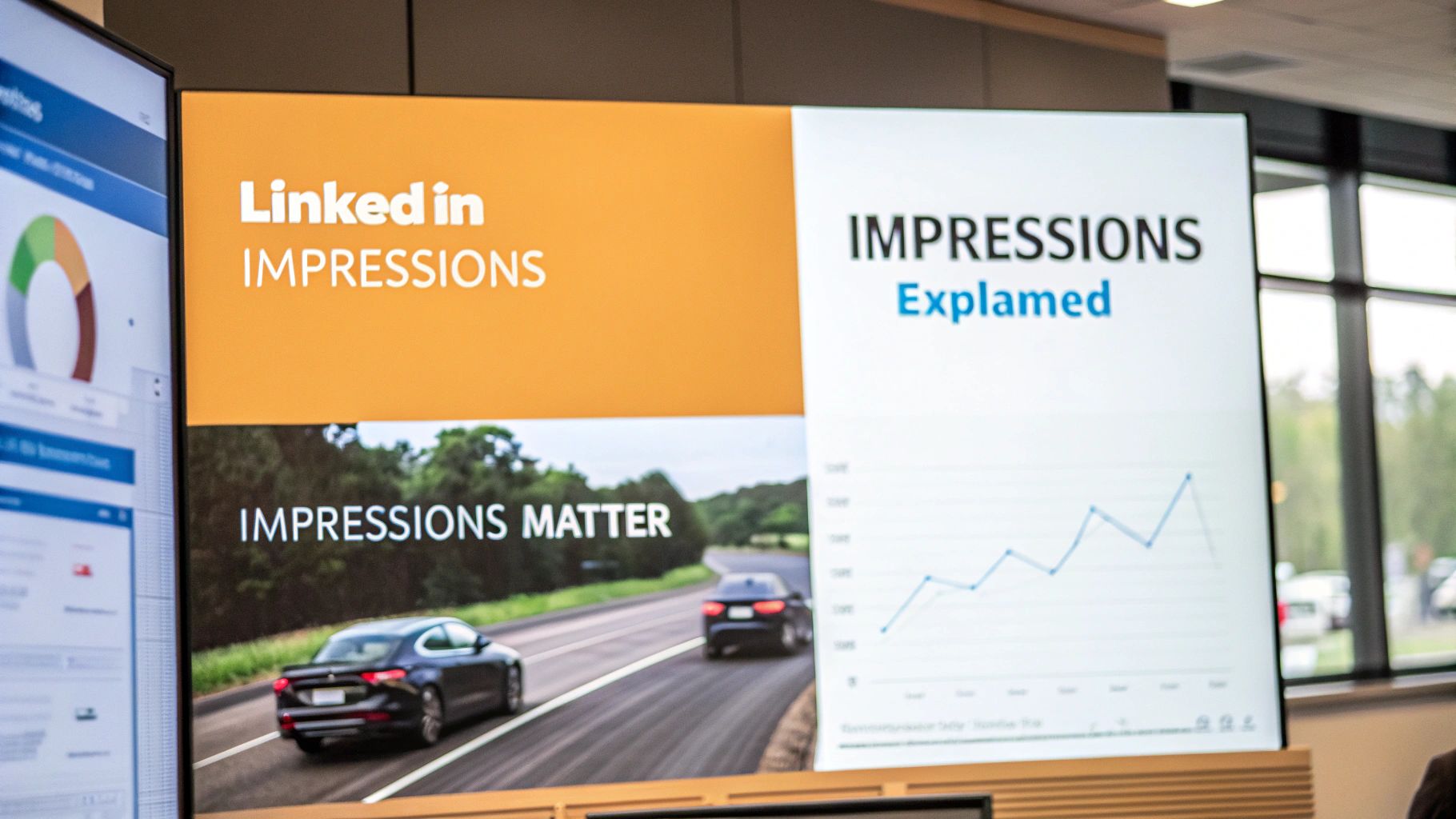
When you bold text, you’re not just changing the font. You’re boosting your post’s chances of capturing attention, driving engagement, and improving your overall what are impressions on LinkedIn. It’s just one piece of the puzzle, but it’s a critical part of learning how to get noticed on LinkedIn.
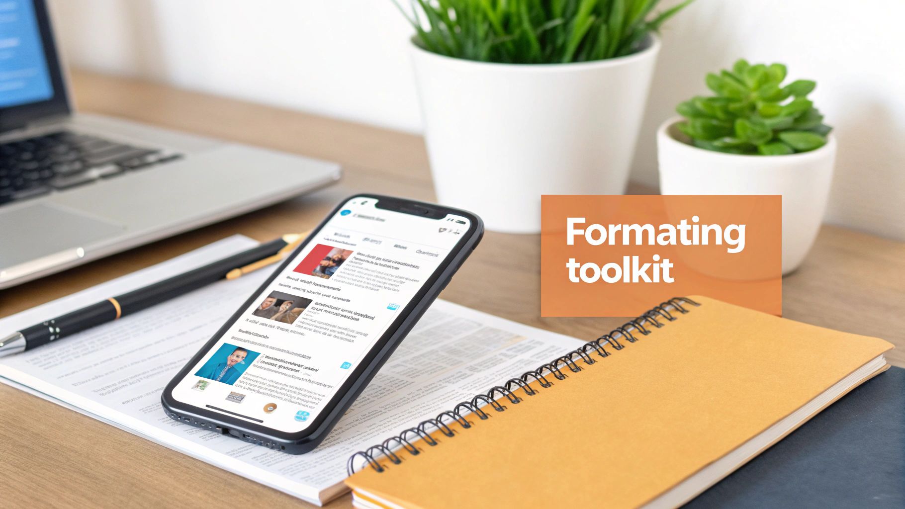
How to Use Unicode Text Converters to Make Your Text Pop
So, how do you get that slick bold formatting when LinkedIn doesn't give you a toolbar? The magic trick is using a Unicode text converter.
These are simple, free websites that swap your plain text for special characters that look bold. It’s a super quick copy-and-paste process that literally anyone can do in seconds.
Just type what you want to emphasize into the tool, and it instantly spits out a bunch of styled options. Find the bold one you like, copy it, and drop it straight into your LinkedIn post. Easy as that.
Finding a Good Text Generator
A quick search will turn up tons of these tools, and honestly, most of them do the exact same thing. They're built to be incredibly straightforward—no downloads, no sign-ups, just a simple text box.
A classic example is YayText, which gives you a clean, no-fuss interface with multiple bold and italic styles to choose from at a glance. You just type in the top box and grab your formatted text from the results below.
The key is to pick a style that looks professional and is easy to read. Some of the more decorative fonts can look messy and unprofessional. I usually stick with a standard bold serif or sans-serif style to keep things looking clean.
Crucial Tip: Always, always double-check how your post looks on both mobile and desktop before you hit publish. Unicode characters can sometimes look a little different depending on the device, and you want to make sure your message comes across perfectly.
Learning how to bold text in a LinkedIn post is more than a novelty; it’s a simple way to make your content more scannable and engaging. The better your formatting, the more likely people are to stop scrolling and actually read what you have to say.
For an all-in-one solution, a dedicated LinkedIn post formatter can be a great option. These tools often combine text styling with a live preview, so you can see exactly how your post will look.
To help you get started, here's a quick rundown of some of the most reliable and popular tools out there. They're all free and get the job done quickly.
Top Unicode Text Generators for LinkedIn
| Tool Name | Key Features | Ease of Use |
|---|---|---|
| YayText | Wide variety of styles, clean interface, quick copy buttons. | Excellent |
| Fancy Text Generator | Offers many decorative and "weird" fonts alongside standard bold. | Very Good |
| Lingojam | Extremely simple, two-box interface. Fast and no-fuss. | Excellent |
These are just a few solid options, but they all operate on the same simple principle. Find one you like, bookmark it, and you're good to go.
A Quick Word on Accessibility
One important thing to remember: these "bold" characters aren't technically text. They're symbols. This means screen readers, which people with visual impairments use, might not read them correctly. Sometimes they’re skipped entirely or read out as a jumble of random characters.
Because of this, it's best to use bold formatting for emphasis on a few key words or phrases—not for entire paragraphs. Keep it strategic and purposeful.
Beyond Bold: The Art of Strategic Post Formatting
So, you've figured out how to bold text on LinkedIn. That's a great first step, but it's really just one tool in your toolbox. The real pros on the platform know that it's the combination of different formatting tricks that makes a post truly stop the scroll.
Think about it: you’re not just writing a block of text; you’re creating a visual experience. Your goal is to guide your reader's eye and make your message as easy to absorb as possible, especially on a phone where everyone is just speed-scrolling.
The impact of good formatting is huge. A Socialinsider study that crunched the numbers on over a million posts found that visually formatted content got a whopping 300% more engagement than plain text. Since the LinkedIn algorithm rewards engagement, a little formatting effort can seriously boost your reach.
Creating Structure and Flow
The simplest yet most powerful way to make your posts more readable? White space. Seriously, just hit that 'enter' key more often. Keep your paragraphs super short—one or two sentences, max. This one change alone prevents that dreaded "wall of text" and makes your content feel way more approachable.
Next up, bring in some lists. They're a fantastic way to break up long stretches of text and present information that's easy to scan.
- Bullet points are your go-to for listing out features, benefits, or key ideas where the order doesn't matter.
- Numbered lists are perfect when you need to show a clear sequence, like for step-by-step guides or ranking things.
For a deeper dive into content structure, our complete guide on https://redactai.io/blog/how-to-write-linkedin-post has you covered.
Adding Personality and Emphasis
Don't be afraid of emojis! They're not just for fun—they act as visual cues that can draw attention, inject some personality, and add emotional context that plain text just can't. The key is moderation; a few well-placed emojis look great, but too many can look unprofessional.
Another trick is strategic capitalization. Using ALL CAPS on a single, impactful word can add emphasis without you having to mess with any text generators. Again, use this one sparingly. Overdo it, and it feels like you're shouting at your audience.
Ultimately, bolding is just one piece of a much larger strategy. Many of the same principles apply when crafting engaging blog posts, where structure and visual appeal are just as critical.
Best Practices for Using Bold Text on LinkedIn
Knowing how to make text bold is one thing; knowing when to do it is the real art. It’s tempting to go wild with your newfound formatting powers, but think of bolding like a highlighter. If you highlight the entire page, nothing actually stands out.
The secret is to be selective. A well-placed bold word or phrase guides your reader's eye right to the juicy parts of your post. Keep it clean, simple, and intentional. Less is definitely more.
When to Bold Your Text
So, what are the perfect moments to deploy some bold text? It’s all about adding punch to the most critical pieces of your message.
I find it works best for:
- Key Statistics: Numbers can get lost in a block of text. Make them pop. "We saw a 45% increase in engagement" hits a lot harder than the plain version.
- Main Takeaways: If someone only reads one sentence in your entire post, what should it be? Bold that sentence. It’s the perfect way to get your main point across in a split second.
- Calls to Action (CTAs): Don't let your call to action get buried! Bolding something like "Drop your thoughts in the comments below" makes it a clear, unmissable instruction.
Bolding isn't just decoration; it's a strategic tool for readability. You're creating visual signposts that help someone scrolling through their feed quickly grasp the value you're offering. It’s a small detail that shows you respect their time.
Real-World Scenarios
Let's make this practical. Say you're sharing an update on a new market trend. You could bold the most surprising stat to hook your reader immediately: "AI adoption in marketing has doubled in the last six months." That single line sets the stage for the rest of your analysis.
Or maybe you’re posting a job opening. Instead of just listing responsibilities, bold the one thing you know candidates are looking for. Highlighting a benefit like "This role offers a fully remote work option" can make a huge difference in catching the right person's eye.
At the end of the day, using bold text effectively is about clarity and persuasion. Use it to enhance your message, not just to decorate it.
5 Common Mistakes to Sidestep When Formatting Your Posts
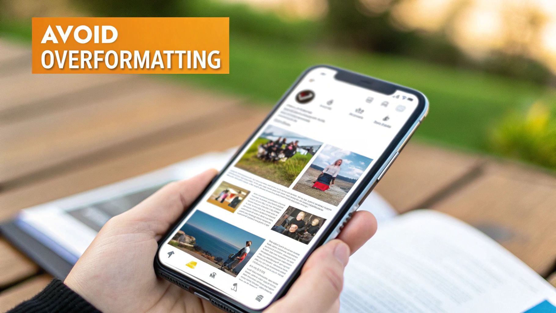
It's tempting to go all-out with your newfound formatting powers, but a few common missteps can really tank your post's performance. I've seen it happen time and again.
Here are the biggest traps to watch out for:
1. The "Everything is Important" Trap
This is the most common mistake by far: over-formatting. When you bold everything, nothing stands out. A post screaming with a chaotic jumble of bold, italics, underlines, and a rainbow of emojis just looks messy and unprofessional. It’s also incredibly difficult to read. The goal is clarity, not visual chaos.
2. Ignoring Accessibility
We've touched on this, but it’s worth repeating. Those fancy Unicode fonts you see people using for bold and italics? They can be a total nightmare for screen readers. This means professionals with visual impairments might get a garbled mess of words or, worse, miss your key points entirely.
3. Forgetting Your Brand Vibe
Your formatting is part of your professional brand. If your posts are consistently cluttered, spammy-looking, or just all over the place, it chips away at your credibility. A clean, consistent style reinforces your expertise; a messy one makes you look amateurish.
4. Making It Hard to Skim
People scroll fast. Your formatting should act like a set of signposts, guiding the reader’s eye to the most important bits of information. If your post is a dense wall of text with no breaks or visual cues, most people will just keep on scrolling.
5. Using Formatting Without a "Why"
This really sums it all up. Don't just bold a word because you can. Ask yourself why you're doing it.
My rule of thumb is simple: Every formatting choice must serve a purpose. It should either guide the reader, emphasize a truly critical point, or make the post easier to scan. If it doesn't do one of those three things, get rid of it.
Using bold text and other formatting tricks should make your message stronger, not create a distraction. A clean, intentional, and accessible style will always win in the long run, building both your brand and your engagement.
Got Questions About LinkedIn Formatting? Let's Clear Things Up
Even with all the tricks in the book, a few questions always come up when people start playing with bolding and formatting on their LinkedIn posts. Let's get them answered.
Does Using Bold Text Mess With Your Reach?
This is the big one. The short answer is: not directly. LinkedIn hasn't come out and said, "We penalize posts with Unicode bolding."
The real concern is accessibility. The "bold" text you get from these tools isn't actually formatted text; it's a different set of characters. This means screen readers, which visually impaired professionals rely on, might stumble over it or just read it as a jumble of symbols.
The bottom line is, if your fancy formatting makes your post hard for someone to read or understand, that lack of engagement can tell the algorithm your content isn't hitting the mark. It all comes back to creating a good experience for your reader.
Can I Get Italic or Other Styles, Too?
You bet. The same tools that give you bold text usually offer a whole smorgasbord of other styles—italics, underlines, strikethrough, you name it.
But the same golden rule applies here: less is more. A touch of italics can add nuance, but a post that looks like a ransom note with a dozen different styles just feels spammy and is a nightmare to read. Always put clarity first.
What Else Can I Do Besides Bolding?
If you're cautious about the accessibility issue or just want to switch things up, there are plenty of other ways to make your key points pop. These are some of my go-to moves:
ALL CAPS: Great for one, maybe two, words you really want to SHOUT. Use it sparingly for maximum impact.
Emojis as brackets: A simple emoji pair can draw the eye right where you want it. 👉 Like this! 👈 It’s visually interesting without hurting readability.
Strategic white space: This is my favorite. Pull your most important sentence out and give it its own line.
That extra space around it automatically makes it feel more important. It's a powerful and completely accessible way to create emphasis.
Ready to create high-impact LinkedIn posts without the hassle? RedactAI uses AI to help you generate, format, and schedule content that reflects your unique professional voice in minutes. Start creating for free at RedactAI.