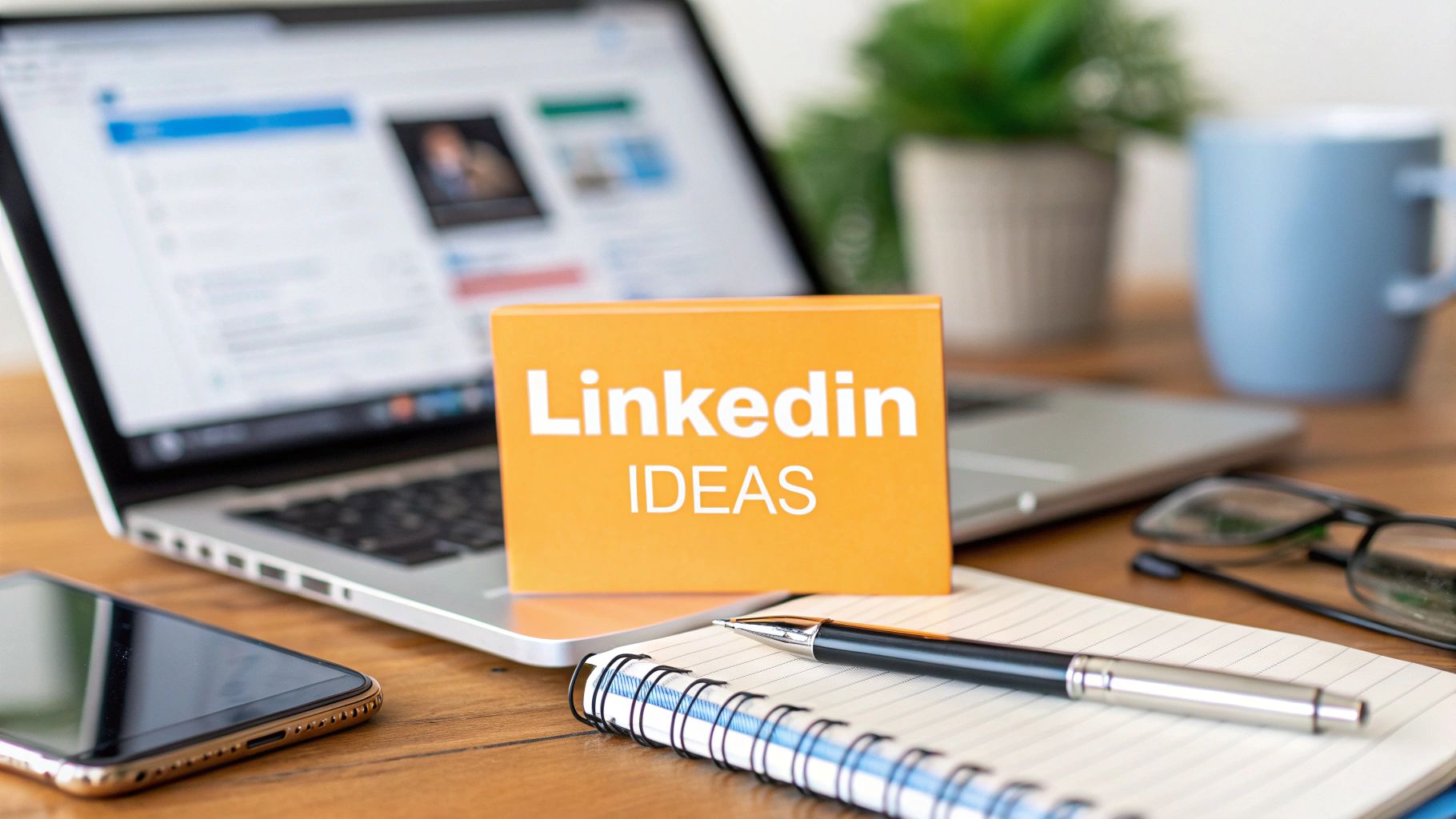
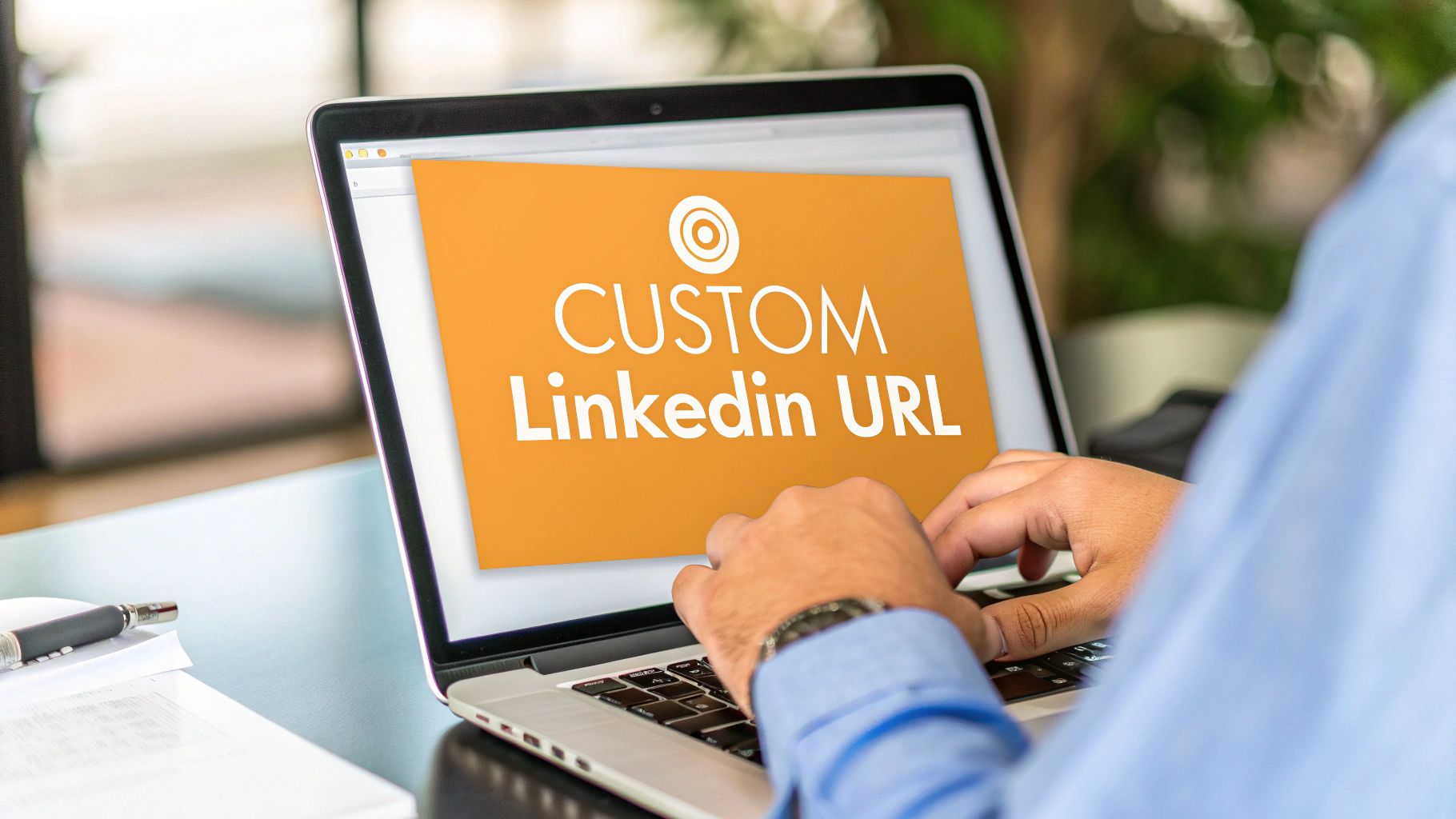
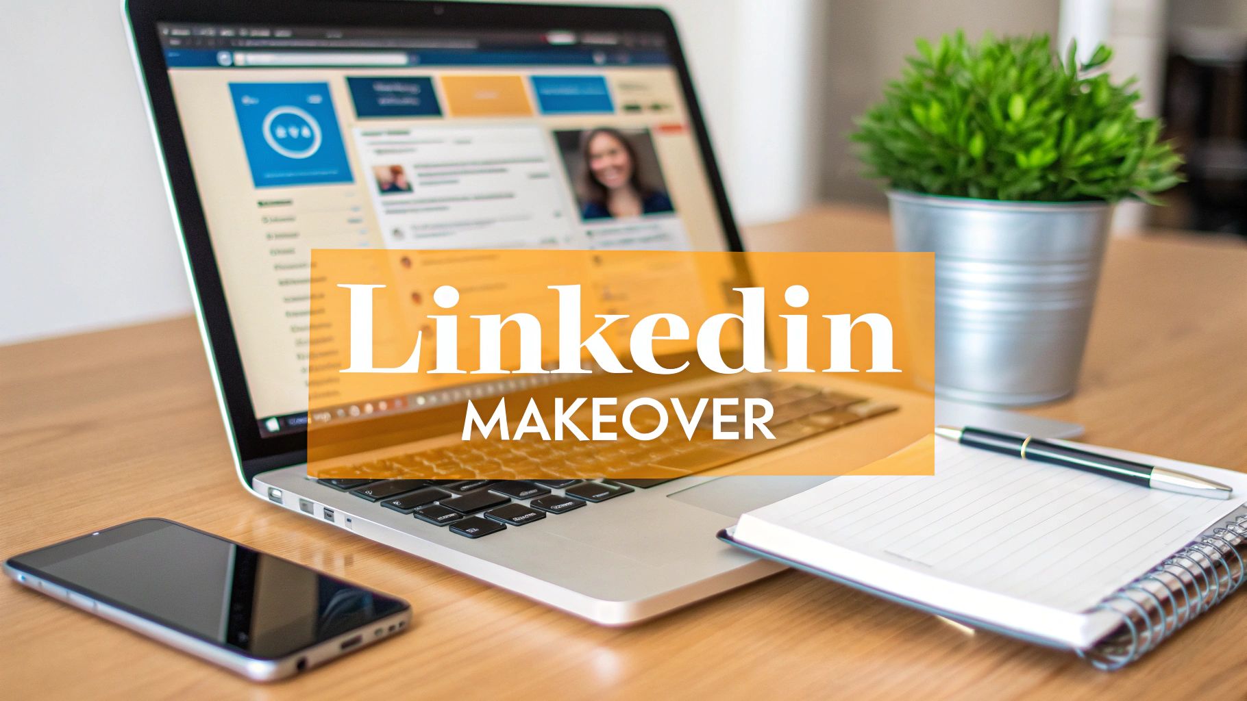
You're probably looking at your LinkedIn profile right now and thinking the banner feels old, off-brand, or just invisible. Maybe it's still the default background. Maybe it's a custom graphic from a role you left a while ago. Either way, it's usually the first thing people notice, and it subtly shapes how the rest of your profile feels.
That's why how to change linkedin banner is only half the job. The clicks are easy. The useful part is making sure the banner supports the story your profile, posts, and company presence are already telling.
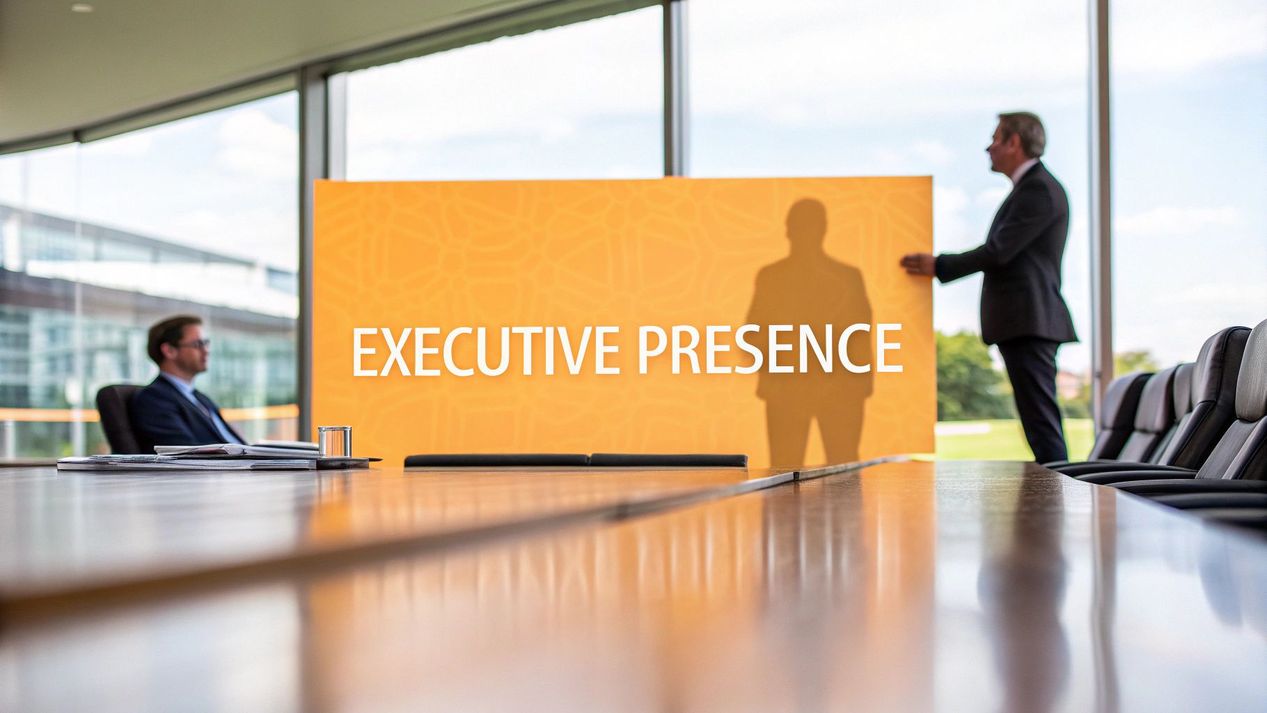
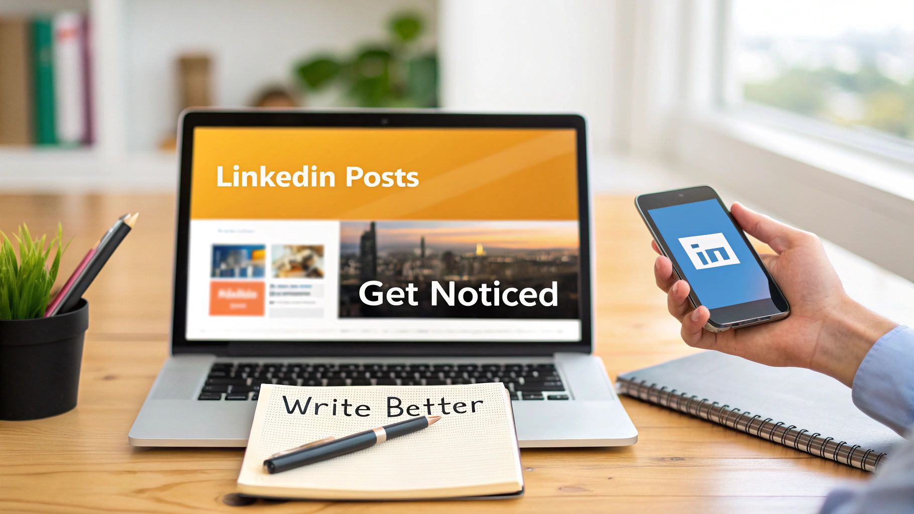
Your Banner Is Your Digital Billboard
A LinkedIn banner sits in prime visual space. It's not a decorative extra. It's a standard profile element you can change directly from your profile header, and the update process is simple enough that there's no real reason to leave it stale.
What matters more is what that space does for you. Your headline tells people what you do. Your featured section gives them somewhere to go next. Your banner connects those pieces and sets the tone before anyone reads a line.
For a lot of professionals, the banner is where their profile either clicks or falls flat. A thoughtful banner can support your positioning, reinforce your niche, and make your content strategy feel consistent. If you post regularly about pipeline, hiring, product marketing, or founder-led growth, your banner should feel like it belongs in that same world. If you're trying to boost your B2B marketing strategy, that alignment matters even more because your profile becomes part of the campaign.
A weak banner doesn't ruin a strong profile. It just wastes the biggest visual space you have.
The good news is that changing it takes minutes. The better news is that a strong banner can make the rest of your LinkedIn presence feel more intentional right away.
Prepping the Perfect Banner Image
A banner refresh goes faster when the prep is right. Bad cropping, fuzzy text, and awkward photo overlap usually start in the design file, not inside LinkedIn.
For a clean upload, build the image at 1584 × 396 pixels with a 4:1 aspect ratio, as shown in this banner sizing guide. That gives you a reliable starting canvas and makes LinkedIn's crop behavior easier to manage.

Start with the right canvas
Set the dimensions first in Canva, Adobe Express, Figma, or whatever tool you already use. Designing on the correct canvas from the start is faster than fixing a stretched image later, and it keeps logos, taglines, and background shapes where you intended them.
Lightweight design tools are usually enough for routine profile updates. For most personal profiles and a lot of company pages, you do not need a designer to create a banner that looks polished and on-brand.
If your profile photo also needs cleanup, pair the banner refresh with a polished headshot. A tool like an ai headshot generator can help you create something that visually matches the new banner style.
Keep the important content in the safe zone
Placement matters more than people expect.
Your banner has to work across desktop, mobile, personal profiles, and company pages. LinkedIn crops differently depending on the device, and your profile photo will cover part of the left side on personal profiles. If the one line you want people to remember sits too close to an edge, it can disappear or feel cramped.
Use this checklist before you export:
- Use exact dimensions: Build at 1584 × 396 px so the layout starts in the right proportions.
- Choose a clean file type: PNG usually works best for banners with text, logos, or sharp graphic elements.
- Center the core message: Keep your headline, role descriptor, or offer away from the far left and far right.
- Leave room for overlap: Personal profiles need space for the headshot area. Company pages need room for different screen widths.
Practical rule: If a word, icon, or logo matters, keep it in the middle area with breathing room around it.
Pick a style that supports your LinkedIn strategy
This is the part many banner guides skip. The design should match how you show up in the feed.
If you post thought leadership every week, your banner should reinforce that same positioning. If your company page publishes hiring updates, customer wins, or category education, the banner should support that story instead of feeling like a disconnected brand asset. The strongest banners act like the headline for the rest of your LinkedIn presence.
A few banner styles work well:
| Banner style | Works well for | Usually fails when |
|---|---|---|
| Minimal text + clean background | Executives, recruiters, operators | The message is too generic |
| Value proposition banner | Consultants, freelancers, agencies | Too much copy gets packed into one line |
| Visual brand banner | Founders, creators, company leaders | The image feels stock-heavy or unrelated to the content |
If you want examples before designing, this guide on a professional LinkedIn cover photo is a useful reference point.
A final trade-off to keep in mind. Clean and simple usually ages better than clever. A banner built around one clear idea is easier to update, easier to align with your posting strategy, and more likely to work across both personal and company pages.
How to Change Your Banner on Desktop
Desktop gives you the clearest view of what other people will see. If you are updating your banner after a positioning change, a new offer, or a company campaign refresh, this is the place to do the final check before it goes live.

The process itself is simple. Sign in, open your profile, click the camera or edit icon in the banner area, upload the image, adjust the framing, then save it. The clicks only take a minute. The actual challenge is making sure the banner still supports the story your profile or company page is trying to tell.
The desktop steps
- Go to LinkedIn and sign in.
- Click Me in the top navigation.
- Select View Profile.
- In the top intro section, click the camera or edit icon on the banner area.
- Choose Edit profile background if LinkedIn shows that option.
- Upload your prepared image.
- Adjust the positioning.
- Click Apply or Save.
That part is straightforward. What usually gets missed is the preview.
What to check before you hit Apply
Use the desktop preview to review the banner like a visitor would. A banner can be the right size and still do a weak job if the message is hard to scan or the composition feels off.
Check these three things:
- Message visibility: Your headline, role, offer, or brand line should be readable at a glance.
- Profile photo overlap: On personal profiles, the headshot often covers the lower-left area. Keep logos, names, and short text away from that zone.
- Fit with your content strategy: If your posts focus on thought leadership, hiring, product education, or client results, the banner should reinforce that same theme instead of introducing a different one.
That last point matters more than people think. On LinkedIn, the banner is not just decoration. It sets expectations before someone reads your About section, checks your featured links, or sees your latest post. On a personal page, that can sharpen your professional positioning. On a company page, it can make the brand feel consistent across the profile and the feed.
LinkedIn usually lets you reposition the image before saving. Use that step. Small adjustments often fix a banner that feels slightly crowded or uneven.
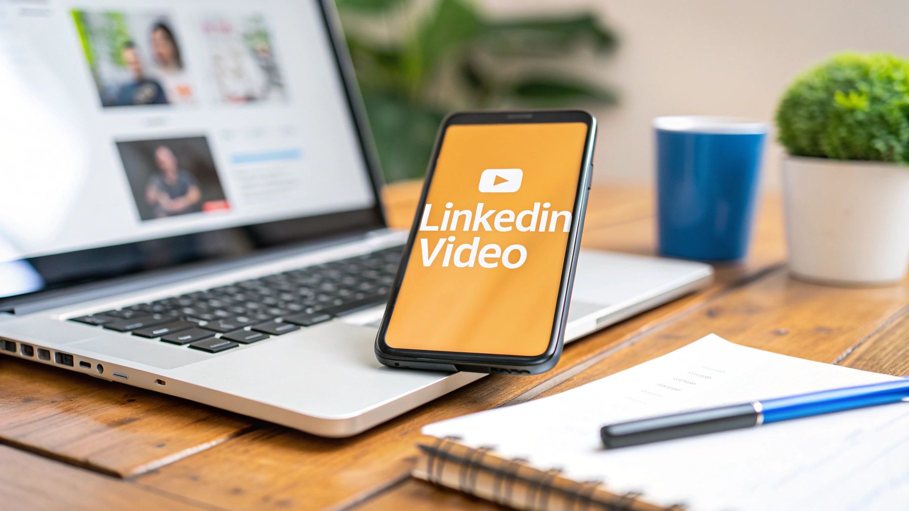
If you want to watch someone go through a similar update flow, this quick walkthrough helps:
One practical habit I recommend: upload on desktop even if the file was created on your phone. It is easier to catch spacing problems, awkward cropping, and off-center text before your banner becomes public to recruiters, prospects, clients, or future hires.
Updating Your Banner From the Mobile App
You can absolutely change your banner from your phone. It's fast, and if you've already built the image correctly, the mobile app is good enough for a quick refresh.

On mobile, the process is similar: open your profile, tap the camera or edit icon on the banner area, choose your image, then reposition and crop before tapping Save or Apply, as described in this mobile LinkedIn banner tutorial.
The fastest mobile flow
Open the LinkedIn app, then:
- Go to your profile: Tap your photo or profile access point and open your profile page.
- Tap the banner edit control: Look for the camera or pencil icon on the banner area.
- Select your image: Choose the prepared banner from your photo library.
- Adjust the crop: Reposition the artwork so the important content stays visible.
- Save it: Tap Save or Apply.
That's all you need.
Where mobile gets tricky
Mobile is faster, but it's also less forgiving. Small movements can change the framing more than you expect, and it's harder to judge how the full banner will feel compared with desktop.
A few habits help:
| Mobile issue | What usually causes it | Better move |
|---|---|---|
| Text looks too close to the edge | Banner designed too tightly | Leave more margin in the original file |
| Headshot blocks important content | Message placed too low or left | Rework the design, not just the crop |
| Banner feels off-center | You adjusted on a small screen too quickly | Save, review, then tweak again if needed |
If the banner includes text, always check the profile again after saving. Mobile previews can look acceptable during editing and still feel cramped once the update goes live.
For quick, image-only banners, mobile is fine. For anything with detailed text, logos, or a layered composition, I'd still do the final review on a larger screen.
Banner Strategy Beyond the Basics
Changing the image is simple. Choosing the right banner is where the actual work begins.
With over 1 billion members globally, LinkedIn makes profile-first impressions more important than ever, and a strong banner strategy now matters more than generic decoration, as discussed in this LinkedIn banner strategy video. Many professionals still treat the banner like empty wallpaper. That's a miss.

Match the banner to the kind of attention you want
A good banner answers one of these questions fast:
- What do you want to be known for?
- Who do you help?
- Why should someone trust you?
That doesn't always mean adding more text. In fact, some of the strongest banners are restrained. For executives and recruiters, a minimalist design often works better than a hard-sell layout. For consultants and agency owners, a concise positioning line can do real work. For creators, the banner can reinforce a content theme so the profile feels connected to the posts.
If your content is focused on a clear niche, your banner should echo that. If you write about RevOps, hiring systems, AI workflows, or founder storytelling, the banner shouldn't look like it belongs to a different person.
What works for different profiles
Here's the practical breakdown.
Personal profiles
For individual professionals, I usually think in three buckets:
- Credibility banner: Good for executives, operators, and senior hires. Keep it clean. Use brand colors, a subtle background, maybe a simple niche statement.
- Positioning banner: Best for consultants, coaches, strategists, and freelancers. Say who you help and what kind of problem you solve.
- Authority banner: Useful if you publish often. Tie the visual identity to the themes people already see in your posts.
A banner that tries to be a resume, brochure, and ad all at once usually underperforms.
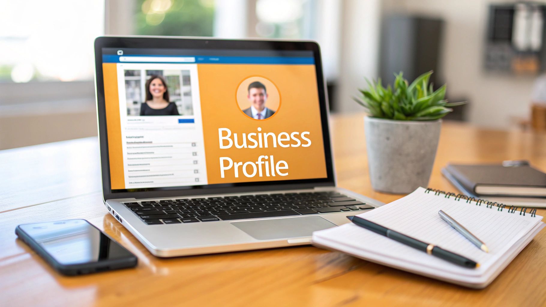
Company pages
Company pages need a different mindset. The banner should support the brand story, but it also has to connect with what the page is posting. If your company page is publishing hiring updates, product education, customer stories, or event content, the banner should feel like the headline for that whole stream.
That's why I'd avoid random stock art or vague brand statements. A company page banner should reinforce one clear idea: what the company does, who it serves, or what kind of trust signal the page wants to build.
Your banner should support your post strategy
Most guides stop too early.
If you post consistently, your banner becomes the backdrop for your content identity. It doesn't need to repeat your posts word for word. It should make your posting pattern feel intentional. Someone reads a post, clicks your profile, sees the banner, and immediately understands they're in the right place.
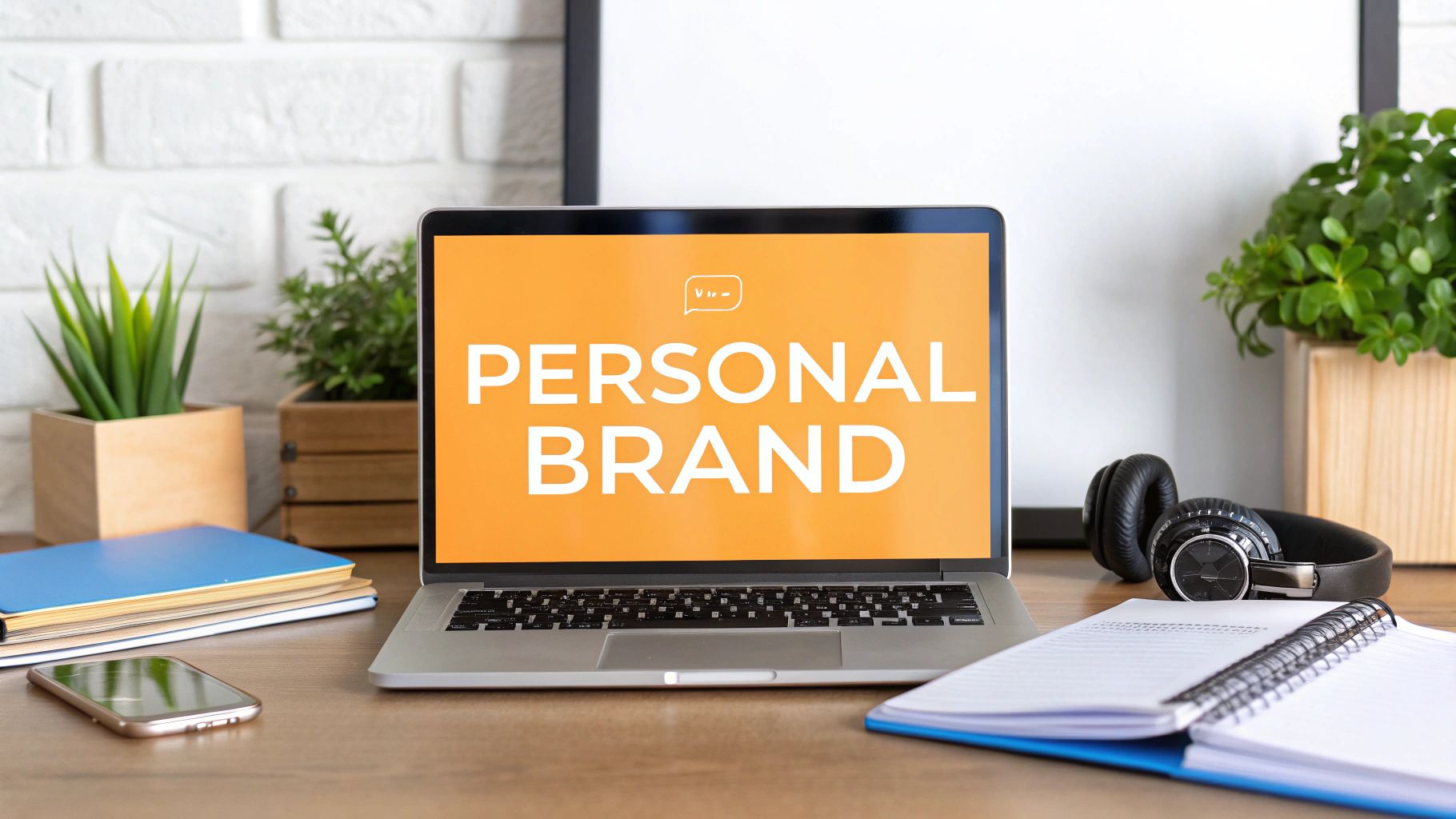
If you're working on that broader presence, this article on personal branding on LinkedIn is a useful companion.
The best banner is usually not the prettiest one. It's the one that makes the rest of your profile make sense faster.
A final trade-off worth remembering: banners that scream promotion can get attention, but they can also lower trust. Banners that clarify positioning and support credibility tend to age better.
Fixing Common Issues and Updating Company Pages
Banner updates are usually straightforward until LinkedIn makes your image look blurry, off-center, or strangely cropped. Most of those issues come down to file prep, not platform bugs.
Fix the common banner problems first
If the banner looks wrong after upload, check these before redesigning from scratch:
- Blurry image: The original file may be low quality, or it may not have been designed at the right canvas size.
- Text gets clipped: The layout is probably too close to the edges.
- Headshot covers key content: Move your message away from the overlap area in the original design.
- Banner feels crowded: Remove elements before you try to resize everything smaller.
A simple troubleshooting approach works well:
| Problem | Likely reason | Fix |
|---|---|---|
| Blurry result | Weak source file | Re-export from the original design file |
| Cropped logo or text | Edge placement | Recenter the layout |
| Strange composition | Over-reliance on LinkedIn crop tools | Adjust the artwork before re-uploading |
One practical habit helps more than people expect. Keep a master version of the banner in Canva, Figma, or Adobe Express, so you can make small edits without rebuilding the whole thing.
How to update a LinkedIn company page banner
Company pages are a separate workflow because you need the right permissions. If you're not an admin, you won't be able to change the page assets.
The cleanest process is:
- Open the company page while logged into the admin account.
- Go to the page management or edit controls.
- Find the header or banner image area.
- Upload the new banner.
- Adjust the framing if LinkedIn allows it.
- Save the update and review the live page.
The banner itself should do a different job than a personal profile banner. On a company page, I'd focus on one of three things: brand clarity, campaign focus, or trust. That could mean a simple brand visual, a concise statement about what the company does, or a campaign-specific graphic that aligns with current posting.
If you manage the brand side as well as content, this guide to a LinkedIn company page is worth bookmarking.
If you're handling both the visual side and the content side, tools can help keep the profile and posting rhythm aligned. RedactAI, for example, is built for LinkedIn content creation and planning, which is useful when you want the banner, profile, and publishing cadence to feel like one system instead of separate tasks.
Your banner is small work with outsized visibility. If you want the rest of your LinkedIn presence to match it, RedactAI helps professionals create LinkedIn posts that fit their positioning, voice, and publishing goals, so the story on the banner carries through into the content people see next.