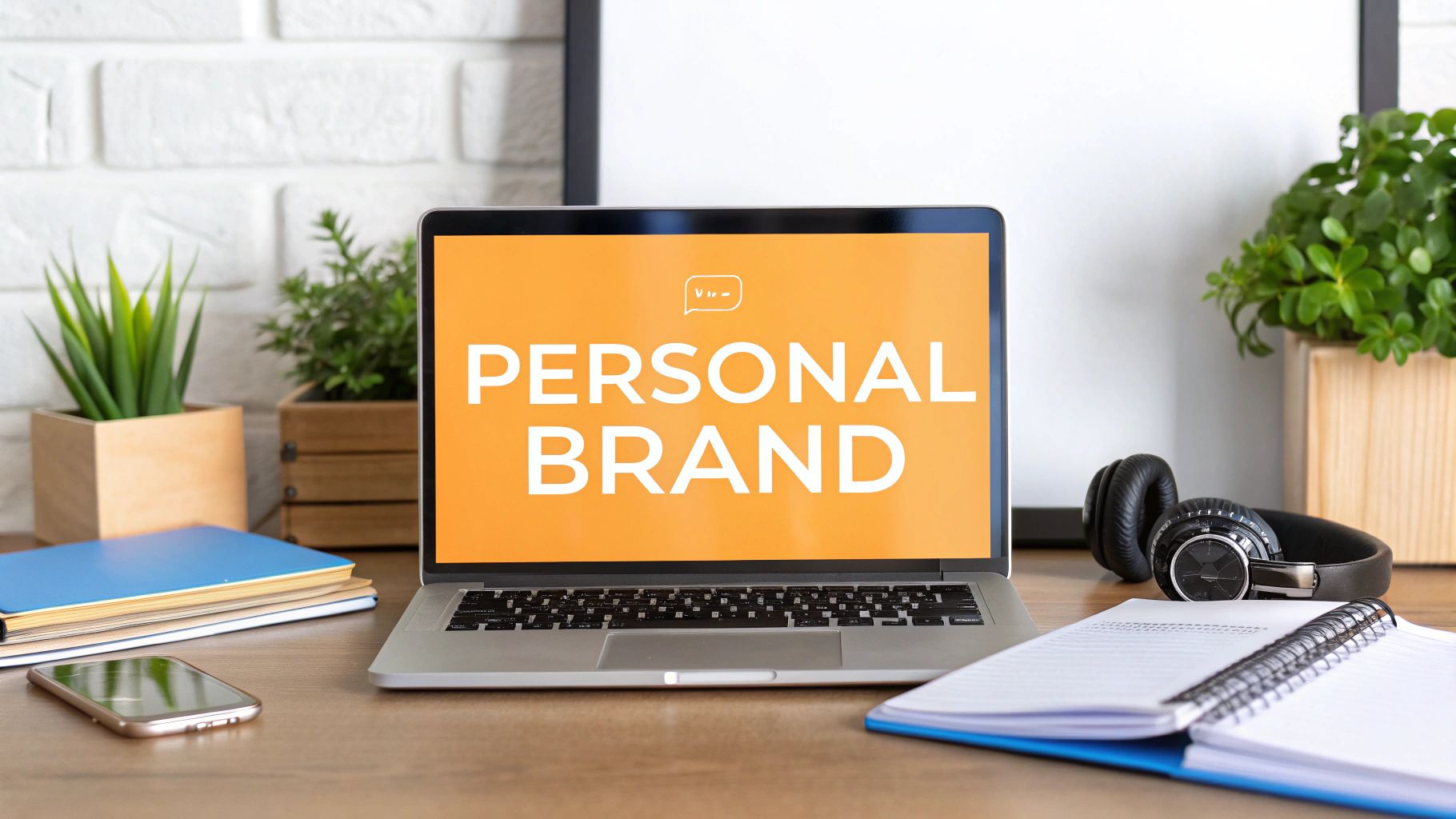
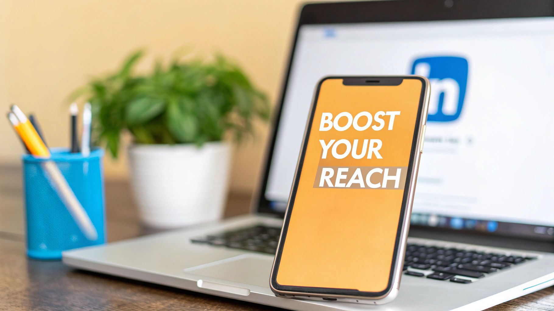
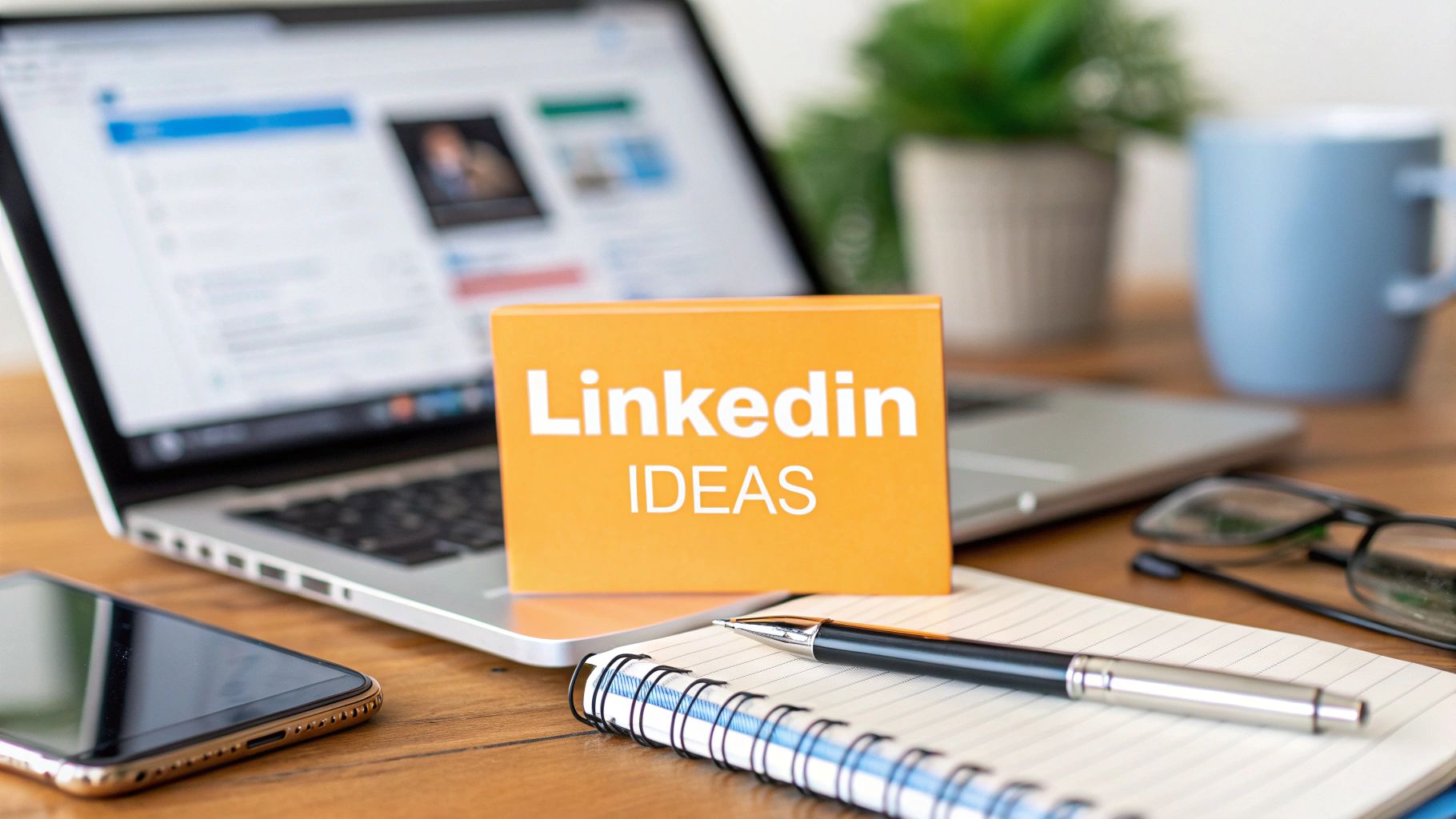
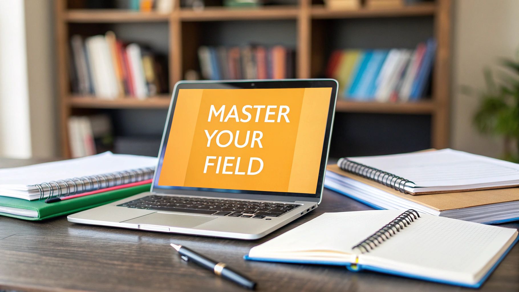
You’ve probably done this at least once. You tuned your headline, cleaned up your About section, reordered your featured links, and maybe even got a polished headshot. Then you looked up at the top of your profile and saw the default blue-gray banner, or a random skyline you uploaded three years ago.
That top strip matters more than is often understood. A professional linkedin cover photo isn’t decoration. It’s the first wide-format message people see before they decide what kind of professional you are, how current you are, and whether your profile feels intentional.
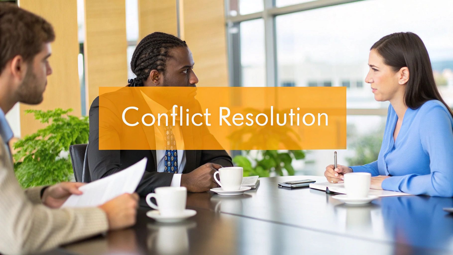
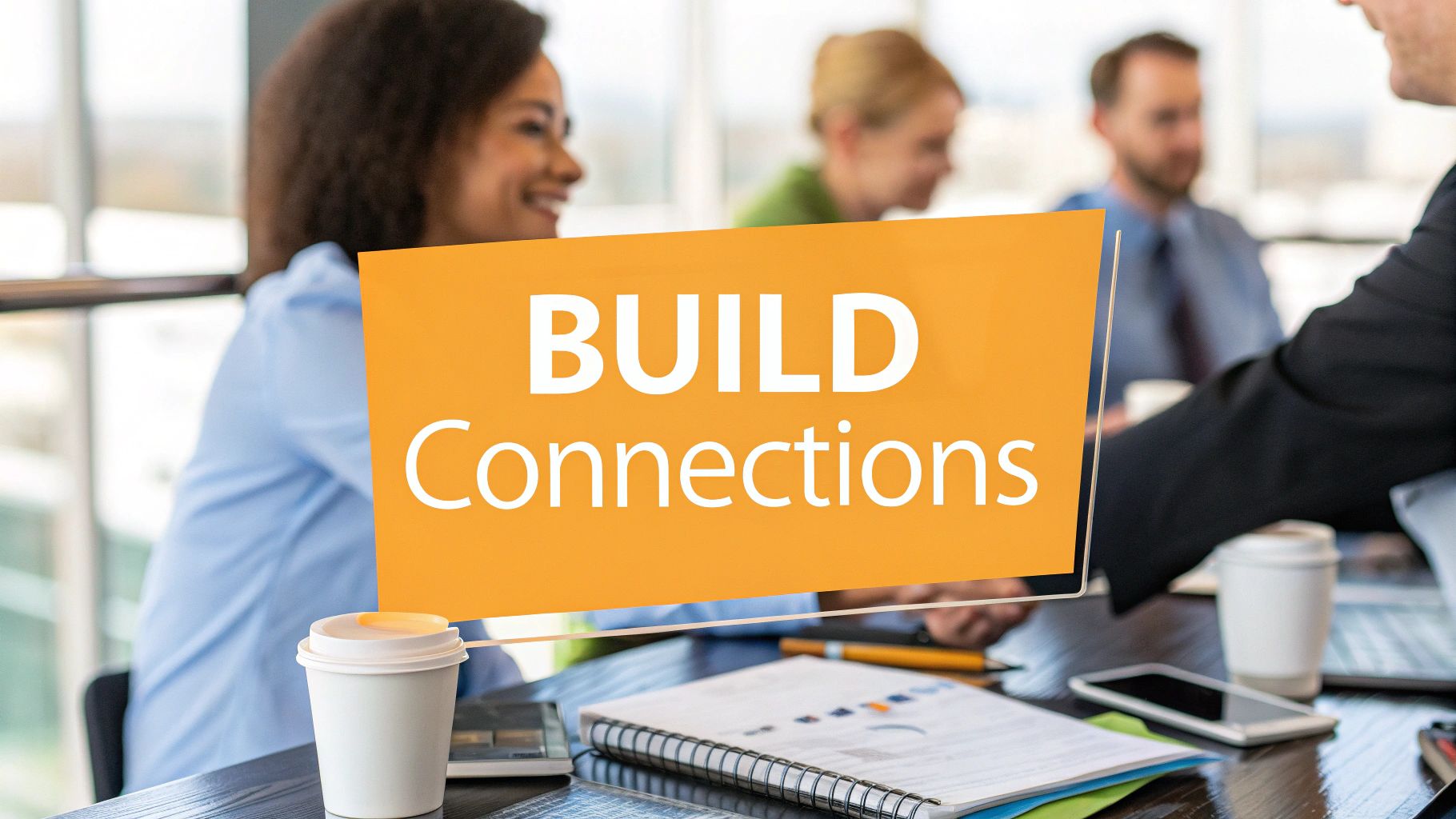
I’ve looked at thousands of LinkedIn profiles, and the pattern is consistent. Strong professionals often lose momentum with weak visual framing. Their experience is solid, but their banner says nothing. Or worse, it says the wrong thing. A generic cityscape makes a founder look interchangeable. A cluttered collage makes a consultant look unfocused. A stock handshake image makes almost anyone look dated.
Your LinkedIn Cover Is Your Digital Billboard
The fastest way to understand your cover photo is to stop thinking of it as background. It’s a billboard attached to your name.
When someone lands on your profile, they don’t read in a neat top-to-bottom sequence. They scan. They form a gut impression. They decide whether to keep going. That means every visual element at the top of the page either helps your positioning or weakens it.

Why the visual layer matters
The strongest hard data we have on this topic comes from profile imagery. Profiles with professional LinkedIn profile photos receive 21 times more views, 9 times more connection requests, and 36 times more messages, with 57% of LinkedIn traffic coming from mobile, according to these LinkedIn profile picture statistics.
That data is about profile photos, not banners alone. But the practical lesson is obvious. People respond to polished, intentional visuals. Your banner sits in the same first-impression zone and shapes how the rest of your profile is interpreted.
A good cover photo does three jobs at once:
- Frames your expertise so visitors know what lane you’re in
- Signals effort and professionalism before they read a word
- Supports memory by giving your profile a distinct visual identity
Practical rule: If your banner could belong to anyone in your industry, it’s not helping you enough.
What weak covers quietly communicate
I see the same misses over and over:
- Default background. This says you haven’t finished setting up your profile.
- Generic stock scene. This says you wanted something “professional” but didn’t decide what message to send.
- Overdesigned banner with tiny text. This says you designed for your laptop, not for LinkedIn.
- Old employer branding. This creates confusion fast, especially if your current role changed.
A professional linkedin cover photo should make your profile feel complete. It should match the quality of your headshot, headline, and recent activity. If one part looks sharp and the banner looks neglected, the overall impression drops.
If you’re refreshing the whole profile, it helps to pair your visual update with broader profile cleanup. This guide to optimize your LinkedIn profile is a solid companion for that process.
The real test
Your cover passes the test if someone can answer this in a few seconds: What does this person want to be known for?
If they can’t, your billboard is blank.
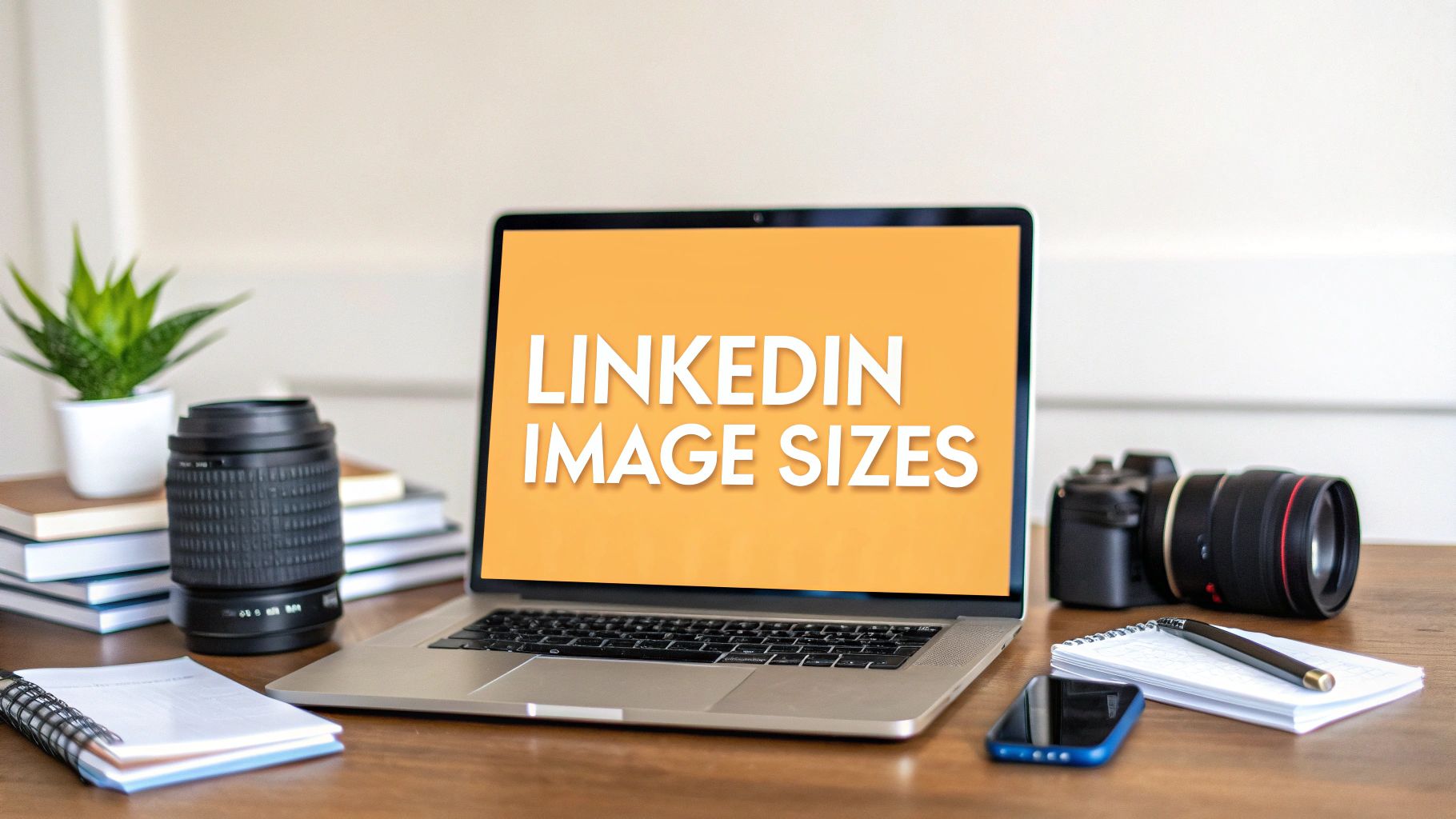
Mastering Dimensions and Safe Zones
Most banner mistakes aren’t creative. They’re technical.
People build a strong design, upload it, and then LinkedIn crops the important part, the profile photo covers the text, or mobile turns a clean layout into a mess. You don’t need fancy design instincts to avoid that. You need to respect the canvas.
The specs that keep you out of trouble
The most practical baseline for a personal LinkedIn banner is 1584 x 396 pixels, which is the recommended personal profile cover size listed in this social media image size guide.
Here’s the simple reference table.
| Attribute | Recommendation |
|---|---|
| Canvas size | 1584 x 396 pixels |
| Shape | Wide horizontal banner |
| File type | Use a common web-friendly image format |
| Text placement | Keep it away from the left side |
| Visual priority | Put the main message in the center-right area |
| Mobile check | Review on your phone before keeping it live |
That one size recommendation solves half the usual problems. The other half comes from safe zones.
What the safe zone actually means
Your profile photo sits on top of the lower-left part of the banner. Desktop and mobile also display the banner a little differently. So even if your image technically fits, key details can still get blocked.
The safest working habit is this:
- Leave the left side quiet. Don’t put your headline, CTA, or logo where the profile photo will overlap.
- Keep critical text short. A few words survive resizing better than a sentence.
- Use the center-right area for your message. That part usually stays readable across devices.
- Avoid edge-hugging layouts. LinkedIn can make designs feel tighter than they looked in your editor.
If a banner only looks right when everything displays perfectly, it’s too fragile for LinkedIn.
Design for the actual viewing experience
Many professionals forget how often their profile gets viewed on a phone. A desktop-perfect design with thin fonts and tiny subtext usually collapses on mobile. That’s why clean contrast, larger type, and fewer elements win.
A practical workflow I recommend:
- Build the banner at full size
- Export it
- Upload it to LinkedIn
- Check desktop
- Check mobile
- Adjust spacing, not just content
If you also create visual content for posts, this LinkedIn image size guide helps keep your profile and content assets consistent.
The point isn’t perfection. It’s reliability. A professional linkedin cover photo should survive real-world viewing conditions, not just your design file.
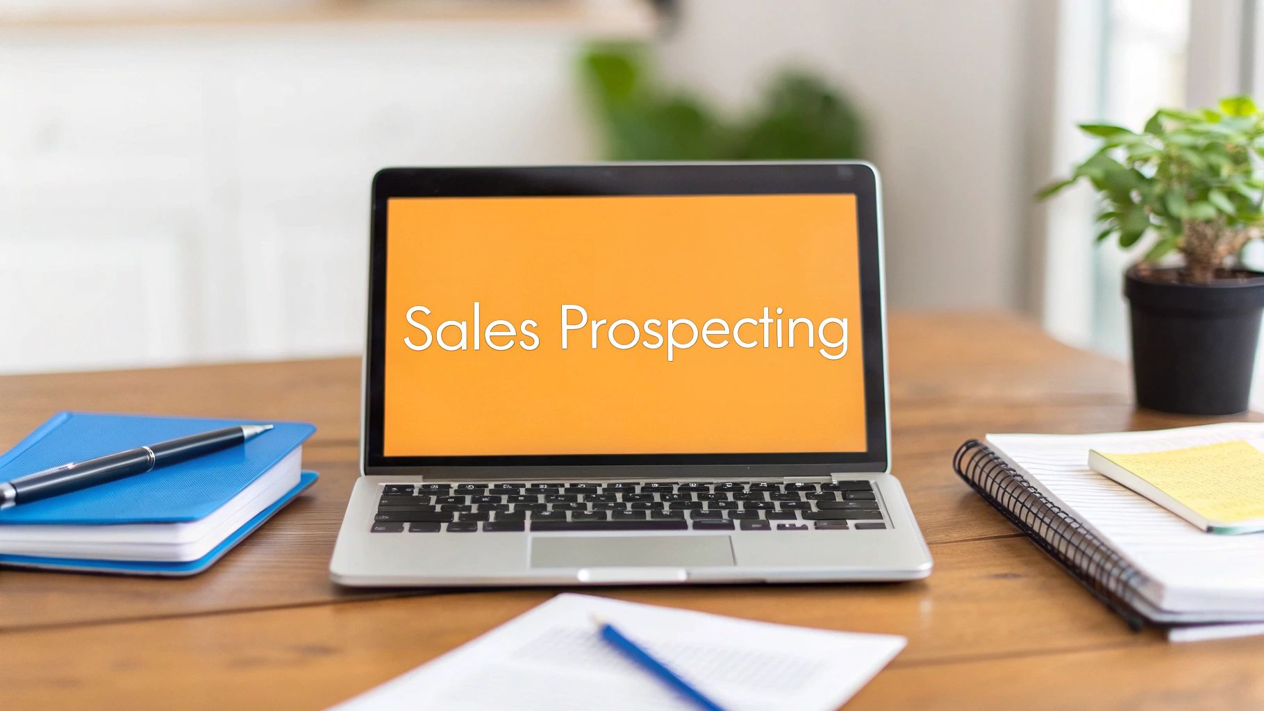
Crafting Your Message and Composition
Most LinkedIn banners fail because they try to look professional instead of trying to say something useful.
That’s the shift. Your professional linkedin cover photo should communicate positioning, not just taste. Good design helps, but message comes first. When the message is fuzzy, even a polished banner feels empty.

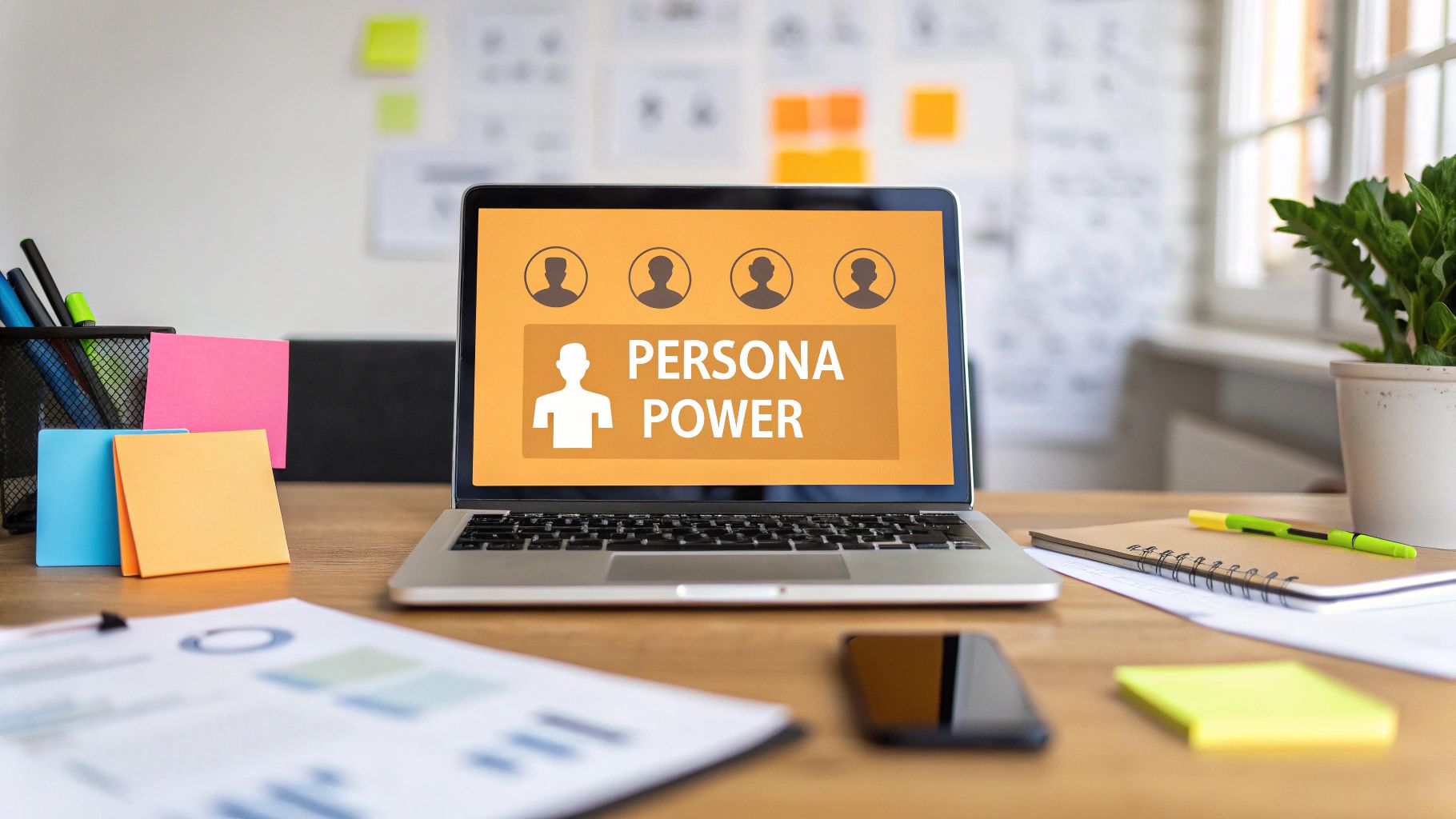
Match the banner to your actual role
The right banner for a salesperson should not look like the right banner for a developer. Unfortunately, most online advice falls short here. It gives the same generic suggestion to everyone: add a nice background, maybe your logo, maybe a slogan. That’s not strategy.
Use role-based messaging instead.
For sales professionals
Your banner should suggest momentum, clarity, and buyer relevance. Not pressure.
What works:
- A short value line tied to your market
- Clean brand colors
- A subtle visual that supports trust, such as product context or customer category
What usually fails:
- Loud “top closer” energy
- Stock handshakes
- Too many badges, logos, or awards jammed together
A strong sales banner often answers one question fast: who do you help?
For developers and technical operators
You don’t need to turn your banner into a code wallpaper. In fact, that usually looks dated.
Better options include:
- A simple statement about what you build
- A visual hint of your stack or domain
- A clean interface screenshot if it’s readable and relevant
- A minimal layout that lets competence speak
The goal isn’t to look flashy. It’s to show precision.
For founders and consultants
Founders need their banner to reduce ambiguity. Consultants need it to sharpen trust.
That usually means one of these directions works well:
- Mission-led statement
- Service positioning
- Signature framework or method
- Product visual with breathing room
The best banners don’t try to summarize your entire career. They anchor one clear idea.
Composition that survives real viewing
You do not need a design degree for this. You need restraint.
A few practical composition rules matter more than fancy technique:
- One focal point. Don’t make people choose between your face, a headline, a logo, and three icons.
- Strong hierarchy. If text is present, one line should dominate. Everything else supports it.
- High contrast. If people have to squint, you’ve already lost them.
- Planned emptiness. Negative space makes a profile feel modern and credible.
A common mistake is trying to “use all the space.” That instinct creates clutter. White space is not wasted space on LinkedIn. It’s what makes the message readable.
Examples by career goal
If you’re actively job searching, your banner should make your direction obvious.
Try:
- “Product marketer focused on B2B SaaS growth”
- “Operations leader building scalable systems”
- “Frontend developer creating fast, accessible experiences”
If you’re trying to attract clients, shift from title to outcome.
Try:
- “Helping SaaS teams clarify positioning”
- “Recruiting support for high-growth startups”
- “Content strategy for technical founders”
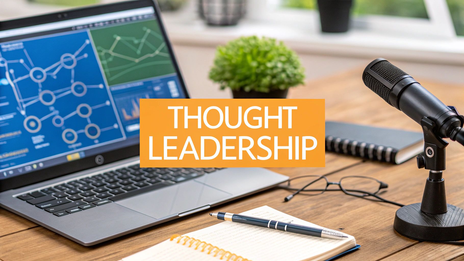
If you’re building thought leadership, let the banner support your niche without repeating your headline word for word. It should complement, not duplicate.
The cleanest banner often beats the cleverest one. People don’t reward effort here. They reward clarity.
Essential Tools and Templates for Easy Design
You don’t need Photoshop skills to create a professional linkedin cover photo. You need the right tool for your comfort level, a decent template, and enough taste to remove things instead of adding more.
It's generally advisable to avoid starting from a blank canvas. Templates save time, prevent spacing mistakes, and reduce the odds of uploading something that feels homemade in the wrong way.
Good, better, best tool choices
Here’s the quick version.
| Tool tier | Best for | What it does well | Watch out for |
|---|---|---|---|
| Good | Canva | Fast templates, easy drag-and-drop editing | Easy to overdecorate |
| Better | Adobe Express | Cleaner typography feel, strong layout control | Slightly more learning curve |
| Best | Figma or pro editor | Full control for custom branding | Overkill for most solo professionals |
Canva is the easiest starting point for many users.

Its LinkedIn banner templates are useful because they remove setup friction. You can test typography, swap backgrounds, and create a clean draft quickly. The danger is that Canva gives you too many decorative options. Most weak banners made in Canva weren’t ruined by Canva. They were ruined by enthusiasm.
Adobe Express tends to produce a slightly cleaner result in the hands of someone who cares about typography and alignment. It’s a good middle ground if you want more polish without going full designer.
If you already work in Figma, use it. It gives you precise control over spacing and layering. But if you don’t already use it, this is not the project to learn it from scratch.
Where to get visuals without making the banner cheesy
The asset choices matter almost as much as the tool.
Good sources include:
- Unsplash for simple, high-quality photography
- The Noun Project for restrained icons
- Your own product or work samples when relevant
- Brand assets if you already have a clear personal or company identity
Avoid:
- Random Google Images
- Glossy “business people smiling at laptop” photos
- Overused skyline shots
- Busy textures behind text
If you plan to fine-tune sharpness, remove distractions, or compare editing options before export, this roundup of photo editing software is useful for choosing a tool that fits your workflow.
A practical workflow that keeps this easy
Most professionals do best with this sequence:
- Pick one template
- Delete half the default elements
- Replace the headline with a role-specific message
- Swap the background for something simpler
- Check readability at small size
- Export and test on LinkedIn
A polished banner usually comes from subtraction. The amateur version keeps adding.
If you create your own content regularly, this list of tools for content creators can help you build a cleaner overall workflow around design, writing, and publishing.
The key is speed with judgment. Don’t spend three hours choosing between twenty background textures. Pick a direction that supports your positioning and get it live.
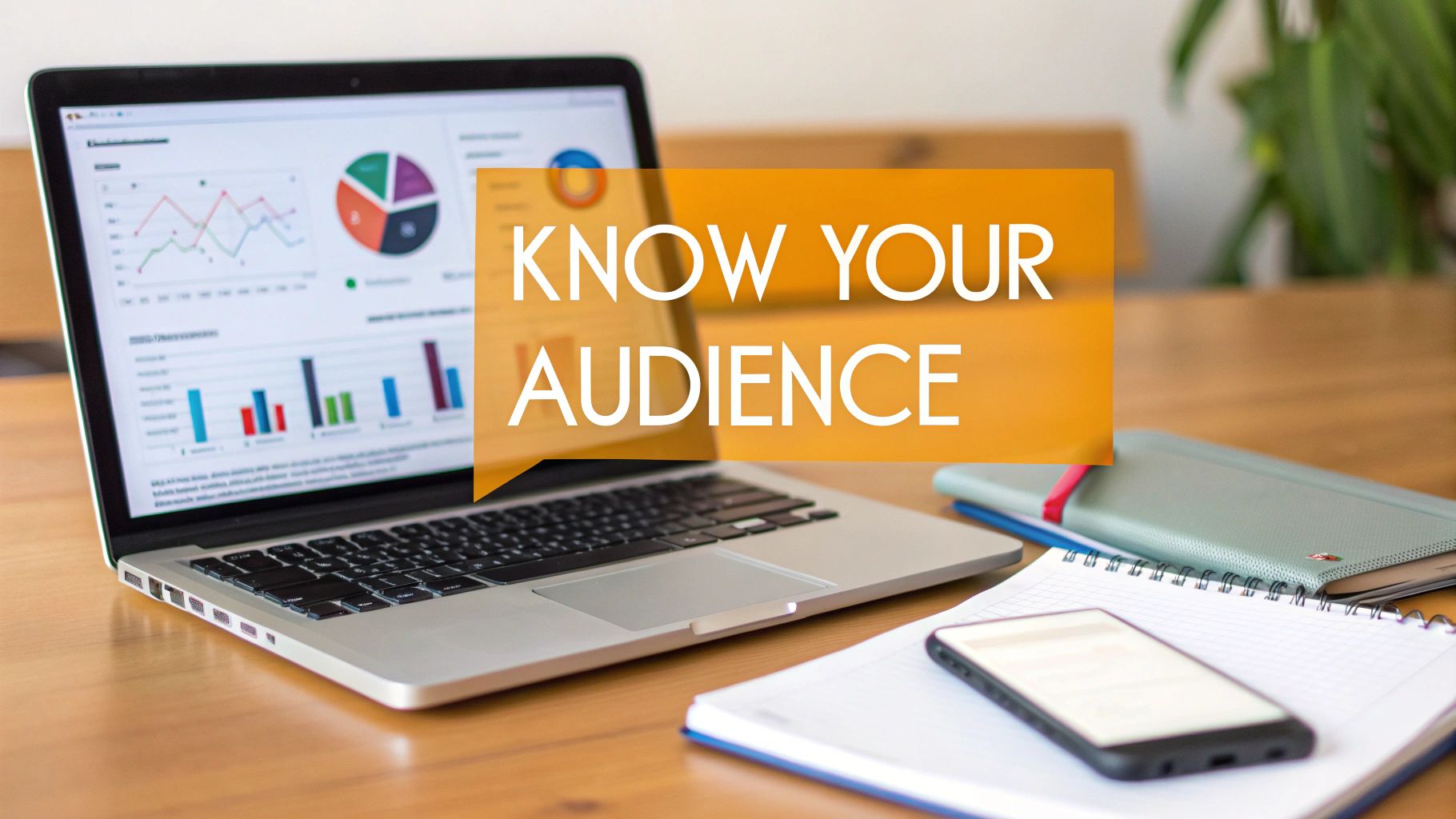
Testing and Optimizing Your Cover Photo
A profile gets a spike of attention after a job change, a post takes off, or a recruiter finally clicks through. Then the banner they see is the same generic header that has been sitting there for two years. I see this constantly, and it costs people more than they realize.
Your cover photo is one of the fastest parts of a LinkedIn profile to improve because you can change it in minutes and judge the result against real career signals. Watch for better profile-to-message conversion, more relevant connection requests, stronger recruiter outreach, or cleaner first-call conversations. Those are the outcomes that matter.
Why optimization matters
Banner testing works because the cover photo sets context before anyone reads the headline or About section. A sales leader with a sharp buyer-facing message gets read differently than a sales leader with a blue abstract shape. A developer who shows product focus and technical clarity gets different reactions than one using a random city skyline.
I have seen small banner changes improve the quality of inbound, even when profile views stay flat. That trade-off is fine. More traffic is not always the goal. Better-fit attention usually is.
The safest rule is simple. Specific beats generic.
What to check before you publish
Run a quick review before you leave any version live:
- Spelling and naming. One typo can make the whole profile feel rushed.
- Mobile readability. Check the banner on your phone, not just your desktop.
- Current relevance. Remove old titles, expired offers, and branding from a past role.
- Visual hierarchy. Make sure the eye lands on one thing first.
- Role fit. The banner should support the kind of work you want next, not just describe what you do now.
Smart A/B tests by professional goal
Good tests are tied to an outcome. Random design swaps waste time.
If you work in sales, test a banner built around buyer pain against one built around a clear result. Example: one version says who you help, the other says the revenue or efficiency outcome you help create. If recruiters are the target, test that against a version centered on team leadership or market scope.
If you are a developer, compare a banner that signals your specialty in plain language with one that uses a product screenshot or interface visual. I have seen engineers overuse abstract visuals because they want to look polished. Recruiters usually respond better to clarity than polish.
If you are a consultant or coach, test niche-first versus outcome-first. One version names the audience. The other names the transformation. Both can work, but one usually pulls stronger interest depending on whether you need recognition or conversion.
Keep the test clean. Change one variable at a time, then leave it live long enough to spot a pattern in profile views, inbound messages, and the quality of conversations that follow.
A strong cover photo is not a one-time design task. It is a positioning asset, and the best version changes as your goals change.
Your New Cover Photo Is Ready for Its Debut
A professional linkedin cover photo does more than fill empty space. It tells people how to read the rest of your profile.
That’s the ultimate payoff. Once your banner is aligned, your headline hits harder, your About section feels more credible, and your profile stops feeling like a collection of parts. It starts feeling like one clear professional brand.
The best banners usually share the same qualities:
- They’re technically clean
- They respect safe zones
- They communicate one focused message
- They fit the person’s actual role and goals
- They get updated when the professional story changes
You do not need a dramatic redesign. You need a banner that looks current, readable, and intentional.
If your current cover is default, outdated, or generic, fix that first. If it already looks decent, improve the message. If the message is strong, test a better version. Small upgrades at the top of the profile often improve the feel of everything below it.
Start with one decision today. Pick the message you want your profile to send in the first few seconds. Then build the banner around that. That single move is often enough to make your profile look sharper, more credible, and easier to remember.
Quick Answers to Common Cover Photo Questions
Should you use AI-generated imagery
You can, but be careful.
If the image looks obviously synthetic, over-smoothed, or visually strange, people notice. On LinkedIn, that usually hurts trust more than it helps creativity. AI can be useful for generating a clean concept background or helping you mock up directions, but the final result should still feel believable, readable, and professional.
Use AI as a design assistant, not as a shortcut to fake polish.
How often should you update your banner
Update it when your professional story changes.
Good triggers include:
- You started a job search
- You changed roles
- You launched a service
- You narrowed your niche
- You shipped a product or major project
- Your current banner no longer reflects your positioning
If nothing important has changed, you don’t need constant redesigns. A banner should evolve with your goals, not with your boredom.
What are the three most common mistakes
The big ones are predictable.
- Being too generic. If your banner could sit on ten other profiles, it won’t help yours stand out.
- Saying too much. Crowded text, multiple messages, and visual noise make the banner harder to process.
- Ignoring device overlap. Important text hidden behind the profile image is still one of the most common avoidable mistakes.
A simple final check helps. Ask: does this banner clearly support the role, audience, and opportunity I want next? If the answer is shaky, revise it before you move on.
If you want your LinkedIn profile to work harder after the banner is fixed, RedactAI helps you turn that clearer positioning into better posts, sharper content ideas, and a more consistent presence without sounding generic. It’s built for professionals who want their profile and publishing to reinforce each other.