Your website is your digital HQ. But a lot of personal branding sites still act like storage lockers. They hold a bio, a headshot, maybe a few links, then just sit there while LinkedIn does all the heavy lifting.
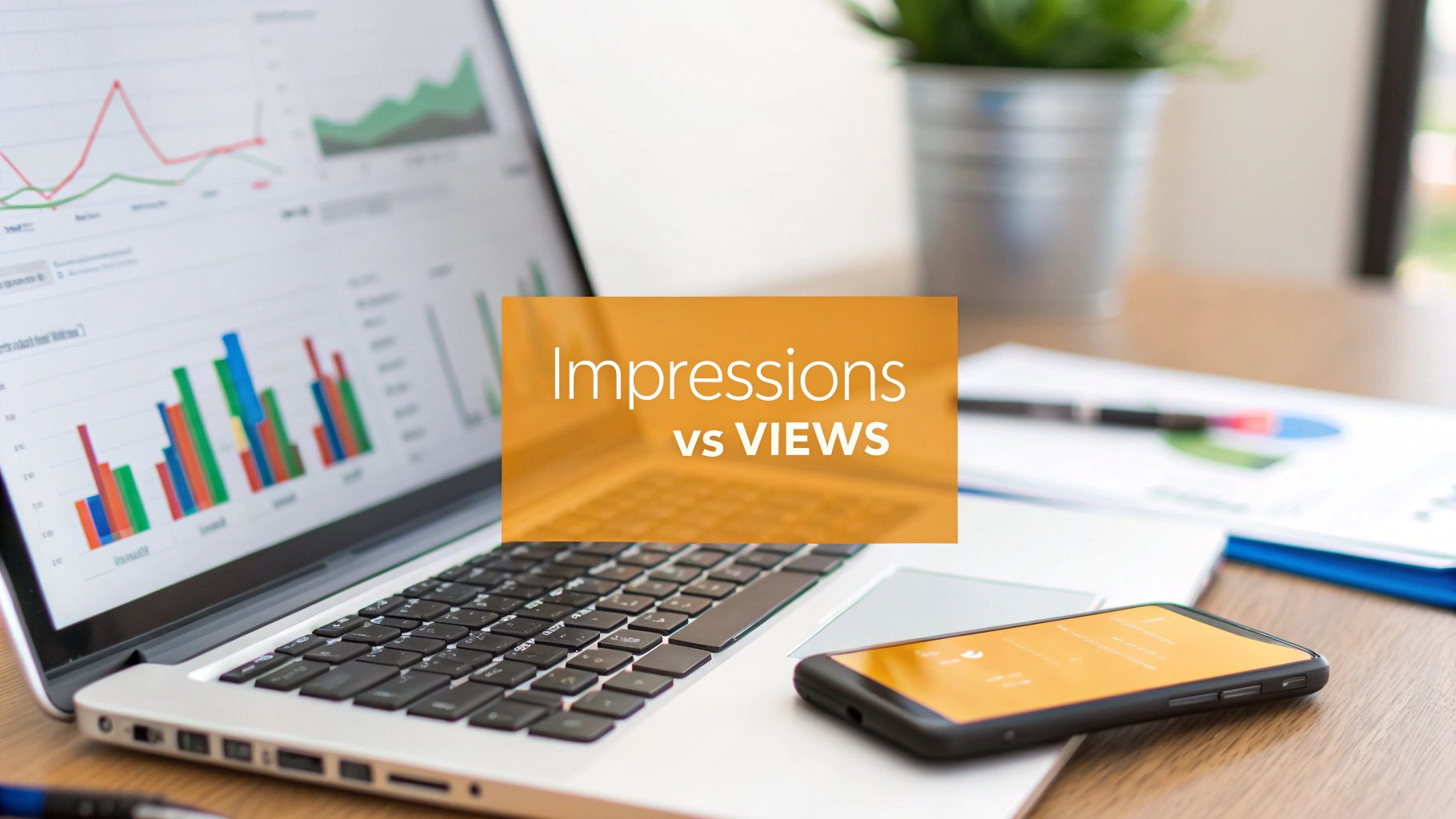
That’s the gap most professionals feel right now. You know you need a site, because employers and buyers search for you before they reply, book, or refer. Human to Brand reports that 44% of employers hire candidates directly based on personal branding content, while 54% reject applicants because of poor social media presence. Your site and your LinkedIn presence are part of the same trust system, whether you planned it that way or not.
The good news is you don’t need a huge content machine. You need a site that states who you help, what you’re known for, and what to do next. Then you need a way to turn that messaging into consistent LinkedIn posts without sounding like a template.
That’s where the stack matters. Some personal branding sites are better as a polished home base. Some are better if you publish often. Some are ideal if you hate social media and want a lightweight authority asset. And some are strongest when paired with LinkedIn content workflows.
If you're still deciding on the site platform itself, this broader guide to the best website builder for Scotland is a useful companion. For this piece, I’m staying focused on personal branding sites that work effectively, especially when you want your site messaging to feed your LinkedIn content instead of living in a silo.
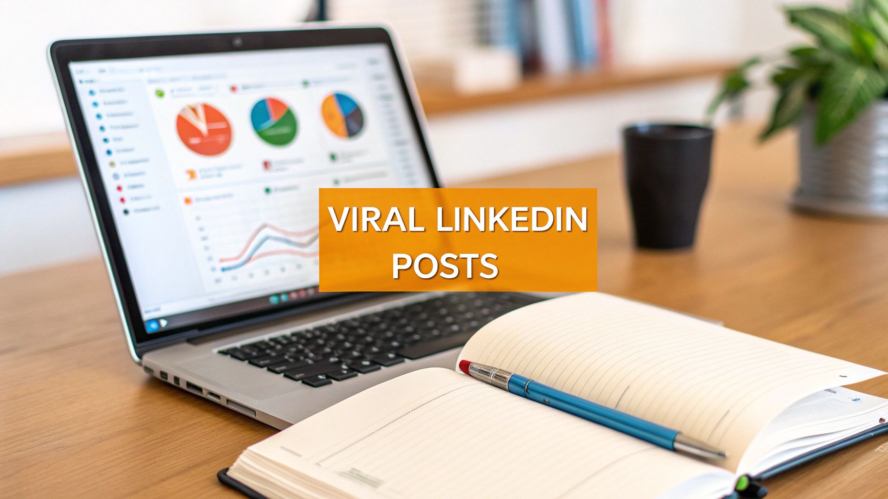
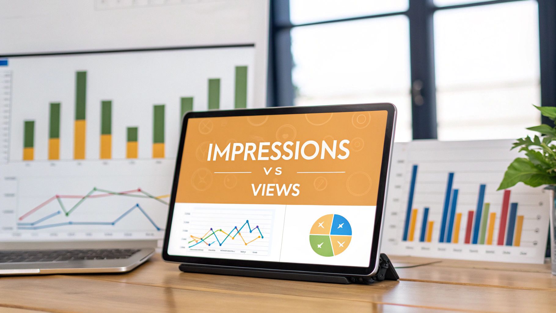
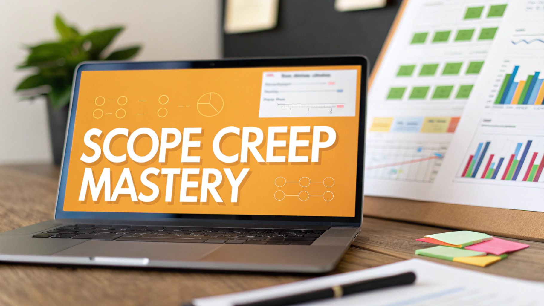
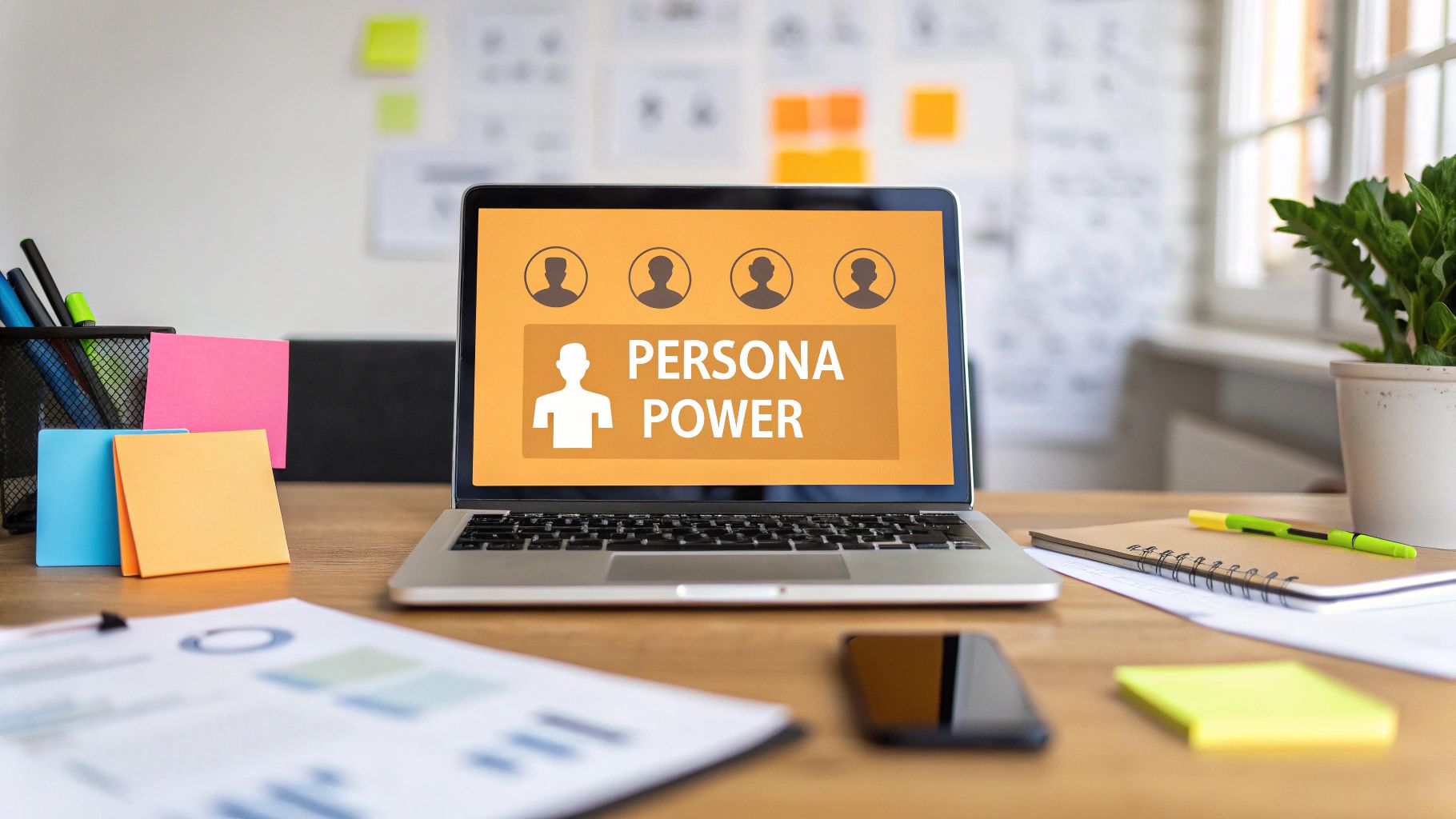
1. RedactAI

You publish a clean personal site. It says the right things. Then LinkedIn goes quiet for three weeks, and the message stops working for you.
That gap is why RedactAI belongs in this list. It sits beside your website, not in place of it, and helps turn static brand messaging into LinkedIn posts you can keep publishing. For a personal brand, that matters more than one more pretty page builder.
I use a simple rule here. Your website should hold your clearest positioning. Your LinkedIn should distribute it, test it, and keep it visible in the market. RedactAI helps connect those two jobs so your site copy does more than sit on a homepage.
Where it fits in your stack
RedactAI works best when your site already has solid raw material. That includes your headline, bio, offer framing, proof points, speaking topics, case studies, and strong opinion lines. Instead of rewriting from scratch every time you post, you use that material to build recurring LinkedIn themes.
The practical advantage is speed with consistency. LinkedIn content often falls apart because people improvise every post, drift away from their positioning, or start sounding like borrowed advice. RedactAI is useful because it is built for LinkedIn output and trained on your profile context, not just a blank prompt box.
That gives you a tighter workflow:
- Start with site messaging: Pull your homepage promise, About page positioning, and offer language first.
- Create 3 to 5 repeatable themes: For example, client patterns, contrarian takes, lessons from delivery, common mistakes, or decision criteria.
- Match the site voice: If your website is clear and restrained, your posts should not suddenly read like trend-chasing copy.
- Reuse strong ideas on purpose: One sharp line from your site can become several posts if you approach it from different angles.
A sentence strong enough for your homepage usually has enough tension to carry multiple LinkedIn posts.
Why it stands out
Generic AI tools can produce text. The trade-off is that they often flatten your point of view and wash out the parts that make a personal brand credible. RedactAI is more useful for this job because the product is centered on LinkedIn writing and voice alignment.
That distinction matters if your website is already doing strategic work. A good personal site clarifies who you help, what you believe, and why someone should trust you. LinkedIn should reinforce that message in public, over time, with examples and opinions that sound like they came from the same person.
For hiring and buying decisions, being easy to find still matters. CareerBuilder found that many employers screen candidates online before interviews, which is one reason a personal site and active LinkedIn presence work better together than either one alone. Your site confirms credibility. Your posts keep you top of mind.
If you want a stronger system for that connection, RedactAI’s guide to personal branding on LinkedIn is a useful companion to your website planning.
Trade-offs to know before you rely on it
RedactAI will not fix weak positioning. If your website says a little bit of everything, your LinkedIn content will inherit the same problem faster. The tool helps you express a sharp brand more consistently. It does not create one for you.
It also should not be treated like an autopilot growth machine. Strong results still depend on having something worth saying, a clear audience, and enough editorial judgment to reject bland drafts. I would rather see one founder publish two grounded posts a week than seven generic ones that sound technically polished and strategically empty.
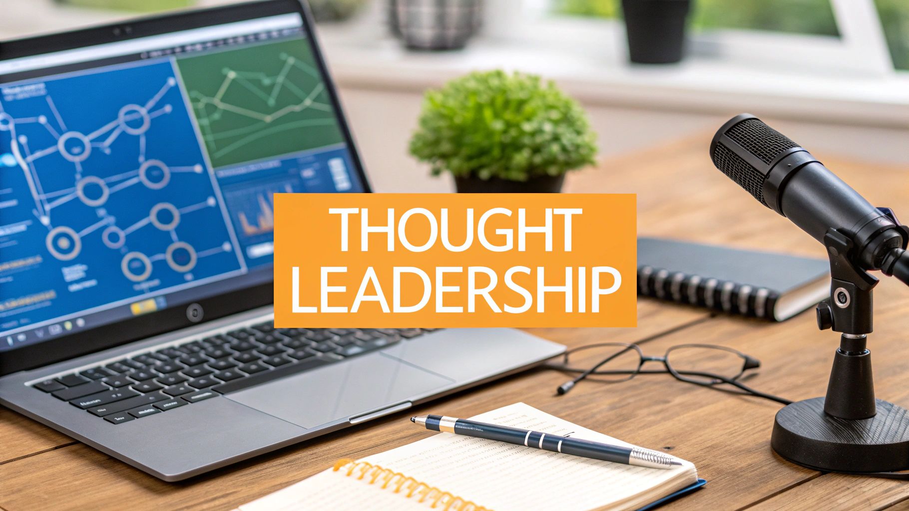
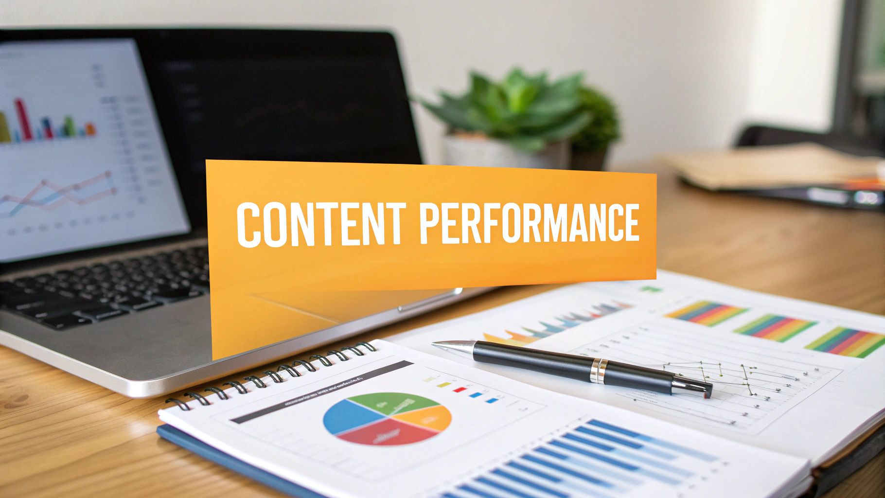
A key benefit is consistency without voice decay. Edelman and LinkedIn found that decision-makers spend time with thought leadership content when assessing companies and experts, but poor-quality content can reduce trust. That is the trade-off in plain terms. More output helps only if the message stays credible.
Best for
- Consultants and coaches: Turn service messaging and client patterns into authority posts.
- Founders and executives: Use your site narrative as the base for a steady thought leadership rhythm.
- Agencies and ghostwriters: Speed up production while staying closer to the client’s actual voice.
If your site already explains your value well, but your LinkedIn presence is inconsistent, RedactAI is one of the few tools in this lineup that solves the right problem. It helps your website behave less like a static brochure and more like the source material for an active personal brand.
2. Squarespace

Squarespace is the answer for people who want their personal branding site to look polished fast, without messing with plugins, hosting, or a developer backlog. It’s especially good when your brand needs to feel premium on day one.
That makes it a strong fit for consultants, speakers, designers, operators, and executives who want a site that looks intentional even if they never touch code. The templates usually do a lot of the visual heavy lifting for you.
What it gets right
Squarespace is strongest when your site needs a few core jobs done well. A homepage, About page, speaking page, blog, contact flow, and maybe a simple lead magnet or booking calendar. That’s enough for most professionals.
I also like it for people who overcomplicate their first build. You don’t need twelve pages. You need a sharp message, clean hierarchy, and a clear next action.
A typical winning setup on Squarespace looks like this:
- Homepage with one promise: Say who you help and why you’re credible.
- About page with point of view: Don’t paste a resume. Explain how you work and what you believe.
- Proof section: Media mentions, client logos, selected work, or testimonials.
- Simple CTA: Book, inquire, subscribe, or connect.
Simpler, identity-led personal branding sites often do the job better than complicated builds loaded with features people never use.
That point matters more than people think. Searchbloom’s review of personal branding website strategy highlights a gap in the market for professionals who don’t want to live on social media. It also points to a practical truth: simpler, identity-focused sites can raise credibility quickly, especially for offline-first professionals using networking, panels, events, and partnerships rather than daily posting.
Where Squarespace can frustrate you
The trade-off is control. Squarespace gives you structure and speed, but not endless flexibility. If you want highly custom interactions, deep CMS logic, or unusual layout behavior, you may hit the edges sooner than you’d like.
That’s not always a bad thing. For many personal branding sites, constraints are useful. They stop you from building an elaborate machine when a strong message and a clean path to contact would do more for your brand.
A second watchout is migration. If your brand evolves fast, or if you expect to build a dense content library over time, you should think ahead. Squarespace can support a blog well enough, but content-heavy operators sometimes outgrow its editing model.
Best for
Squarespace is ideal when you want your personal brand to feel calm, professional, and established.
It’s not the best choice for the person who treats their site like a product with constant design experimentation. It is one of the best choices for the person who wants to launch a credible digital HQ, then spend their real energy on messaging and distribution.
3. Webflow

Webflow is for people who care about precision. Not “I want a nice template” precision. I mean layout, motion, spacing, content structure, and visual differentiation at a level that feels much closer to front-end design.
If your personal branding site needs to feel distinct, Webflow is usually the strongest builder in this list. Designers, creative directors, startup founders with a strong visual taste, and premium consultants tend to love it for that reason.
Why serious personal brands pick it
The biggest advantage is creative control without going fully custom. You can shape the site much more intentionally than you can in a typical drag-and-drop builder. That matters if your brand depends on how the message is presented, not just the words themselves.
Webflow also handles dynamic content well through CMS collections. That’s useful when your site includes repeatable assets like articles, case studies, speaking appearances, media mentions, or project summaries.
A few things Webflow does especially well:
- Custom brand presentation: Better for unique layouts and visual systems.
- Scalable content structure: Useful when you publish often or maintain archives.
- Portfolio storytelling: Great for consultants and creatives who need case-study depth.
Where people get stuck
Webflow has a steeper learning curve than Squarespace or Carrd. That doesn’t mean it’s inaccessible. It means you’ll feel the platform if you try to rush.
The pricing and seat setup can also confuse solo users, especially if you’re mixing design work with hosting decisions. And if you’re inheriting an older workflow, you need to pay attention to product changes like the legacy Editor transition.
A polished Webflow build can elevate your brand. A half-finished one can make you look more unfinished than a simpler site would have.
That’s the trade-off in plain English. Webflow rewards craft. It doesn’t reward indecision.
Best use case for LinkedIn synergy
Webflow becomes powerful when you pair a strong CMS with a disciplined content repurposing routine. Write one well-framed article on your site. Pull out a sharp opinion, a client lesson, a framework, and a contrarian take. Those become LinkedIn posts. The post builds interest. The site holds the deeper version.
This builder is also a good fit for the growing question around AI-era site strategy. Unicorn Platform’s 2026 strategy discussion points out a real gap in current guidance: many personal branding resources still don’t show how sites should adapt to AI proliferation, profession-specific needs, or the demand for clearer human authenticity. Webflow gives you room to solve that with design and content choices, but you need the strategy first.
Best for
Choose Webflow if your personal branding site is part brand asset, part experience. Don’t choose it just because it looks impressive on Twitter.
If your real need is to publish a clear message and get inquiries, a simpler platform may get you there faster.
4. Wix

Wix wins on speed. If you need a personal branding site live quickly, with enough built-in features to handle service pages, contact forms, bookings, and light content, it’s a practical option.
That speed matters for solo operators. A lot of people delay launching because they treat the website like a six-month design project. Wix lowers that barrier.
Where Wix shines
The combination of AI-assisted setup, a huge template library, and built-in business features makes Wix useful for coaches, freelancers, creators, recruiters, and local service professionals. You can get from blank page to “good enough to publish” fast.
That’s often the right move. A published site with clear messaging beats an endlessly revised Notion doc pretending to be your brand strategy.
For personal branding sites, Wix tends to work best when you need:
- A service-led homepage: Clear offer, proof, and CTA.
- Booking or inquiry flows: Useful for consultants and freelancers.
- Simple content publishing: Enough for occasional articles or updates.
- Quick reactivity: You can edit and launch without much technical friction.
If you're refining the messaging behind the site itself, RedactAI’s piece on how to develop a personal brand is a solid companion before you start tweaking templates.
The real trade-offs
Wix is flexible early, but that flexibility can become messy later. If you rebrand extensively, template switching isn’t always painless. That matters more than people expect, because personal branding sites tend to evolve as your positioning sharpens.
I also wouldn’t pick Wix if your long-term plan is a highly structured content engine with a lot of custom relationships between pages. It can do a lot, but it’s not where I’d build a serious content architecture if publishing is central to your strategy.
For a broader builder comparison that includes Wix in context, UpTime Web Hosting’s piece on website builders and platform trade-offs is useful.
What works in practice
The best Wix sites keep the structure tight. Hero section. Credibility. Offer. Select proof. CTA. They don’t try to use every available widget.
That discipline matters because your site isn’t there to show that the builder has features. It’s there to help a visitor answer three questions quickly: who are you, why should I trust you, and what do I do next?
If Wix gives you twenty ways to decorate a page, use five. The cleanest version usually converts better for personal brands.
Best for
Wix is a good fit when you want a fast, capable site and don’t want to manage technical complexity. It’s not the cleanest option for long-term structural elegance, but it’s one of the easiest ways to stop overthinking and get your personal brand online.
5. WordPress.com

WordPress.com sits in an interesting middle ground. It gives you more growth room than the most locked-down builders, while still removing a lot of the maintenance headaches that come with self-hosted WordPress.
That makes it appealing for people who know their site may expand. Maybe today you need a personal bio site and a blog. Later you may want resources, newsletter capture, gated content, or a more developed service funnel.
Why it works for content-led brands
If your brand strategy depends on publishing, WordPress is still hard to ignore. The ecosystem is massive, the content model is mature, and the path from simple website to full content hub is well established.
I tend to recommend WordPress.com over flashier builders. Not because it’s prettier out of the box, but because it can support a serious content operation without forcing a migration too early.
For personal branding sites, that helps when your authority comes from ideas rather than visuals alone.
A strong WordPress.com setup usually includes:
- A homepage that frames your niche clearly
- A clean archive for insights or articles
- Topic pages if your expertise spans a few distinct themes
- Lead capture tied to your strongest idea, not a generic newsletter ask
The cost of flexibility
The downside is complexity. Not developer-level complexity, necessarily, but decision complexity. Themes, plugins, settings, blocks, layout choices. If you like systems, that’s manageable. If you hate making platform decisions, it can feel heavier than it should.
That’s the trade-off with WordPress.com. You’re buying room to grow. In exchange, you accept a bit more setup logic and a few more moving parts than you’d have on Carrd or Squarespace.
When I’d choose it over the others
I’d choose WordPress.com if your site is going to become your actual media base. Not just a digital business card, but a place where your articles, frameworks, resources, and search traffic compound over time.
That approach aligns with what we’ve seen in stronger personal brand examples. One cited case study from NNC Services describes a cloud computing expert who built visibility through a professional blog and targeted strategy, reaching a Google page rank of 4, more than 1,000 new LinkedIn connections, and key collaboration opportunities within a few months. The lesson isn’t “copy the exact format.” It’s that a real content base on your own domain can create momentum that social profiles alone rarely sustain.
Best for
Pick WordPress.com if you think in terms of publishing assets, not just pages.
If you only need a sleek front door and a contact button, it may be more platform than you need. If you want your personal branding site to grow into a durable authority hub, it’s one of the safest bets.
6. about.me

about.me is for professionals who need a credible presence fast and don’t need a full website yet. It’s closer to a polished professional calling card than a traditional site builder.
That sounds limiting until you remember how many personal branding sites fail by trying to be everything. Sometimes one clean page with a sharp bio, one good photo, a few proof points, and a direct CTA is enough.
Why this format still works
For recruiters, freelancers, speakers, advisors, and executives who get most opportunities through referrals or networking, about.me can be the right level of effort. It gives people somewhere to verify who you are and where to go next.
This is especially useful if you dislike heavy social media but still want a stable public presence. You can use LinkedIn for visibility, then send people to a single-page destination that feels more intentional than a profile link stack.
A simple one-page personal branding setup works best when it includes:
- A focused headline: Not your job title, your value.
- A short narrative: Why your work matters and what you’re known for.
- Selected proof: A few highlights, not your entire career history.
- One next step: Book, contact, or view work.
If you need help tightening the message itself, RedactAI’s article on what is a personal brand statement is useful before you start filling in the page.
One-page personal branding sites work when they make a strong promise quickly and remove every extra click.
What you give up
You give up depth. That’s the obvious limitation. about.me is not where you build a detailed blog, layered SEO architecture, or a rich portfolio with multiple content types.
You also won’t get the same design freedom you’d have in Webflow or even Wix. So if your visual identity is a major part of your professional edge, this may feel too constrained.
Still, constraints can help. If your current alternative is no website at all, about.me is a much better move than waiting until you have the “perfect” build.
Best for
Choose about.me if your main problem is absence, not sophistication. You need to be findable, clear, and professional. You don’t need a mini media company on your domain.
For many professionals, that’s enough to support a stronger LinkedIn presence and a cleaner handoff from profile view to real-world conversation.
7. Carrd

Carrd is the most stripped-down option on this list, and that’s its strength. It’s fast, lightweight, cheap to maintain, and surprisingly effective when your personal branding site only needs to do one job well.
I recommend Carrd to people who need a high-clarity landing page, not a sprawling website. Think consultants testing a niche, founders building a personal profile around speaking, or creators who want a clean page for bio, offer, and email capture.
Why Carrd punches above its weight
Most personal branding sites don’t fail because they’re too small. They fail because they’re unfocused. Carrd forces focus.
The one-page format pushes you to decide what matters. That’s useful. It makes you clarify your positioning, simplify your story, and reduce friction.
A strong Carrd page usually includes:
- A sharp opening line
- One paragraph on who you help
- A small proof block
- A single offer or CTA
- Links to LinkedIn and one core contact method
That structure is enough for a lot of people, especially if LinkedIn is doing the top-of-funnel work already.
Where it breaks down
Carrd isn’t a full CMS, and you feel that quickly if you want deeper content. If your strategy depends on article archives, topic clusters, detailed case studies, or richer SEO targeting, you’ll outgrow it.
That doesn’t make it a bad choice. It just means you should use it on purpose. Carrd is excellent for a focused front door. It’s weak as a long-term publishing engine.
Best use case
Carrd works best when you treat your site like a conversion layer attached to your LinkedIn activity. Your post creates interest. Your Carrd page captures that interest cleanly.
This can be especially effective for people still refining their positioning. You don’t need to overbuild while testing your message. Put your strongest promise on the page, point LinkedIn traffic toward it, and adjust as you learn what people respond to.
The fastest site to launch is often the best site to launch, especially when your real bottleneck is message clarity, not design capacity.
Best for
Carrd is ideal for minimalists, solo operators, and anyone who wants a clean personal branding site without maintenance drama.
If your brand needs depth, choose WordPress.com or Webflow. If your brand needs a simple, credible place to land this week, Carrd is hard to beat.
7 Personal Branding Sites: Feature Comparison
| Product | Implementation Complexity 🔄 | Resource Requirements | Speed/Efficiency ⚡ | Expected Outcomes ⭐📊 | Ideal Use Cases 💡 |
|---|---|---|---|---|---|
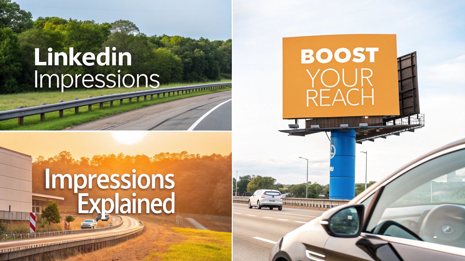
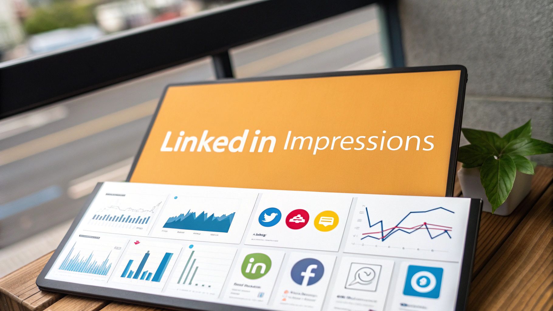
| RedactAI | Low–Moderate (profile ingestion, model tuning) | Minimal: LinkedIn data + optional paid plan | ⚡ High, draft posts in minutes | Personalized LinkedIn content; reported boosts (e.g., up to 2.3× impressions) | LinkedIn creators, founders, agencies, ghostwriters |
| Squarespace | Low (template-driven builder) | Moderate: subscription, template/design time | ⚡ Fast to launch | Polished on-brand site with built-in analytics & campaigns | Portfolios, CVs, speaker pages, small businesses |
| Webflow | High (CSS-level visual design, learning curve) | Higher: design time, plan/seat decisions | Moderate, design-focused workflow | High-fidelity bespoke sites with CMS scaling | Designers, marketers, creative portfolios needing micro-interactions |
| Wix | Low (AI scaffolding + editor) | Low–Moderate: templates, subscription, apps | ⚡ Very fast, AI scaffolds pages | Rapid professional sites with bookings/monetization | Creators, service pages, quick personal sites |
| WordPress.com | Moderate (more moving parts than drag/drop) | Moderate–High: paid plans for plugins/features | Moderate, setup depends on plugins/customization | Highly extensible sites that scale into commerce/content hubs | Bloggers, businesses needing plugin ecosystem and growth path |
| about.me | Very Low (single-page setup) | Minimal: free or Pro for custom domain/features | ⚡ Very fast, minutes to publish | Clean professional profile and lead capture | Simple personal profiles, link hubs, top-of-funnel presence |
| Carrd | Very Low (single-page builder) | Minimal: low-cost Pro for domains/forms/embeds | ⚡ Very fast, lightweight launch | Compact landing pages, newsletter capture, simple payments | Solo creators, consultants, microsites and link pages |
From Static Site to Dynamic Brand
A personal branding site gives you control. That’s the big advantage. Social platforms change formats, feeds get crowded, and audience attention moves around. Your site stays yours.
But control alone doesn’t create momentum. A lot of good sites go stale because the owner treats them like a one-time asset instead of a working message library. The homepage gets written once, the About page gathers dust, and the strongest ideas never leave the site.
That’s the missed opportunity.
Your site already contains the raw ingredients for LinkedIn content. Your headline holds your positioning. Your bio holds your story. Your case studies hold lessons. Your services page holds objections, differentiators, and proof. If you pull those pieces apart carefully, you can build a steady stream of posts that sound aligned because they all come from the same core message.
At this point, the best personal branding sites become more than online brochures. They become source material.
One approach works especially well. Start with your homepage promise and turn it into a short opinion post. Then take the same promise and explain the mistake people make before they understand it. Next, pull a real example from client work or your own career. Then write the “behind the scenes” version about how your thinking changed. That’s already a useful mini content series, and it came from one section of your website.
Neil Patel’s brand story is a useful example of what happens when a personal site becomes a true authority asset. A case study summary notes that his site evolved into a major engine for reach, lead generation, and reputation, including historical peaks of over 2 million monthly visitors and more than 100,000 email subscribers. You don’t need that scale to apply the lesson. The takeaway is that your site works best when it holds value-rich content and your distribution channels keep pointing back to it.
That’s also why I don’t treat website choice and LinkedIn strategy as separate decisions. They’re connected.
If your site is on Squarespace, Wix, Webflow, WordPress.com, about.me, or Carrd, the actual platform is only part of the equation. The sharper question is this: can your site express your positioning clearly enough that you can spin it into posts, comments, lead magnets, outreach, and conversations without reinventing yourself each week?
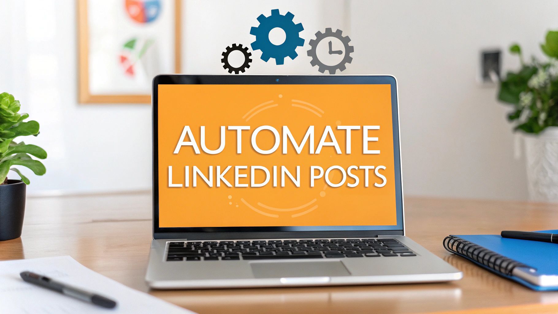
That’s where a tool like RedactAI becomes useful. Not because AI should replace your thinking. It shouldn’t. It should help you operationalize what you already know.
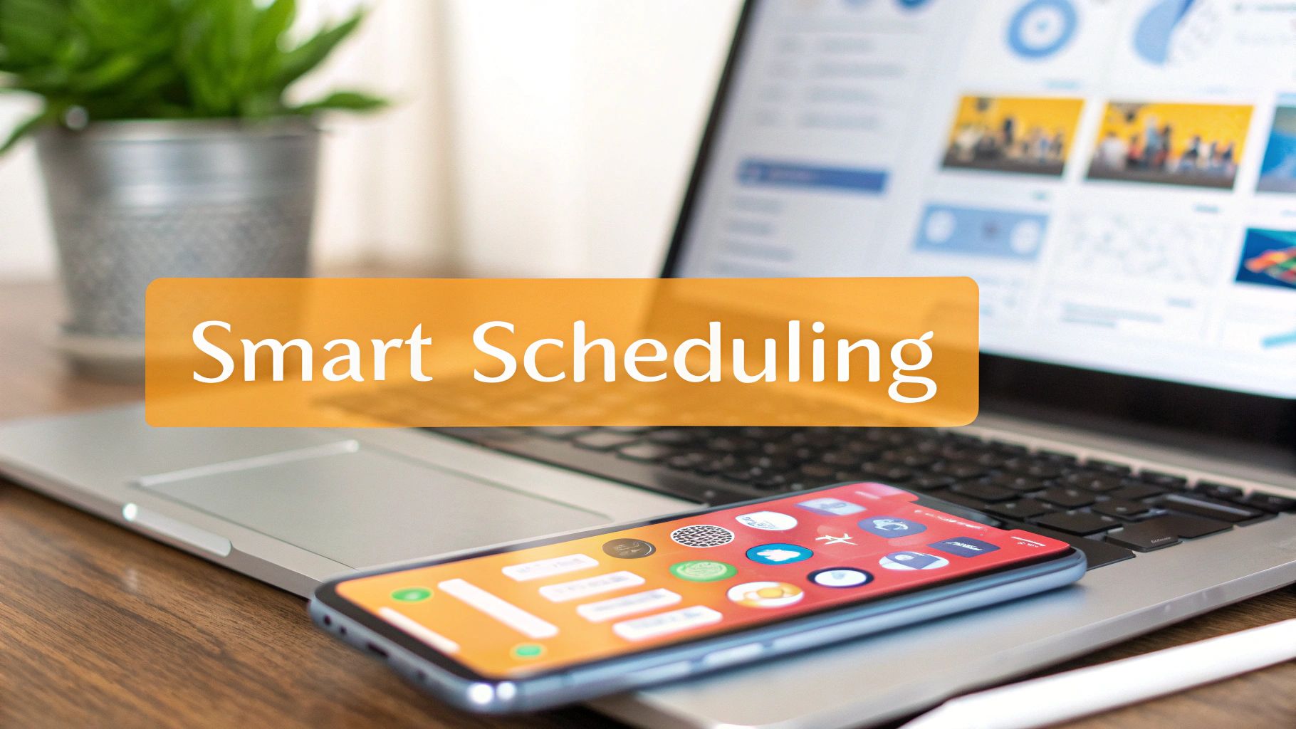
Use your site copy as input. Feed in your angle, your experience, your past post style, and your strongest proof. Then let the tool help you draft, reshape, test, and schedule LinkedIn content that sounds like the same person visitors meet on your website. That consistency is what makes a personal brand feel real instead of patched together.
Own your home base. Then amplify it.
And while you're tightening the fundamentals, don't overlook basics like securing your brandable domain. A strong name, a clear site, and a consistent LinkedIn presence work better together than any one piece does alone.
If your website already says the right things but your LinkedIn presence is inconsistent, RedactAI is the missing layer. Use it to turn your site messaging, expertise, and past posts into LinkedIn content that sounds like you, stays on-brand, and keeps your personal branding site connected to real daily visibility.