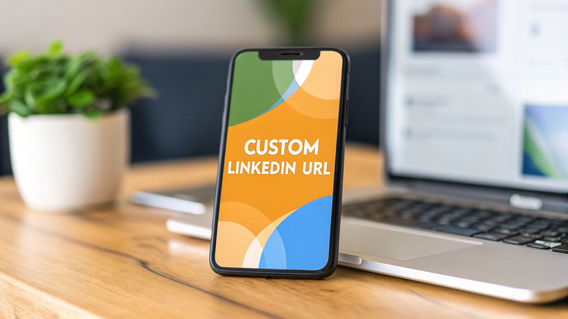
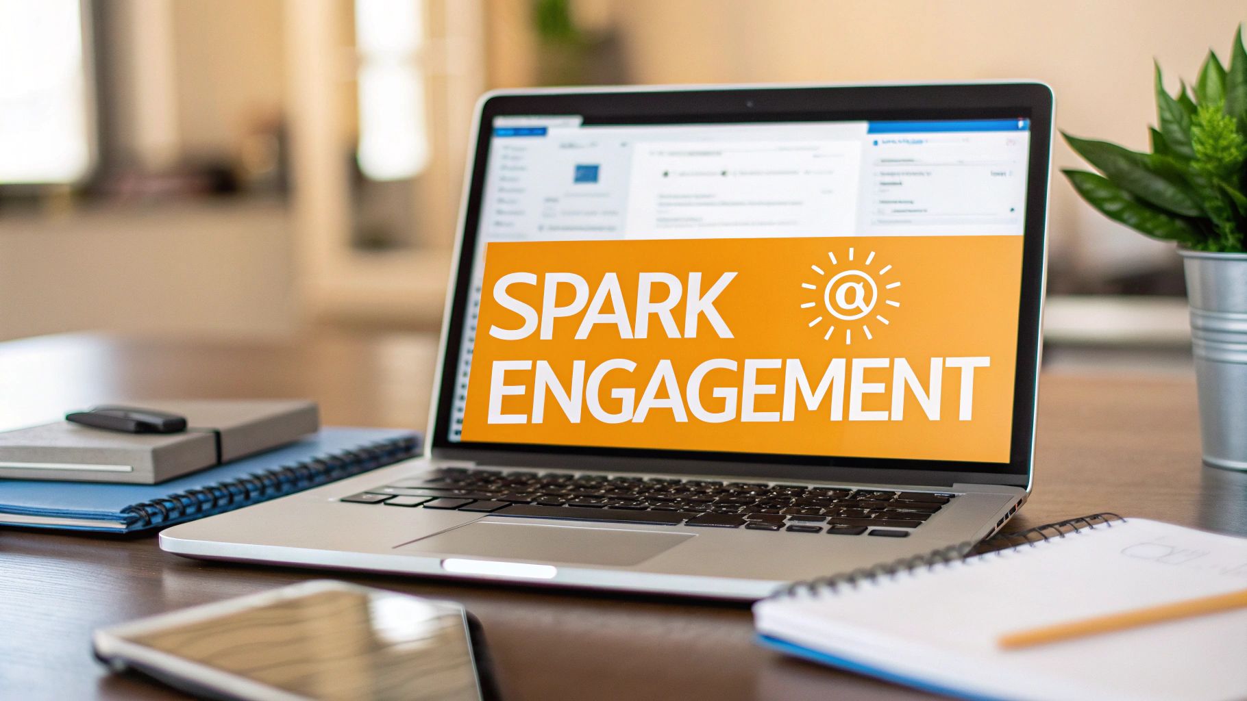
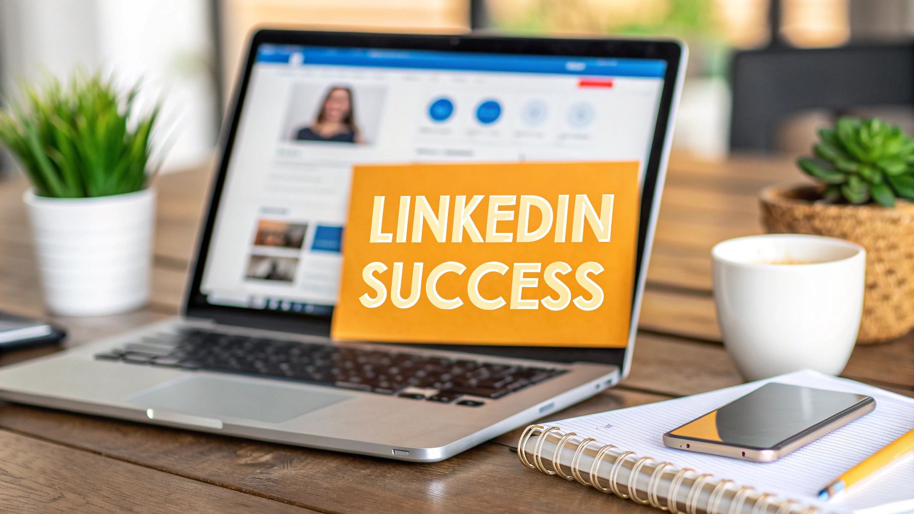
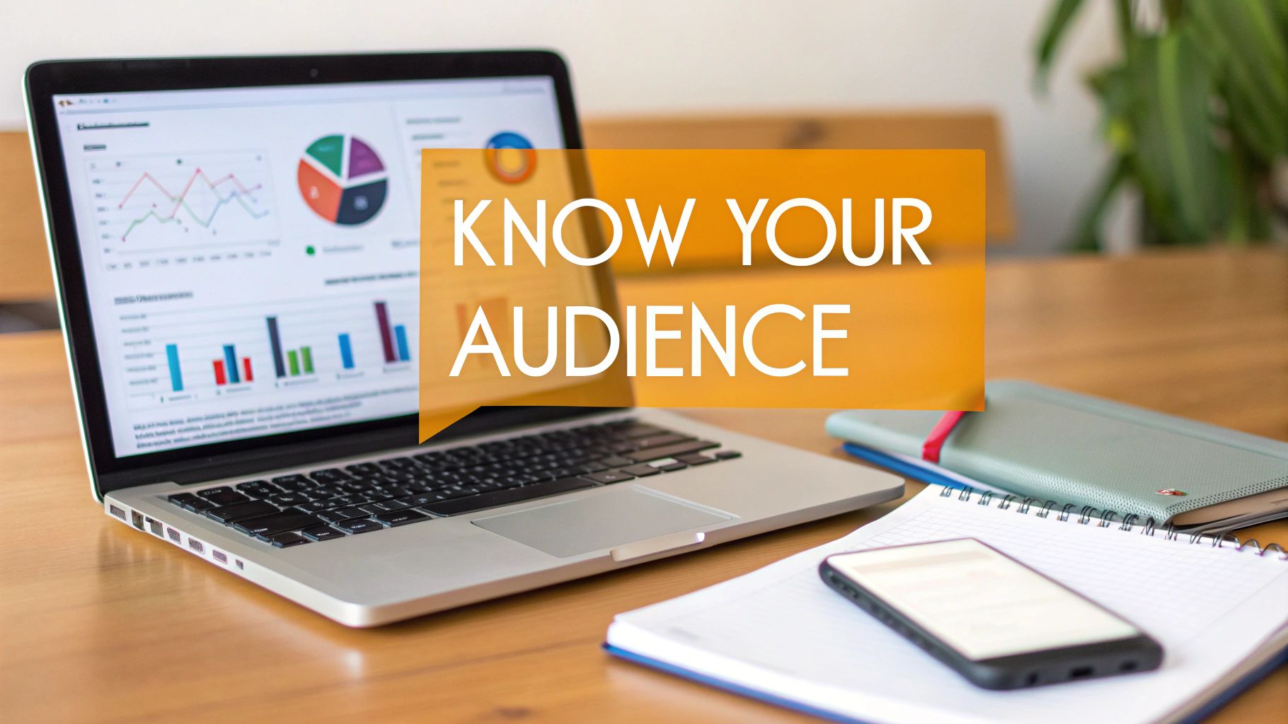
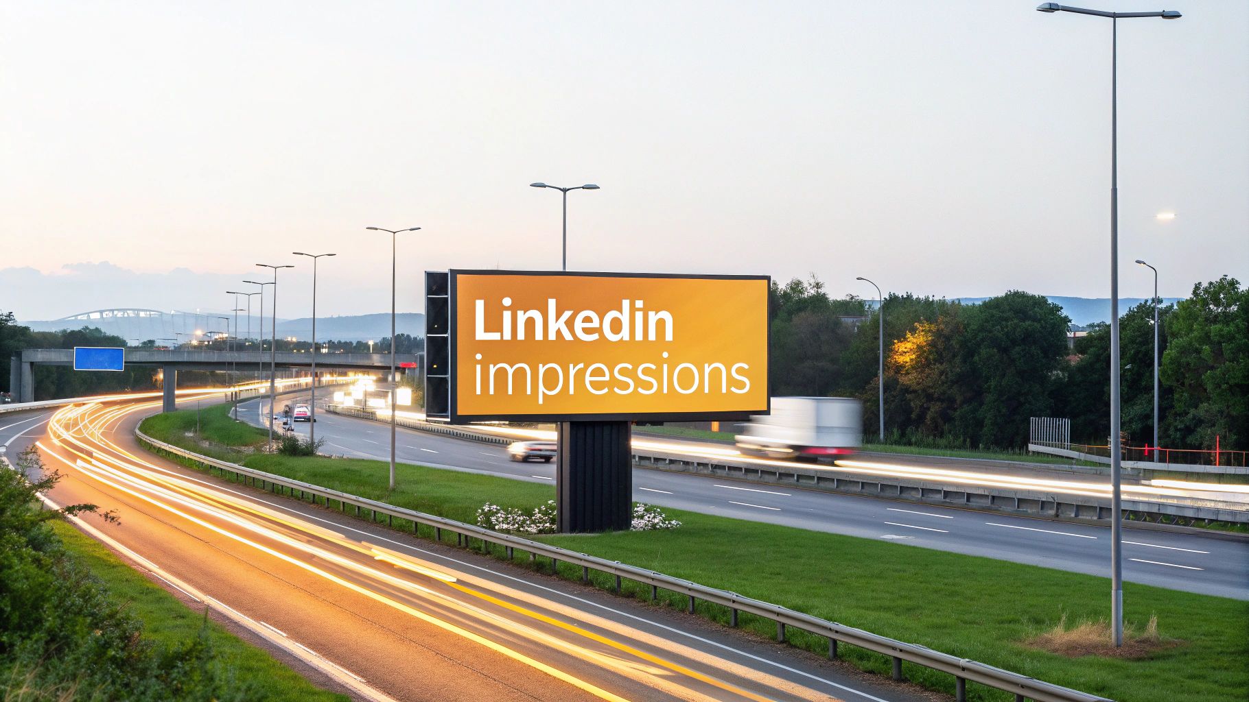
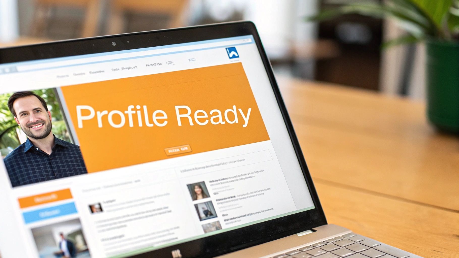
Let's get this right from the start: the best image size for a LinkedIn post is 1200 x 627 pixels. This simple landscape dimension is your ticket to a crisp, professional-looking visual that won't get awkwardly cropped in the feed.
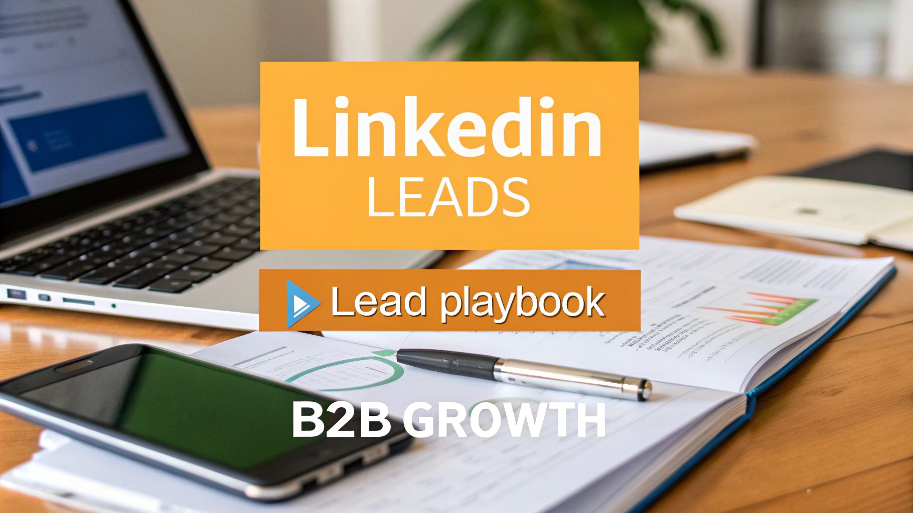
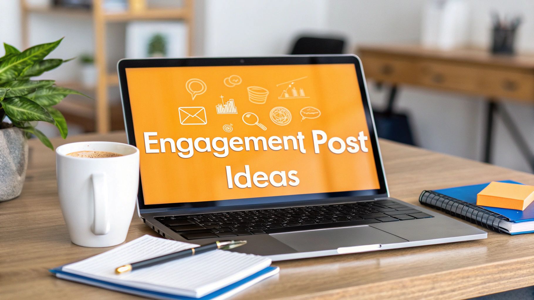
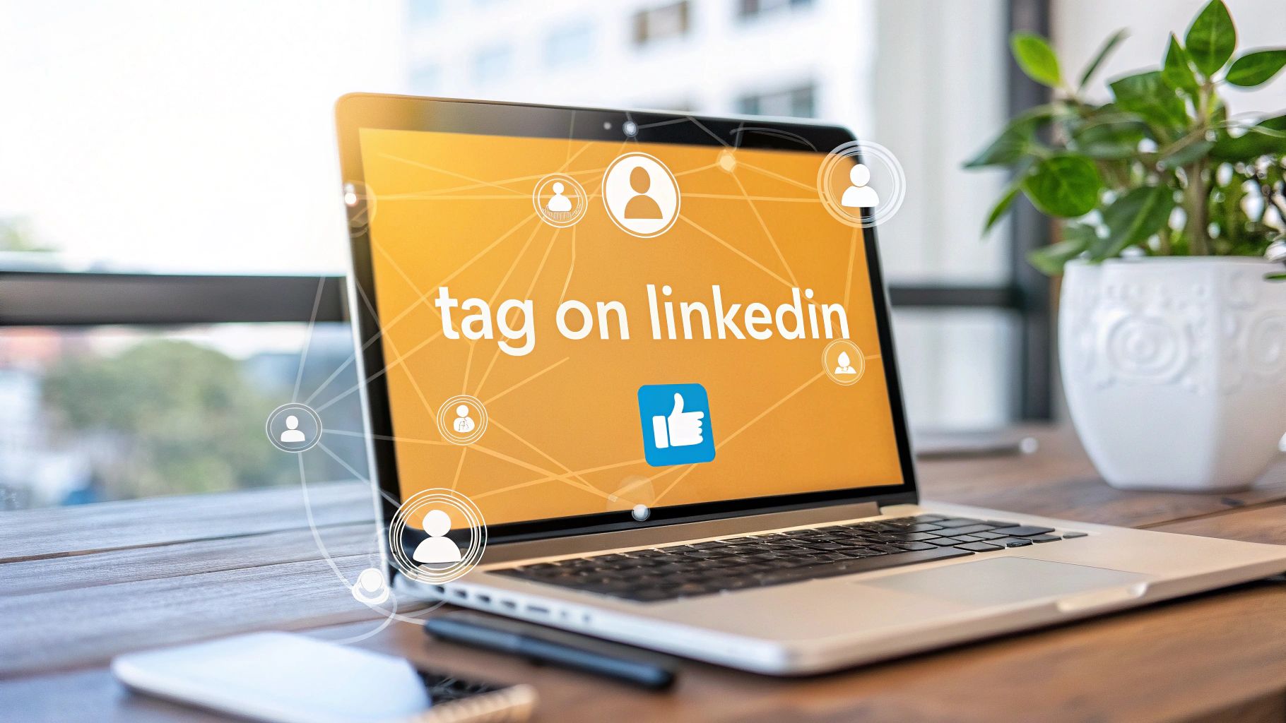
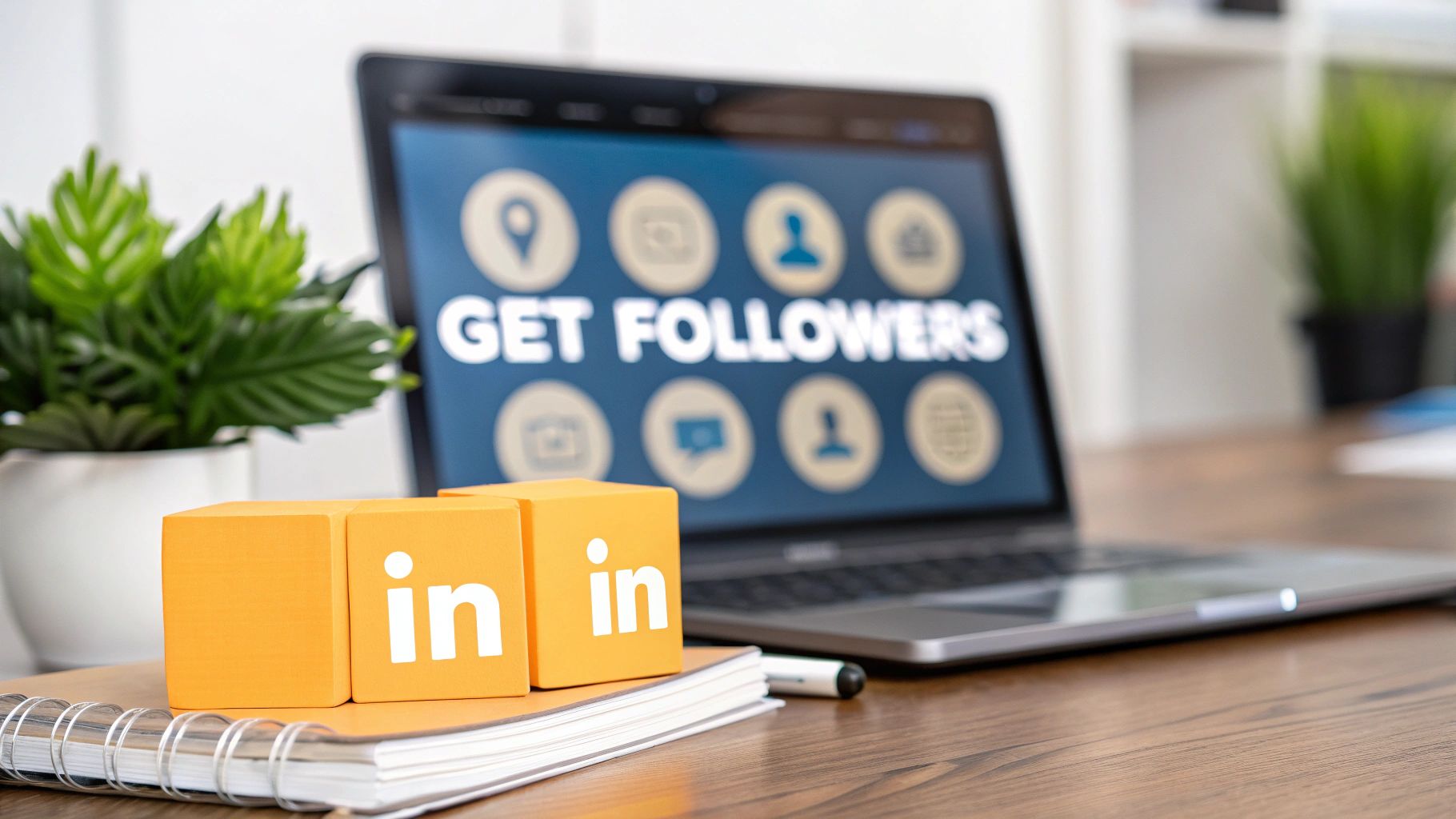
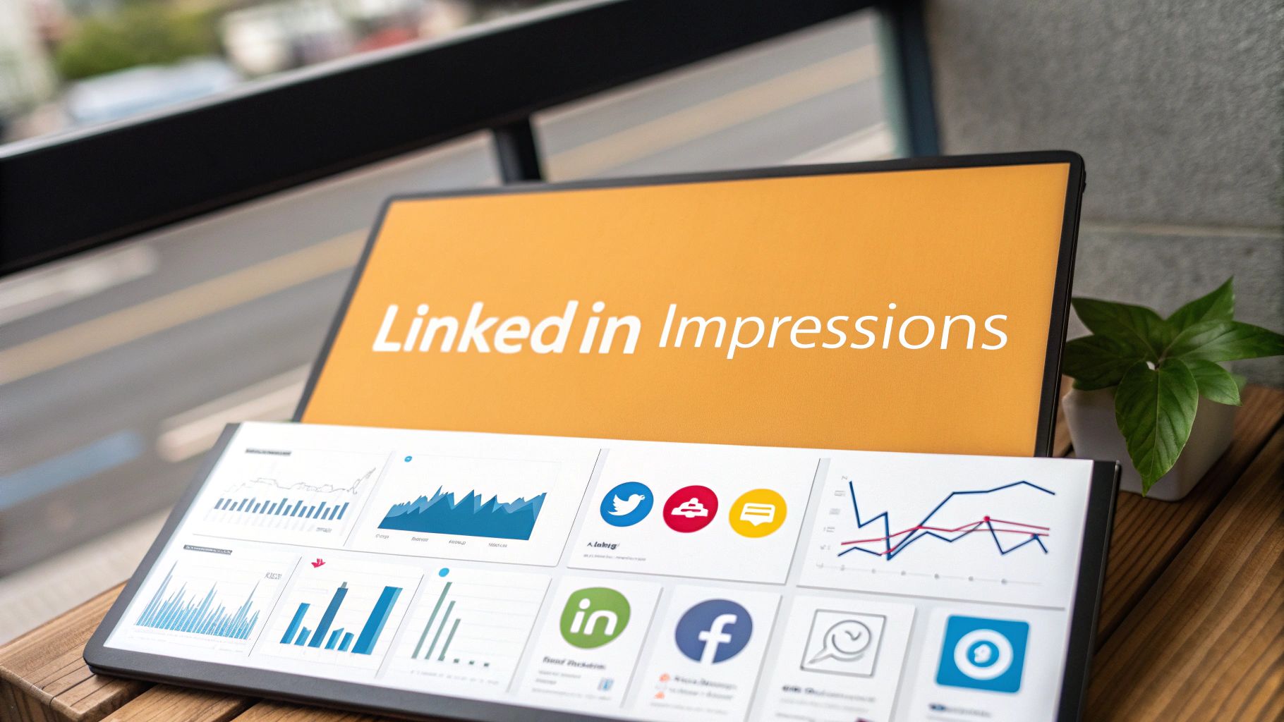
Your Quick Guide to LinkedIn Image Sizes
Stop the guesswork. Nailing your image dimensions isn't just about looking good—it's about making sure your message actually lands. The right size prevents bizarre cropping that can ruin a great post, ensuring your content is clear and professional every single time.
Think of this guide as your go-to reference. I've pulled together all the current, official recommendations for pixel sizes, aspect ratios, and file specs for everything you'll ever need on LinkedIn. From your profile picture to company page banners and even those tricky carousel ads, these numbers will save you time and make your content perform better.
The Most Common LinkedIn Dimensions
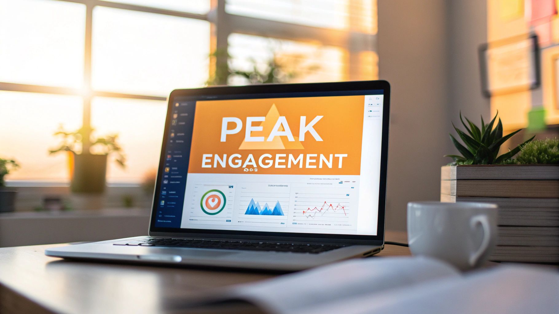
To keep things simple, let's start with the big three you'll deal with most often: your profile photo, your banner, and your posts. Each one has a specific job to do and a unique size to match.
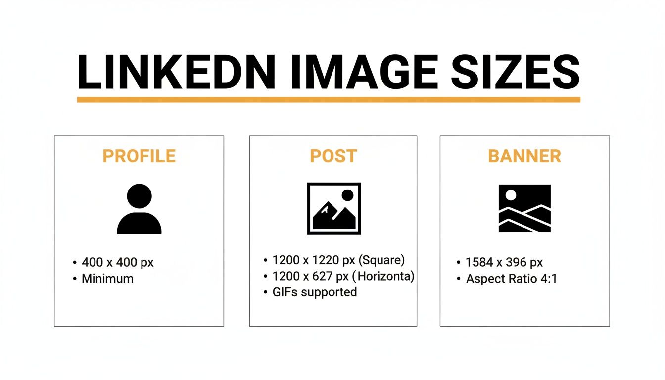
As you can see, a one-size-fits-all approach just doesn't work here. Each image is designed for a specific spot on the platform, which is why having a cheat sheet is so handy.
LinkedIn Image Dimensions Quick Reference
Here’s a table with all the key specs in one place. Bookmark this page, save it, or print it out—just keep it close so you can quickly double-check that every visual you upload is perfectly optimized.
| Image Type | Recommended Dimensions (Pixels) | Aspect Ratio | Supported Formats | Max File Size |
|---|---|---|---|---|
| Personal Profile Photo | 400 x 400 | 1:1 | JPG, PNG, GIF | 8 MB |
| Personal Banner Photo | 1584 x 396 | 4:1 | JPG, PNG, GIF | 8 MB |
| Company Logo | 400 x 400 | 1:1 | JPG, PNG | 3 MB |
| Company Cover Photo | 1128 x 191 | 5.9:1 | JPG, PNG | 3 MB |
| Single Image Post | 1200 x 627 (Landscape) or 1080 x 1080 (Square) | 1.91:1 or 1:1 | JPG, PNG | 5 MB |
| Carousel Post Card | 1080 x 1080 | 1:1 | JPG, PNG | 10 MB |
| Link Preview Image | 1200 x 627 | 1.91:1 | JPG, PNG | 5 MB |
Think of this table as your ultimate shortcut. A quick look here before you upload can save you the headache of re-editing and re-uploading later.
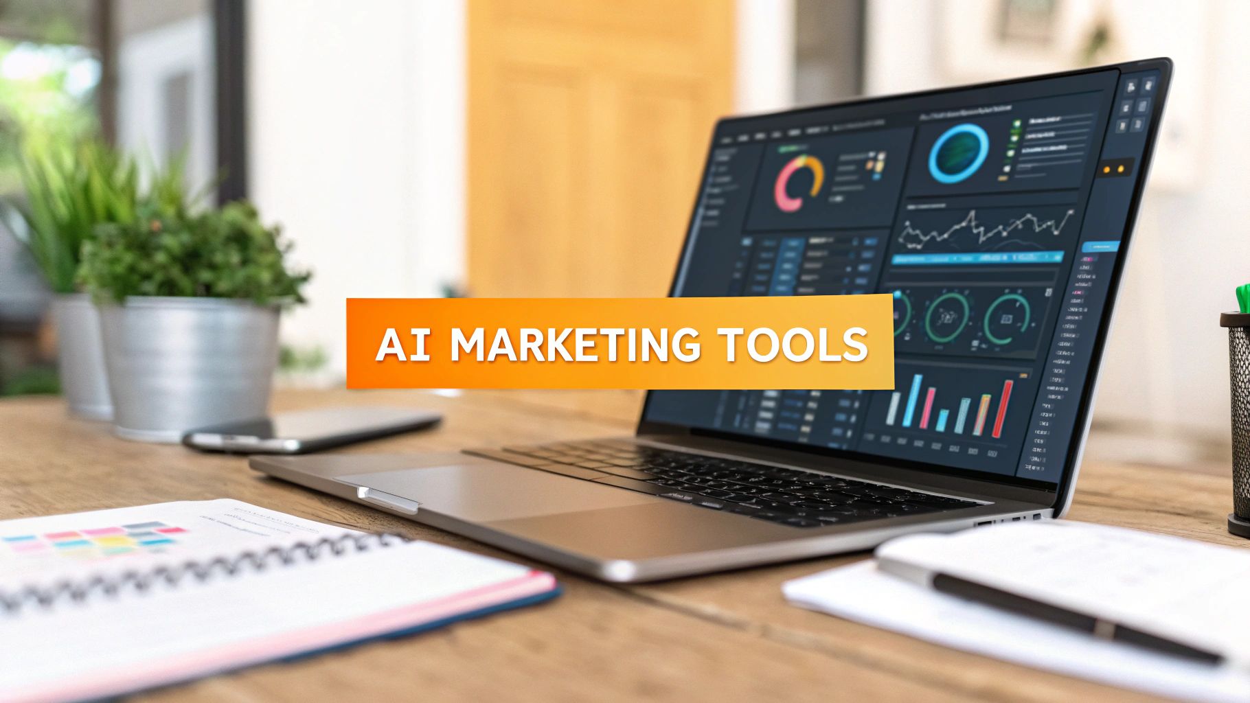
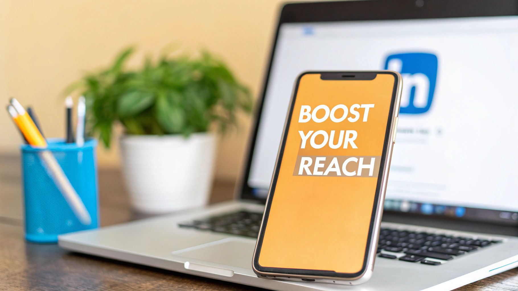
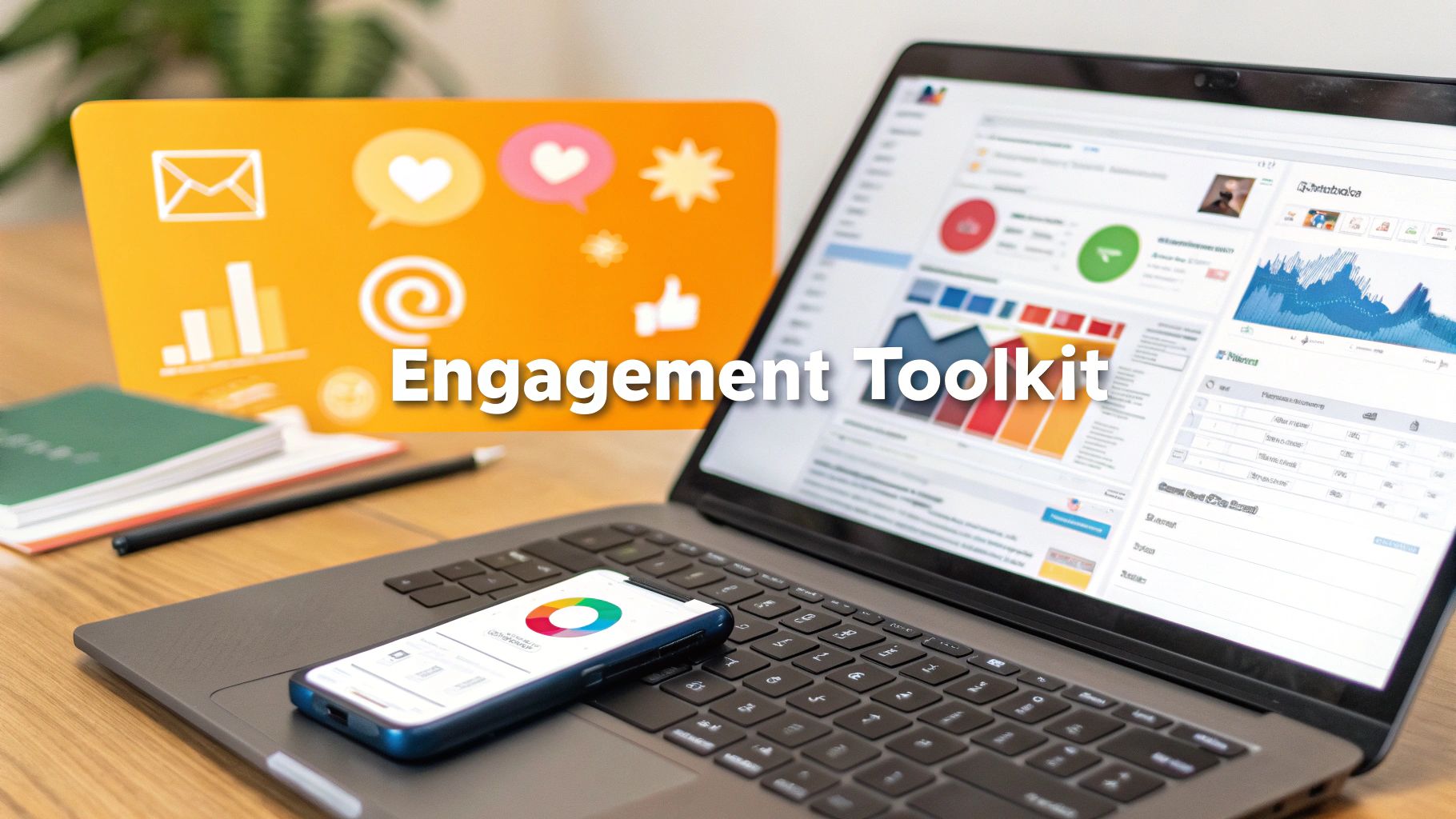
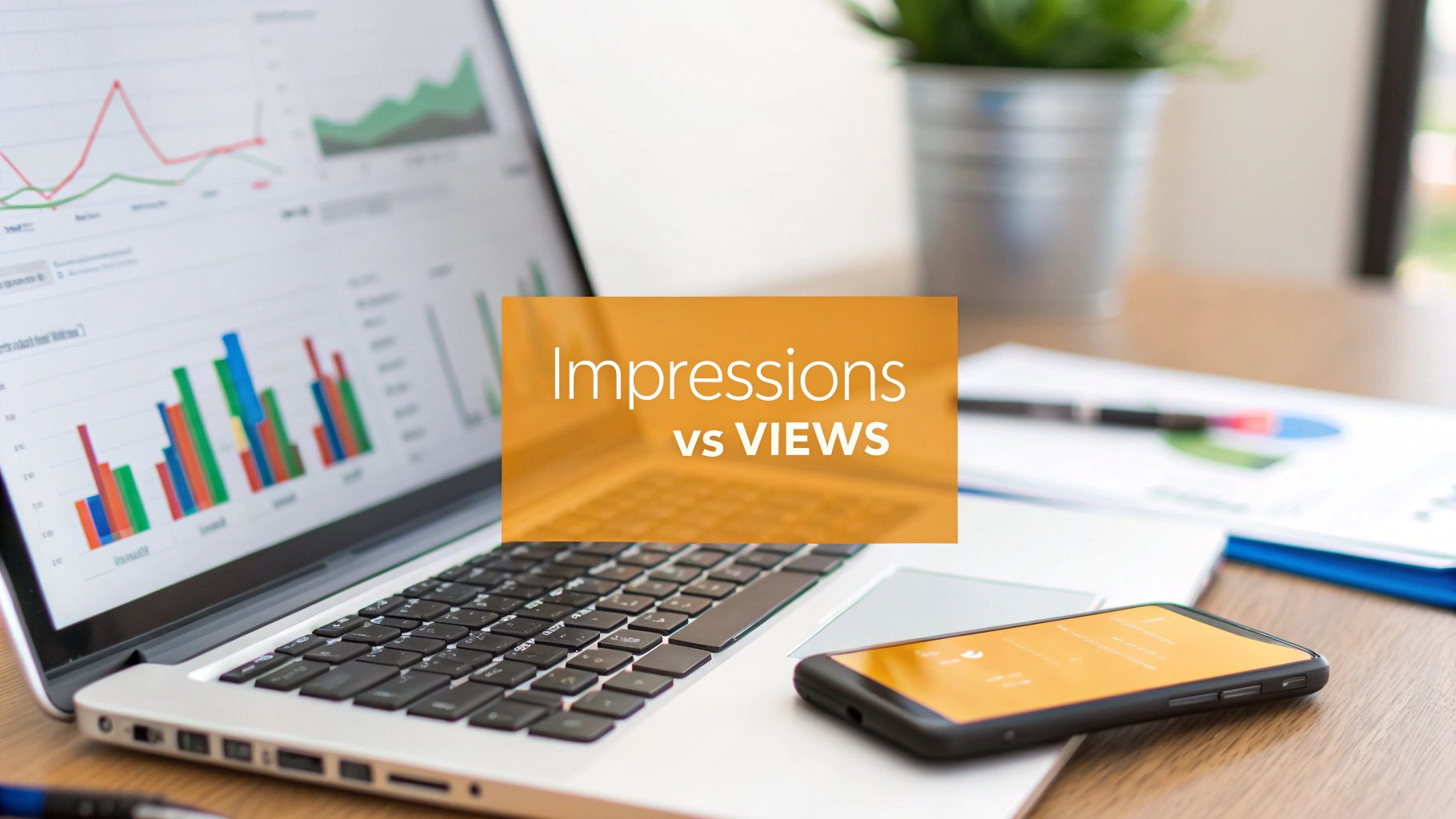
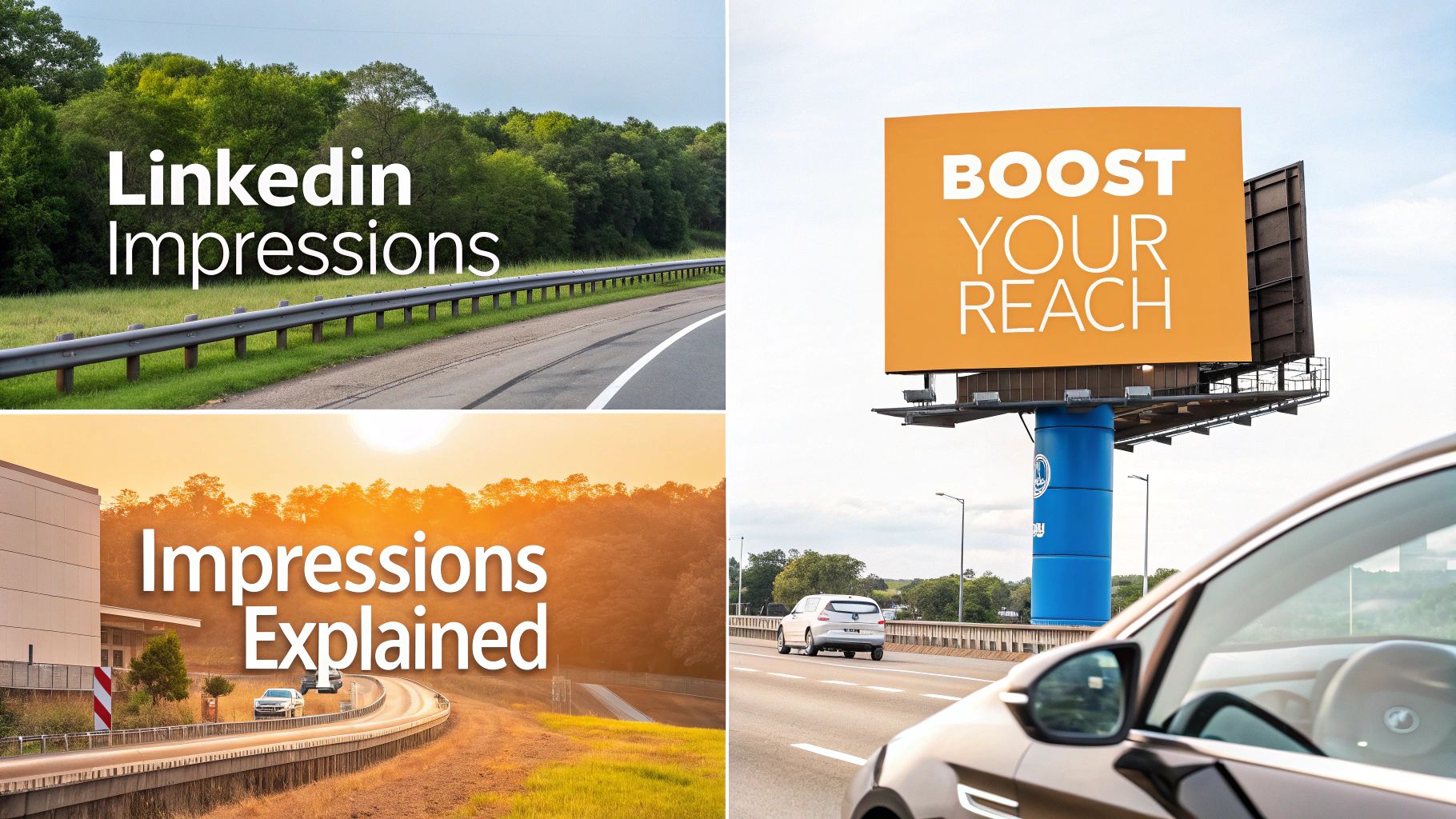
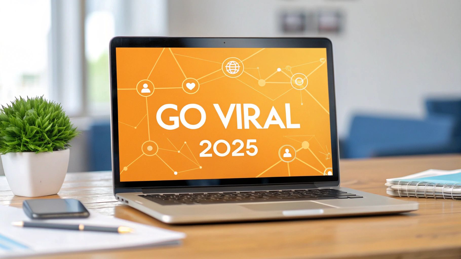
So, Why Do Perfect Image Sizes Actually Boost Your Reach?
Ever put a post up on LinkedIn, only to watch it get almost zero traction, while another one just takes off? The secret sauce isn't always some complex growth hack. Sometimes, it's as simple as the pixel dimensions of your image. Getting the image size for a LinkedIn post right isn't just about making things look pretty; it's a strategic play that tells the algorithm your content is worth showing to more people.
Think about it from LinkedIn's perspective. Their goal is to keep users scrolling happily. That means they're going to push content that looks polished, professional, and loads fast, especially on phones. When you upload an image that's the wrong size, LinkedIn has to squish or stretch it. The result? A blurry, pixelated, or oddly cropped mess that screams "low-effort," and the algorithm takes note.
Say Goodbye to the Dreaded Awkward Crop
There's nothing more frustrating than crafting the perfect visual, only to have LinkedIn chop off the most important part. Your killer headline? Gone. Your logo? Sliced in half. This happens all the time, especially when you consider that over 80% of engagement on LinkedIn happens on a mobile screen, where every pixel counts.
When your images are sized correctly from the start, you control exactly what your audience sees. Your entire message lands, just as you designed it. It’s a small detail that shows you’re a pro who pays attention, which is a huge part of building trust with your network.
Nail That First Impression
In a fast-scrolling feed, your image is your digital handshake. It’s the very first thing that grabs someone's attention and sets the tone for your brand. A crisp, high-quality, and perfectly framed image instantly communicates competence and authority. It’s a subtle psychological cue, but it works, leading to more people stopping, clicking, and engaging.
When your visuals look sharp, it sends a clear message: you care about quality. That small detail can be the difference between someone scrolling right past your post and someone stopping to see what you have to say.
Ultimately, getting your image dimensions down is a non-negotiable part of any solid LinkedIn strategy. It signals to the algorithm that you're sharing quality content, ensures your message is seen in full, and builds the professional credibility you need to stand out. To really level up your entire approach, check out these game-changing social media marketing tips which go hand-in-hand with nailing your visuals. Making these small tweaks can make a massive difference in your reach.
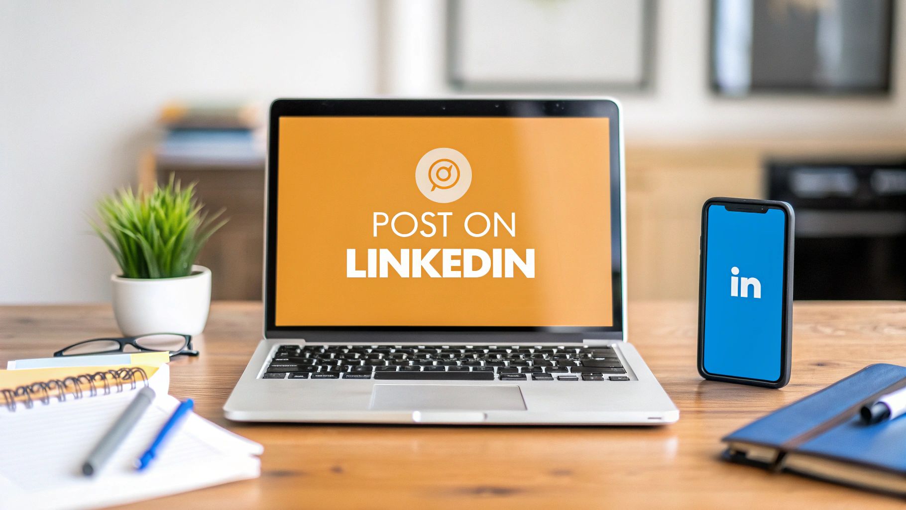
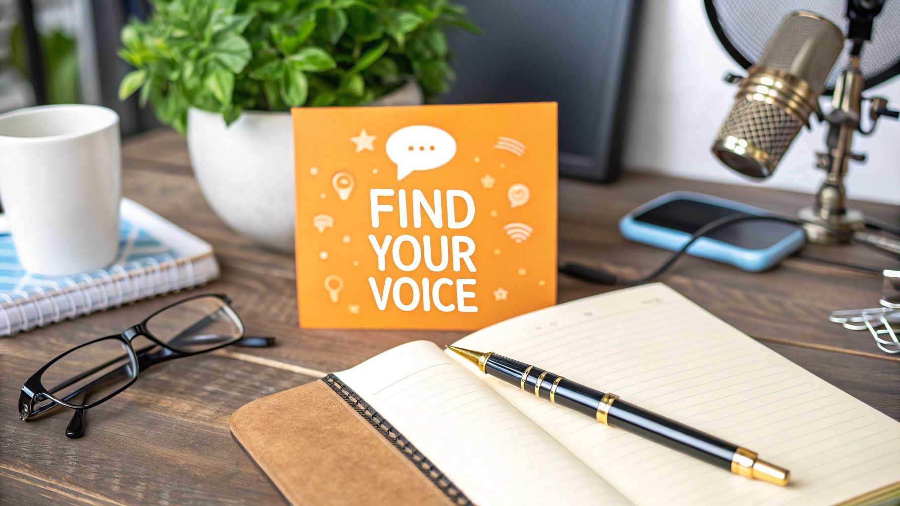
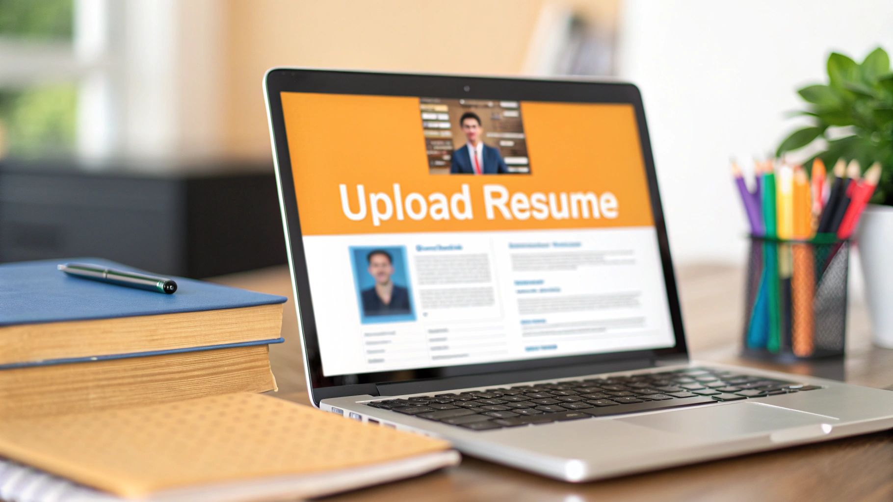
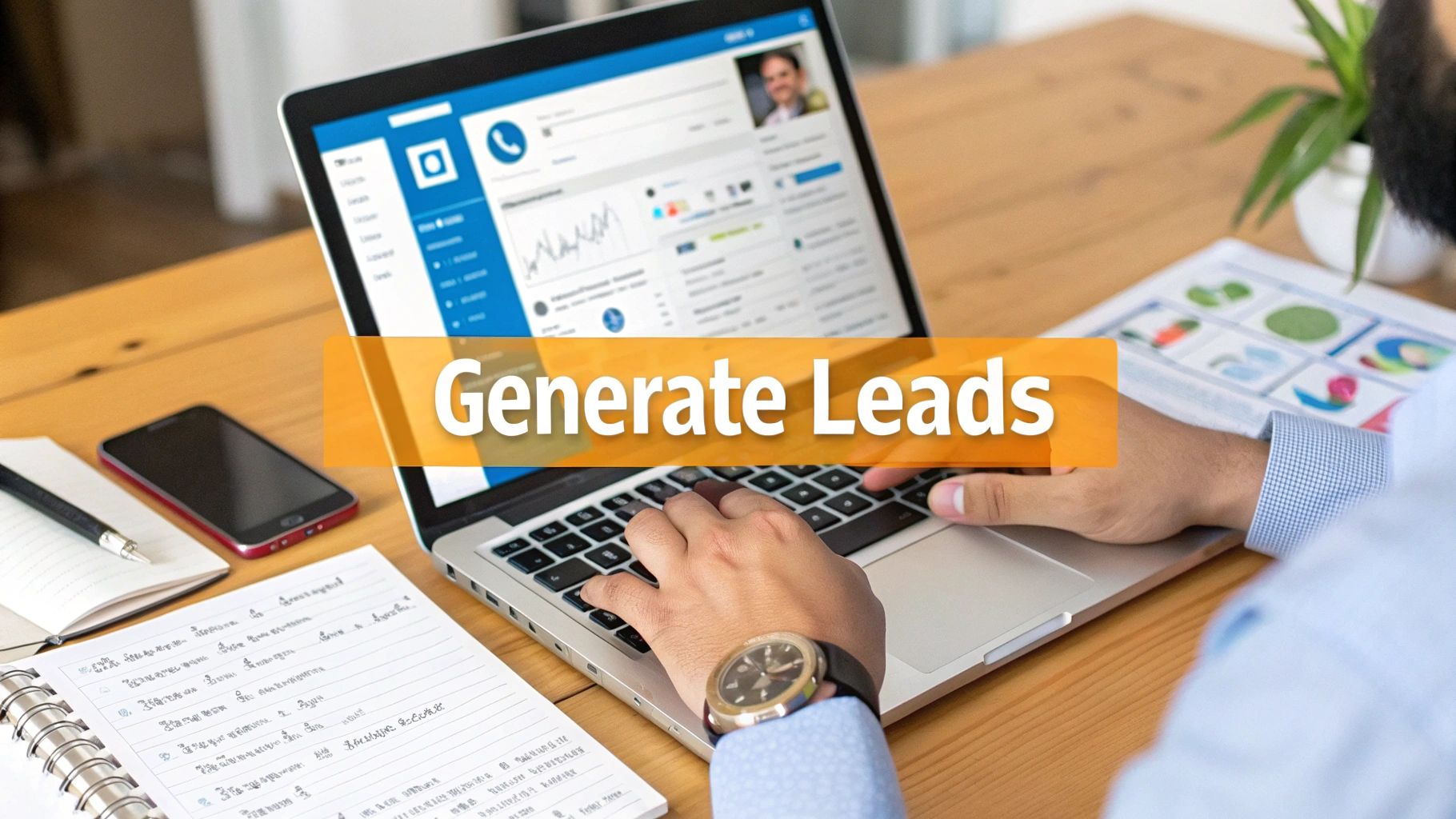
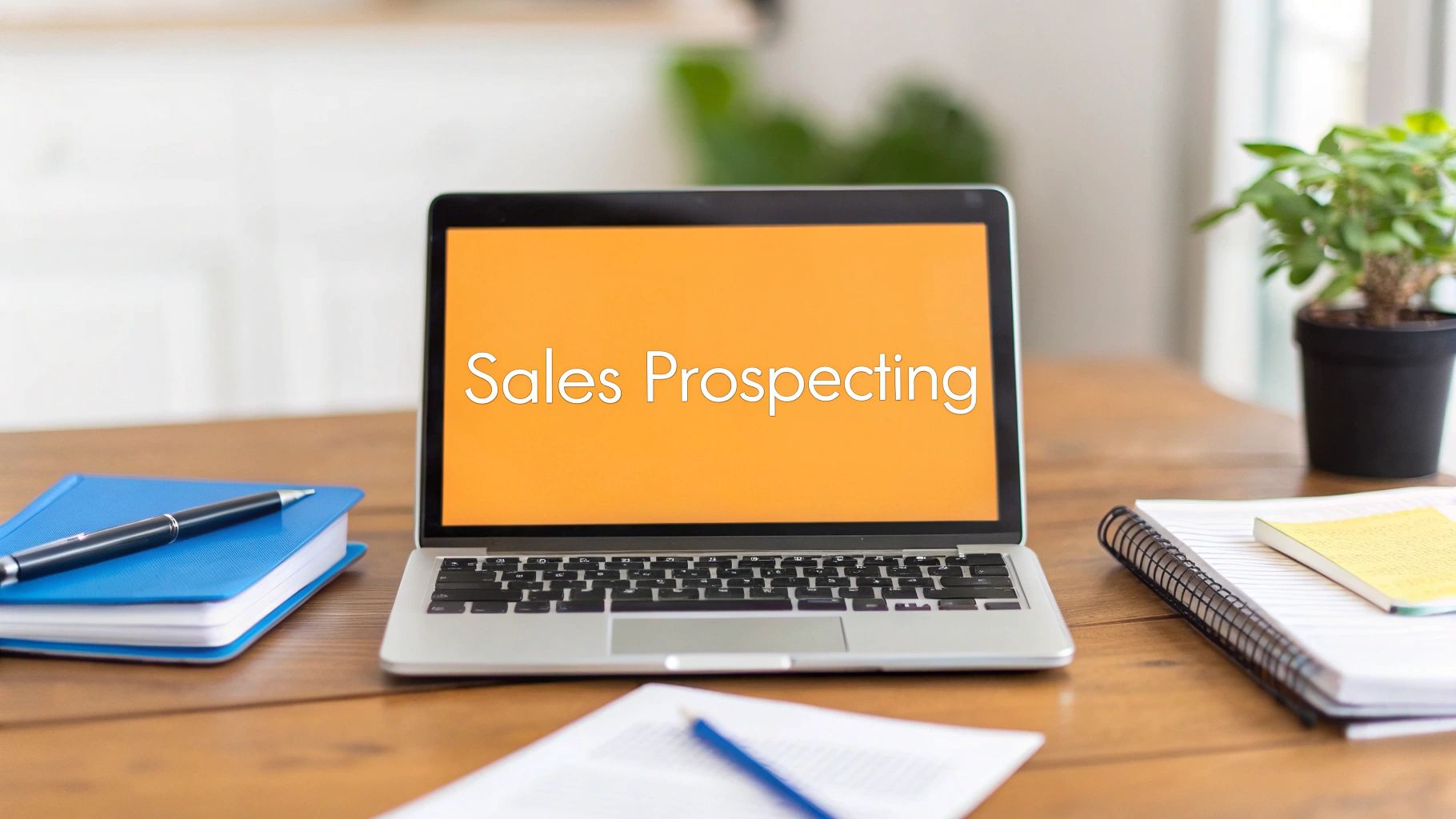
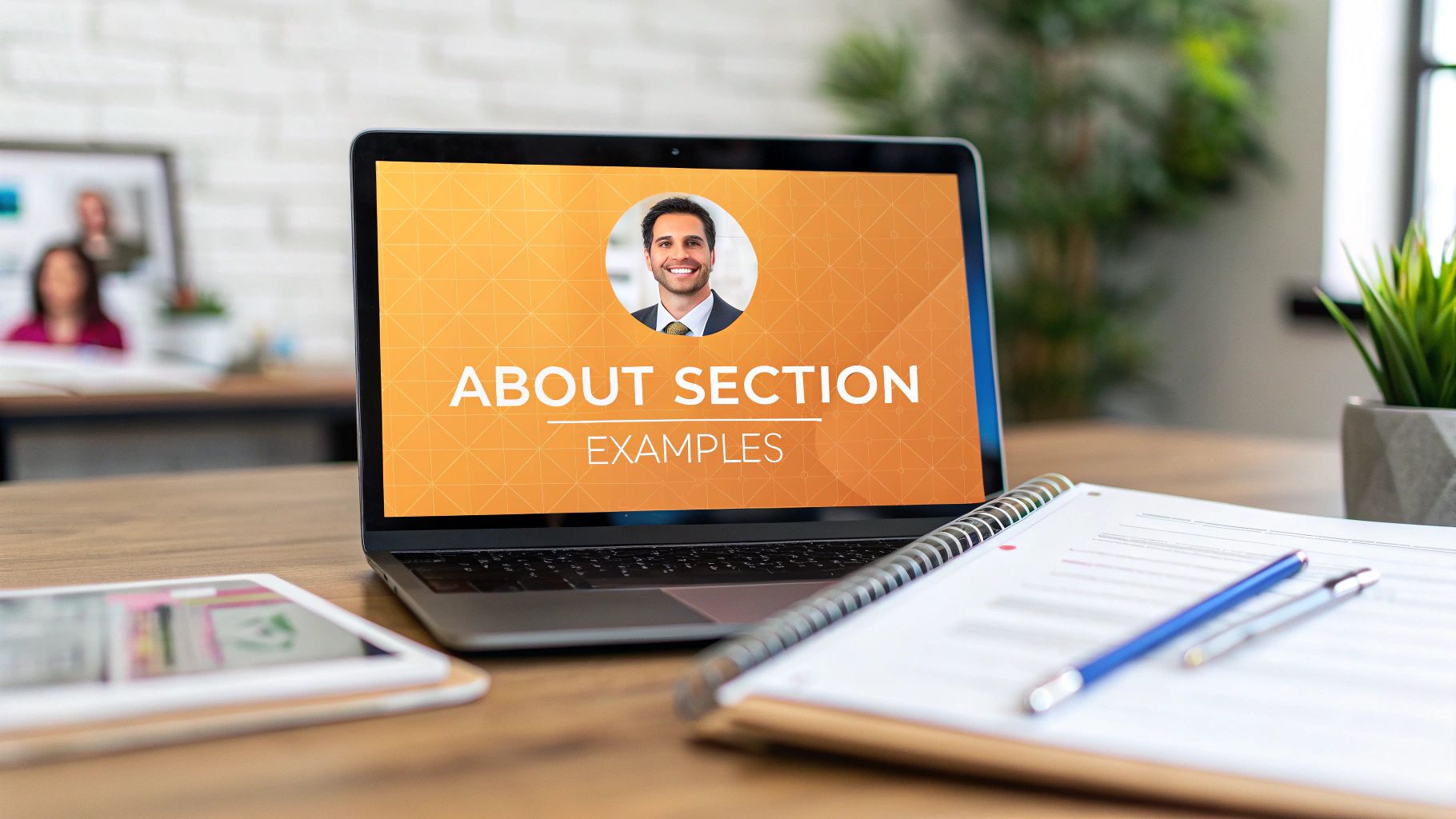
Getting Your Single Image Posts Seen and Clicked
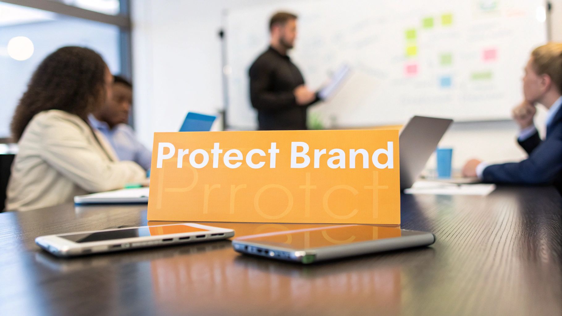
The single image post is the bread and butter of any solid LinkedIn strategy. It's straightforward, powerful, and, when done right, a total scroll-stopper. Getting the image size for a LinkedIn post spot on is your first move to make sure your visual grabs eyeballs and doesn't just get skimmed over.
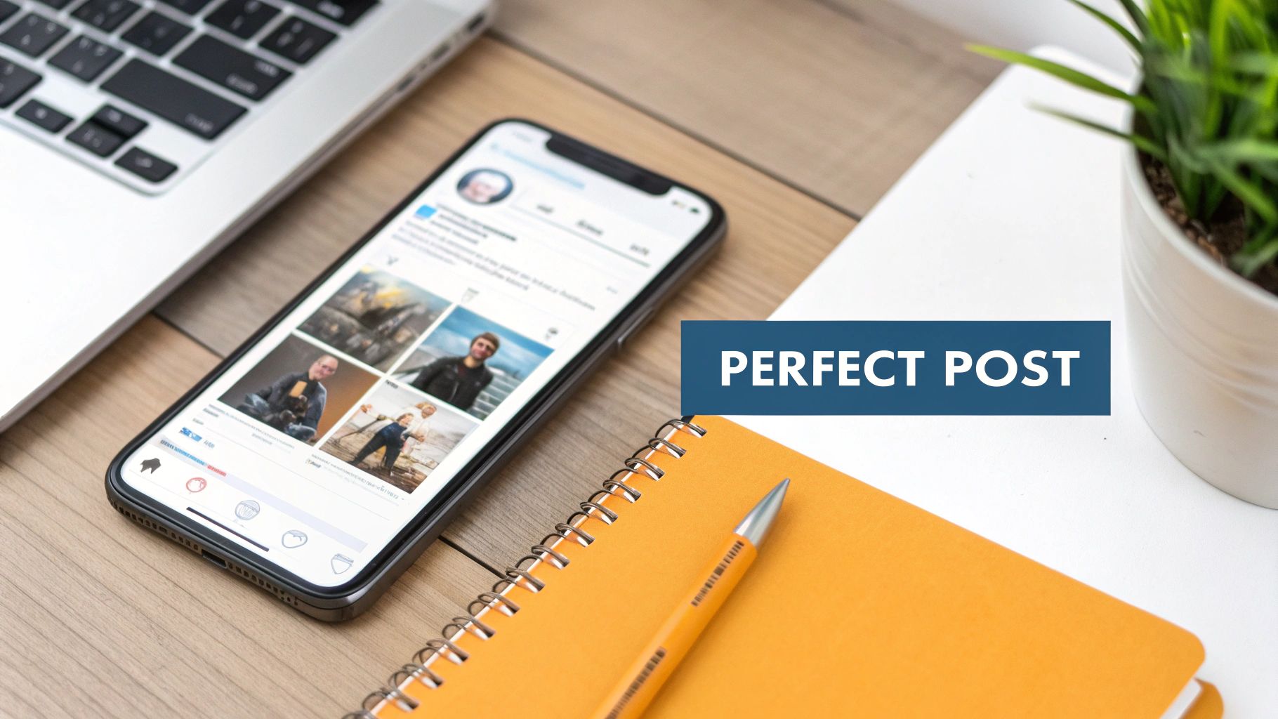
Think of this format as the main event. Whether you’re showing off a new product, sharing a great shot from a team event, or dropping a knowledge bomb with an infographic, a single, sharp image puts your message front and center.
The Two Best Formats for Single Images
When you're prepping a single image post, you've really got two main choices. Each one has its own vibe and purpose, so pick the one that best fits what you're trying to say.
Landscape (1.91:1 Ratio): The sweet spot here is 1200 x 627 pixels. This is the classic, reliable size that looks great everywhere—desktop, mobile, you name it. It’s perfect for those wider shots, group photos, or any graphic where the text flows horizontally.
Square (1:1 Ratio): For a square image, aim for 1080 x 1080 pixels. This format is a beast on mobile because it takes up more vertical real estate in the feed, making it much harder to ignore. It’s my go-to for pull quotes, bold graphics, and professional headshots.
Using these exact dimensions is like giving LinkedIn a little nod; you're telling the algorithm your content is polished and ready to go. It might seem like a small detail, but it can genuinely affect your post's reach.
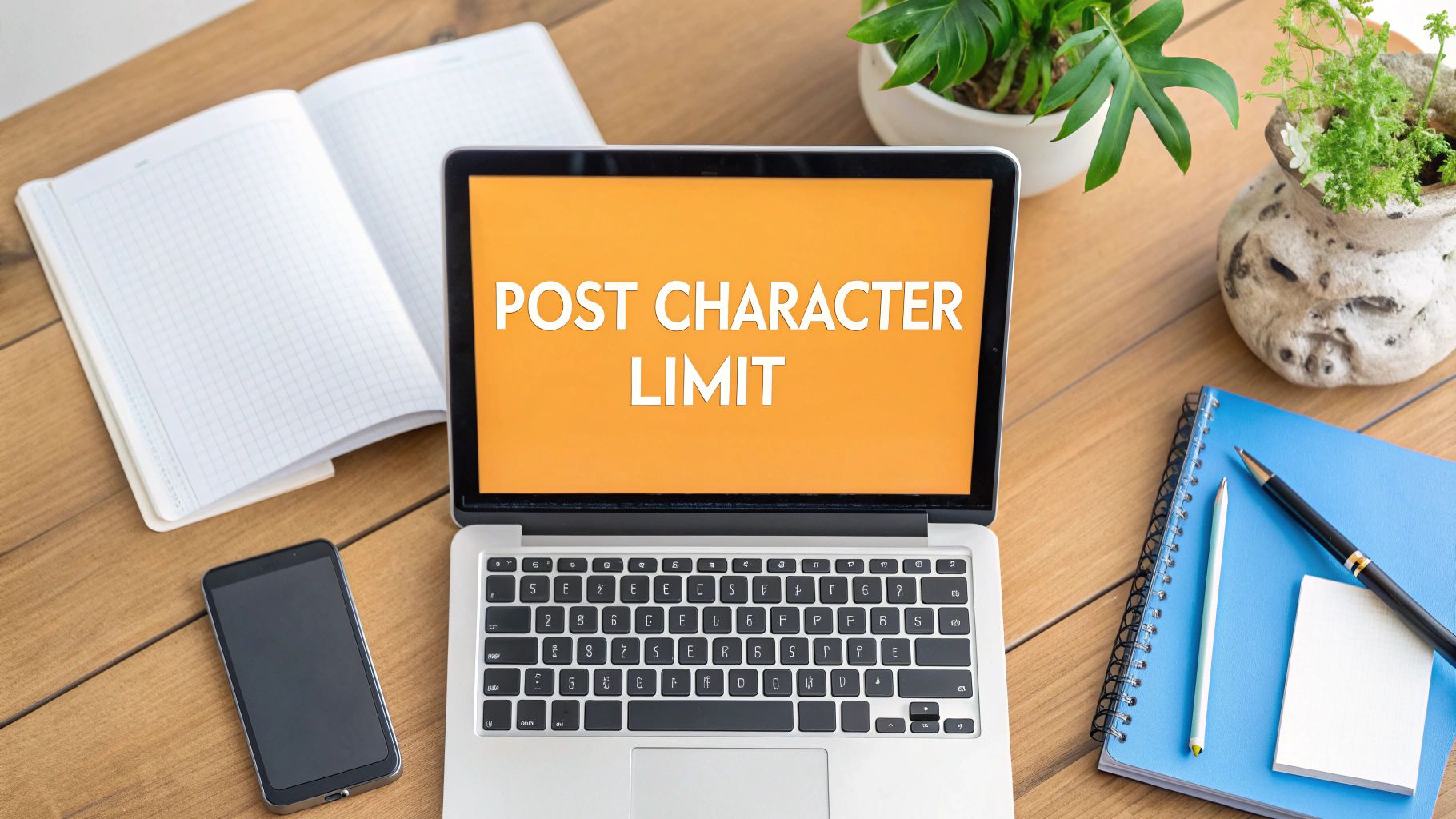
Why You Can't Just "Wing It" With Sizing
I get it, it's tempting to just upload an image and hope for the best. But that’s a gamble. LinkedIn’s feed is all automated, and if your image doesn’t fit its cookie-cutter slots, it's getting cropped. An automatic crop can slice your main point, your logo, or your CTA right out of the picture.
You have to control the narrative. When you use the right dimensions, you guarantee that everyone who sees your post sees it exactly how you designed it. No weird cuts, no missing words—just a clean, professional image that does its job.
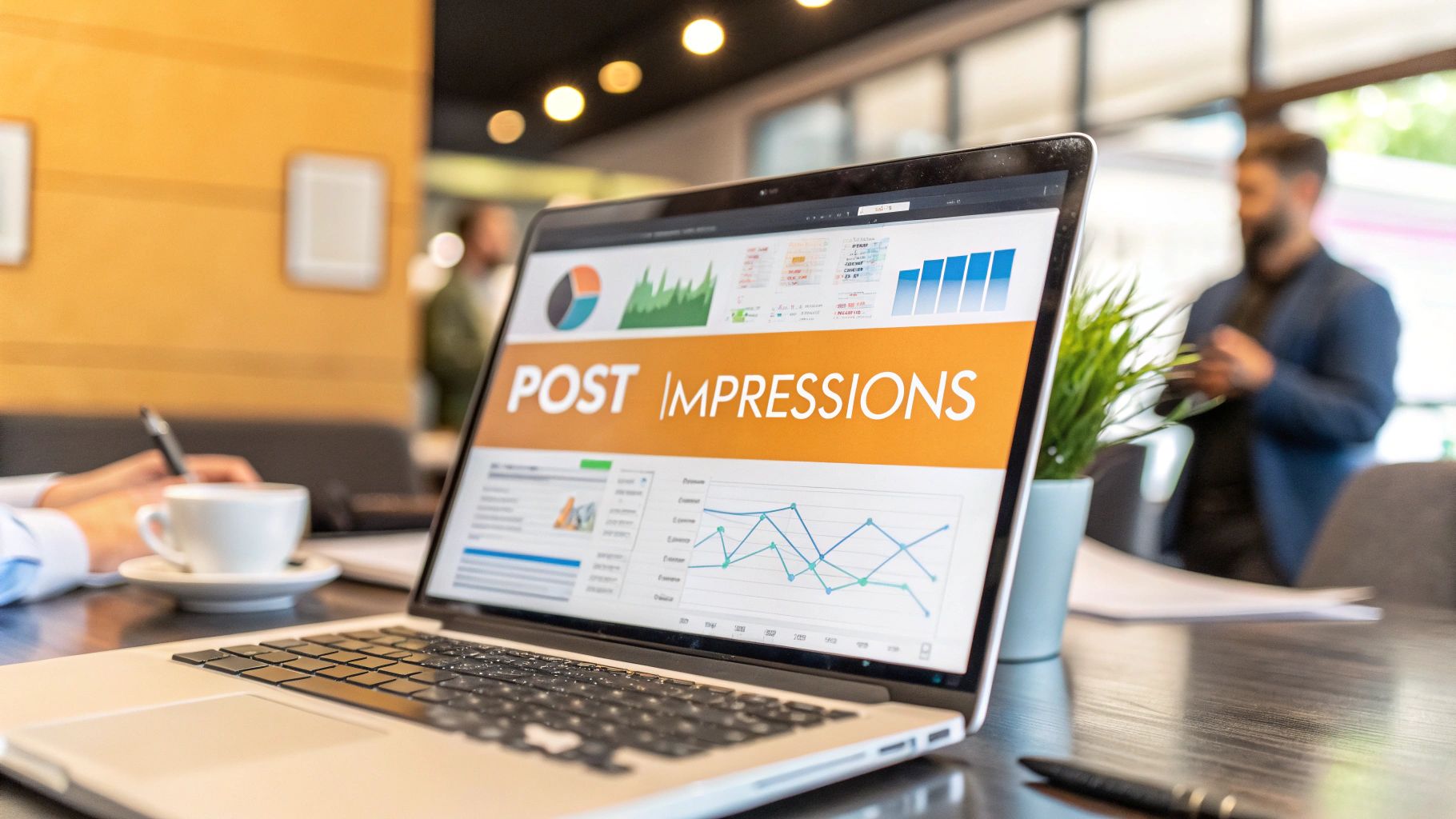
Here's a pro tip: sticking to the 1200 x 627 pixels landscape format can seriously boost your post's performance. It’s the gold standard for a reason, ensuring your visuals look flawless on both desktop and mobile, where a staggering over 80% of users are scrolling. In fact, properly sized images can pull in up to 45% more impressions. Why? Because a botched, auto-cropped image gets ignored. This isn't just about looking good; it's a strategic move that can lead to a much higher click-through rate, especially in crowded B2B spaces. For a deeper dive, check out the guide over at Kanbox.io.
Common Mistakes to Dodge
Even when you have the dimensions down, a few rookie mistakes can trip you up. Watch out for these:
Putting Text on the Edge: Always give your content some breathing room. Leave a "safe zone" or margin around the borders of your image so crucial text or logos don't get chopped off on different screen sizes.
Using Grainy, Low-Res Images: Nothing screams unprofessional like a blurry, pixelated image. Always start with a high-quality source file before you even think about resizing.
Skipping the Final Check: Before you hit that "Post" button, take a second to see how it will actually look in the wild. Learning how to preview a LinkedIn post is a game-changer for catching those little formatting goofs and making sure your visual is perfect.
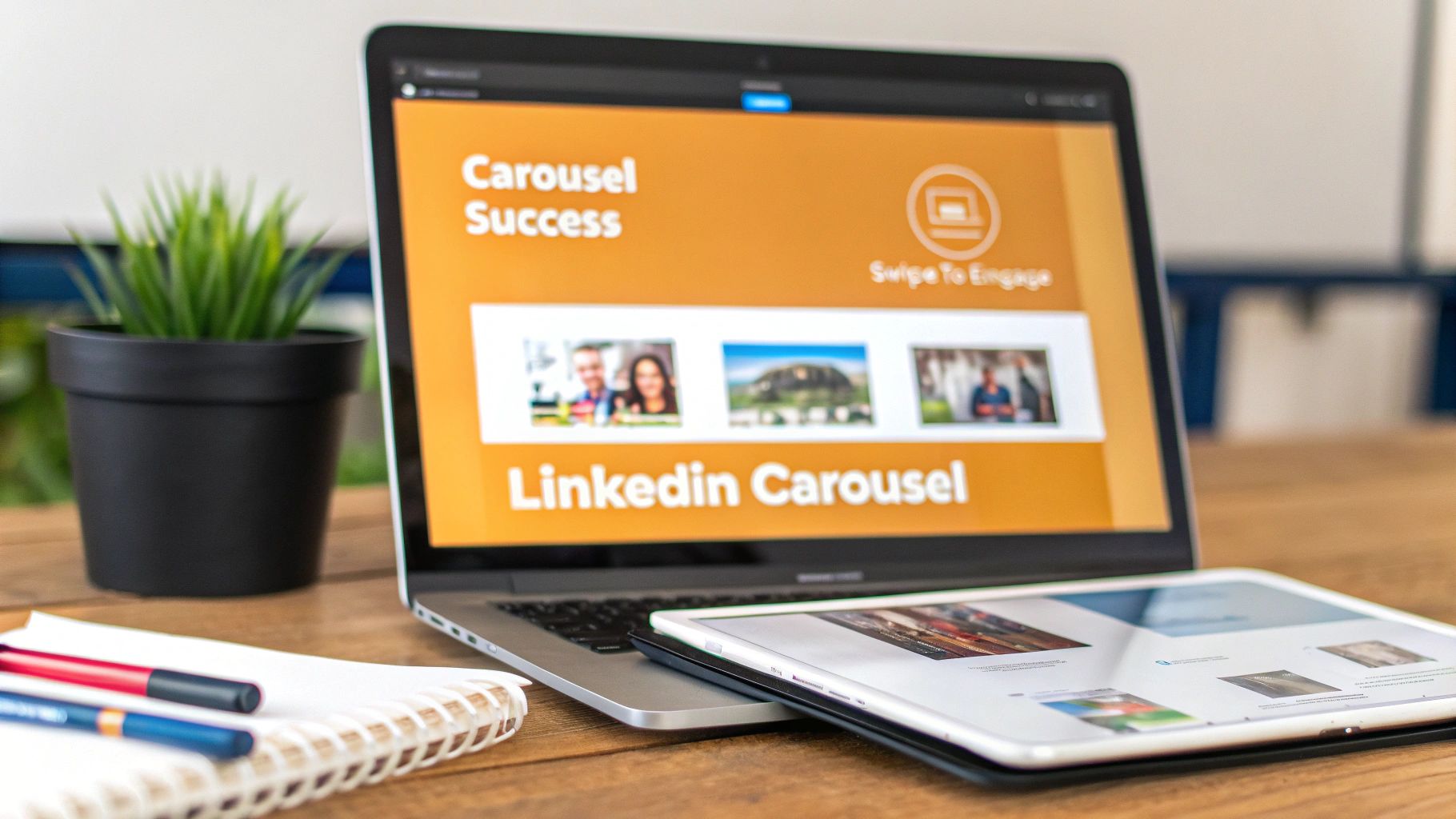
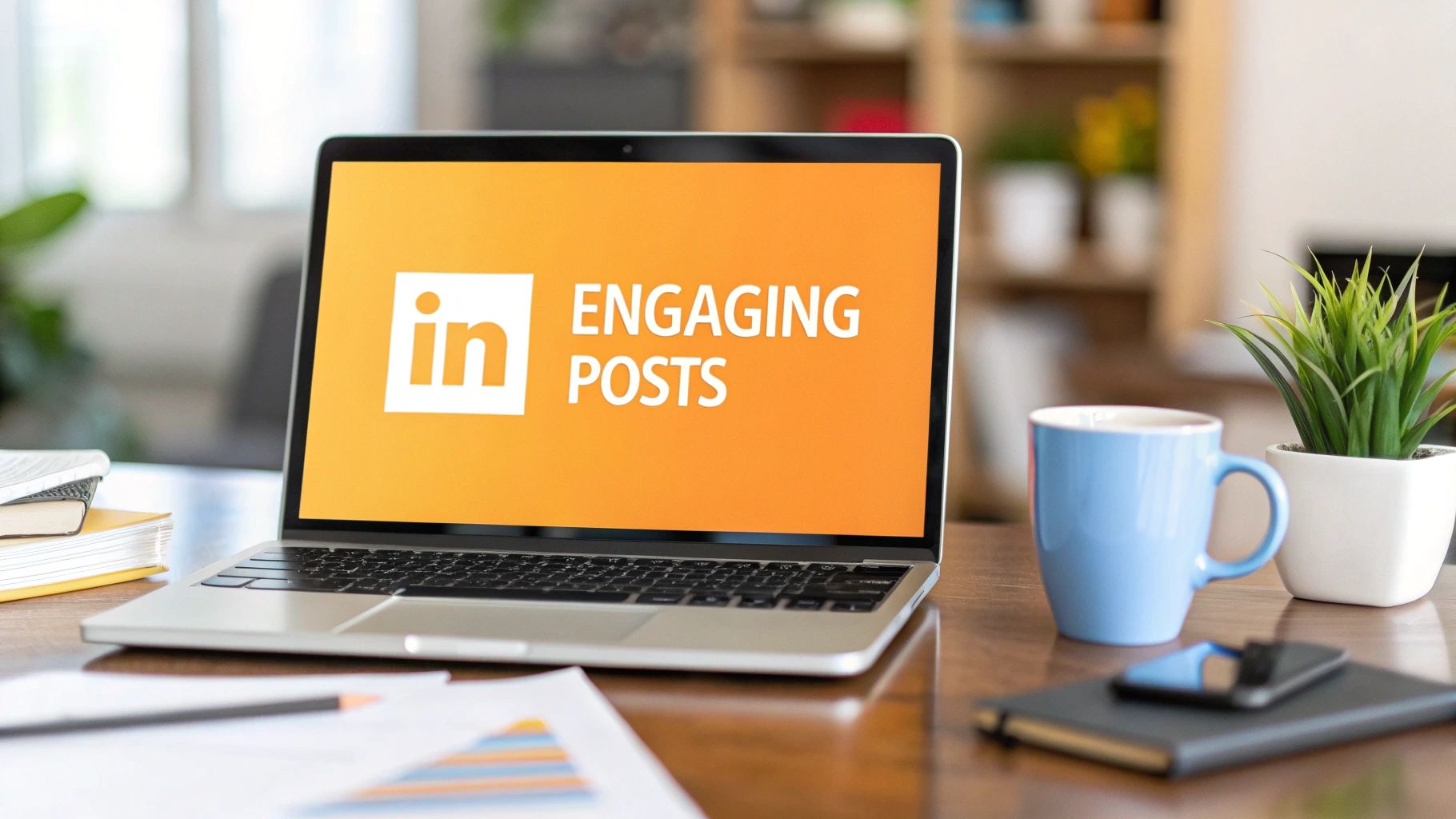
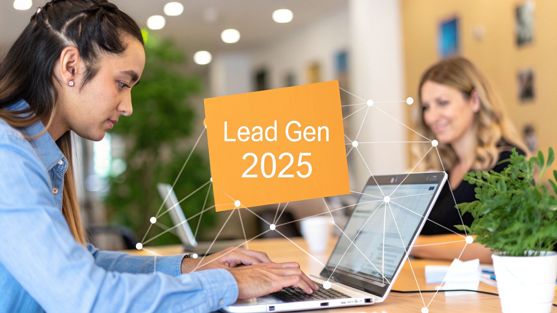
Crafting High-Impact LinkedIn Carousel Posts
If you want to stop the scroll and get people genuinely hooked on your content, LinkedIn carousels are where it's at. They are absolute gold for breaking down big ideas, telling a story, or walking people through a how-to guide. Think of them as mini-presentations built right into the feed.
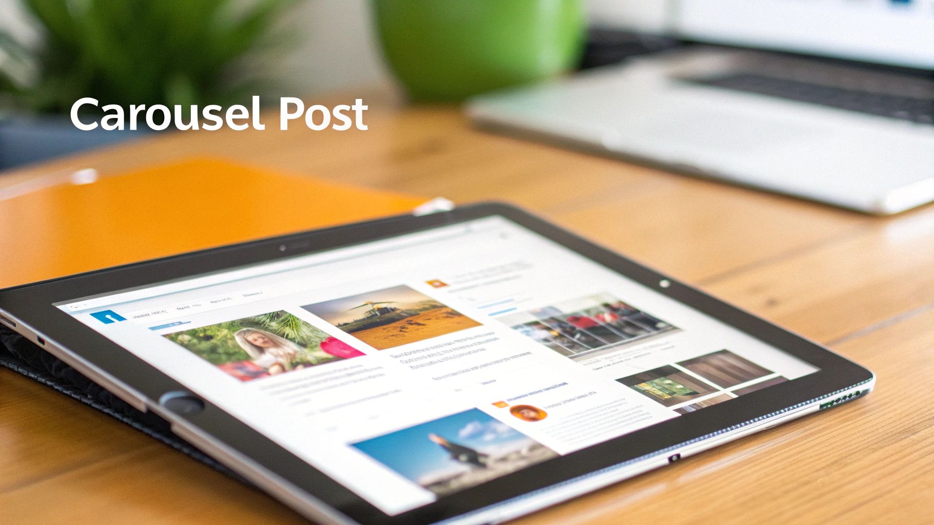
The real magic of a carousel is that it lets you pack so much more value into one post compared to a single image. The LinkedIn algorithm loves this format because it keeps users engaged and swiping longer, which signals that your content is top-notch.
The Best Image Sizes for Carousel Cards
To get that crisp, professional look that makes your carousel inviting, you've got to nail the dimensions. While you can use different sizes, I’ve found two formats consistently perform the best and look great in the feed.
- Square (1:1 Ratio): Go with 1080 x 1080 pixels. This is the go-to, most versatile size for carousel slides. It gives you a clean, balanced look that works perfectly on both desktop and mobile, so you never have to worry about your content getting awkwardly chopped off.
- Vertical (4:5 Ratio): For a more immersive feel, especially on mobile, use 1080 x 1350 pixels. This taller format really dominates the screen on a phone, making it much harder for someone to just scroll past. It's a fantastic choice if your story is very visual and you want your images to make a big statement.
The key is consistency. Stick to one size for all your slides. If you mix and match dimensions, LinkedIn will try to auto-crop them, and the result is a jarring, unprofessional-looking experience as people swipe.
A great carousel tells a seamless story from the first slide to the last. Getting the dimensions right is the foundation that ensures your visual narrative flows smoothly and looks professional.
Honestly, sticking to square 1080 x 1080 pixels is a game-changer. I've seen carousels outperform single images by 67% in dwell time because people stick around to swipe through an average of 5.2 slides. This kind of engagement can boost your reach by as much as 25%. The 1:1 ratio is especially good at preventing text-heavy slides from getting cut off on mobile, which is where about 65% of LinkedIn views happen anyway.
Tips for Designing a Carousel That People Actually Swipe
Getting the right image size for linkedin post is step one, but the design and flow are what will truly captivate your audience. Here’s what I focus on:
- Nail the Title Slide: Your first slide is everything. It needs a bold headline and a compelling visual that screams, "You need to see what's in here!" Make the value of swiping obvious from the get-go.
- Keep the Design Cohesive: Use the same brand fonts, colors, and logos on every slide. This creates a polished, professional vibe and reinforces who you are.
- Less is More with Text: Each slide should have one clear, simple point. Use big, easy-to-read fonts and plenty of white space. People are swiping fast, so make it scannable.
- Finish with a Strong Call-to-Action (CTA): Don't just end it! Your last slide is your chance to tell people what to do next. Ask them to drop a comment, follow your page, or click a link. Guide them.
For a complete walkthrough, check out our guide on how to post a carousel on LinkedIn. It covers everything from the technical upload process to writing a caption that grabs attention. Combine perfect dimensions with smart design, and your carousels will become engagement machines.
Getting Your Profile and Page Images Just Right
Think of your LinkedIn profile picture and cover photo as your digital handshake. They're often the very first thing people see, so they have to make a great impression. These images aren't just for show; they're a huge part of your personal and brand identity on the platform. Nailing the dimensions is the first, and arguably most important, step to looking sharp and professional.
Whether you’re sprucing up your personal profile or running a company page, using the right sizes ensures nothing important gets cropped out and your visuals stay crisp on any device.
Perfecting Your Personal Profile
Your personal profile is your professional storefront. A blurry or awkwardly cropped photo can instantly make you look less credible, and nobody wants that.
- Profile Picture Size: The sweet spot is 400 x 400 pixels. It's a simple square that keeps your headshot clear and centered. Just remember, LinkedIn will crop this into a circle, so make sure your face is right in the middle to avoid any weird cuts.
- Background Banner Size: Go for 1584 x 396 pixels. This gives you a wide, panoramic space to tell a visual story about who you are, what you do, or what your professional mission is all about.
A quick heads-up: your profile picture sits on top of your banner in the bottom-left corner. You need to account for this overlap when designing your background. Keep any crucial text or logos out of that "safe zone" so they're always visible, whether someone is viewing your profile on a desktop or their phone.
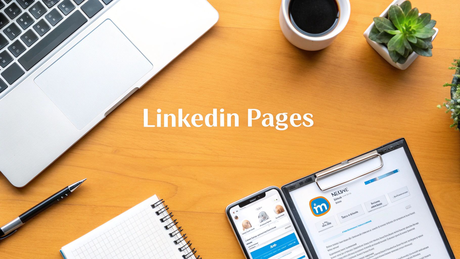
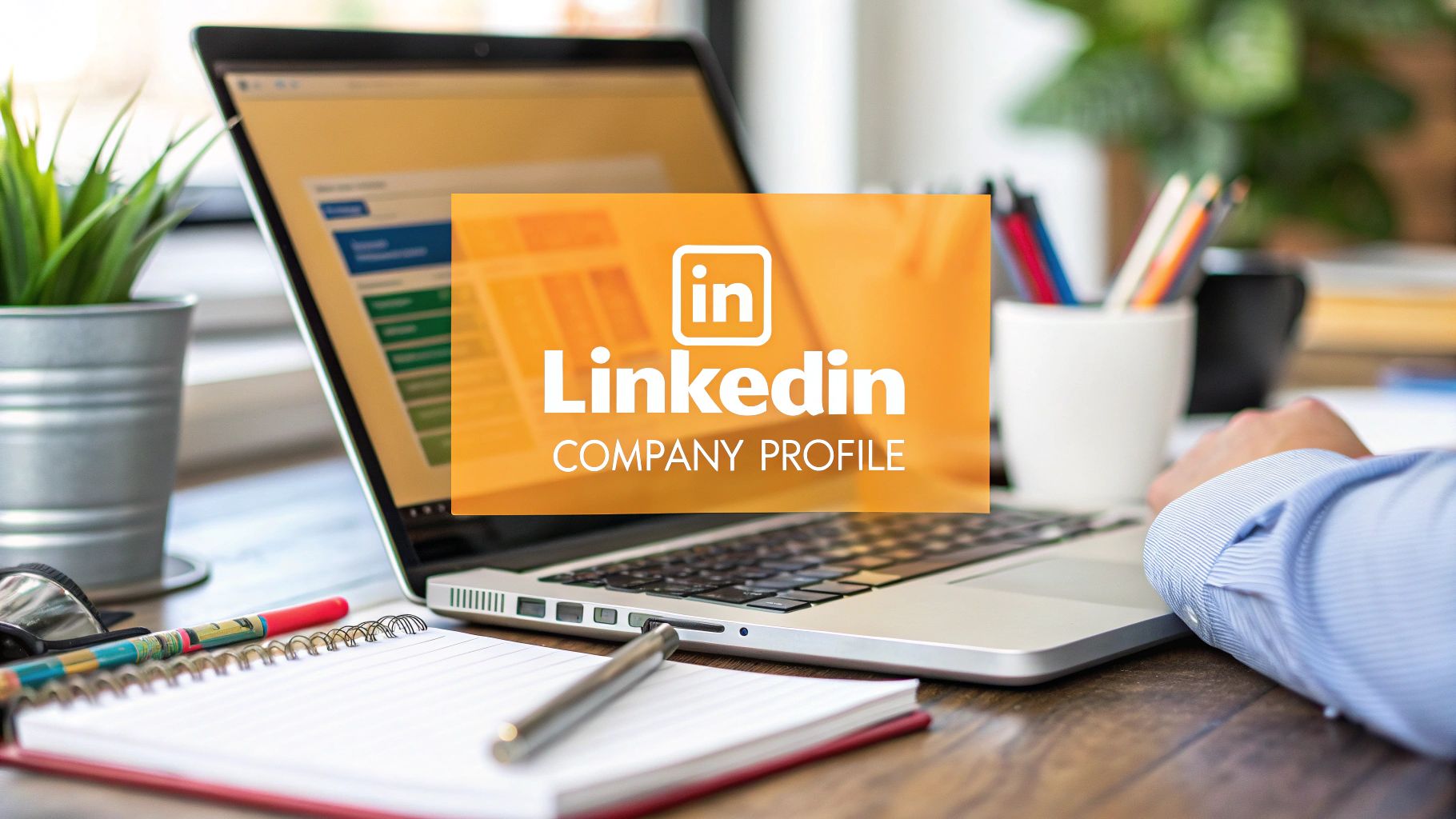
Polishing Your Company Page Presence
For any business, a sharp-looking LinkedIn page is essential for building trust and brand recognition. Every visual element here speaks for your entire organization, so getting it right is non-negotiable.
Here are the key dimensions you'll need for your company page:
- Company Logo: Use a 400 x 400 pixels image. This is the little square icon that shows up next to all your company’s posts and in search results. It’s your brand’s consistent calling card.
- Company Cover Photo: The recommended size is 1128 x 191 pixels. It's a lot shorter and wider than the personal banner, so your design has to be simple but strong to make an impact in that limited space.
Your company cover photo is prime real estate. You can use it to show off your company culture, announce a new product, or drive home your brand's main message. A thoughtfully designed banner can transform a simple page visit into a real connection.
Getting these basic profile and page images right is the foundation for a strong LinkedIn presence. To learn more about making your entire profile stand out, from the images to the copy, check out this comprehensive guide to optimizing your LinkedIn profile. For even more actionable strategies, we’ve also put together our own guide on https://redactai.io/blog/how-to-optimize-your-linkedin-profile.
Choosing the Right Tools to Resize Your Images
Having the perfect image is only half the battle. If it’s the wrong size, LinkedIn’s automatic cropping can ruin its impact. But you don’t need to be a graphic design pro to get the right image size for a LinkedIn post. A handful of simple tools can help you resize your visuals in minutes, keeping them looking sharp and professional.
These tools make resizing a painless process, whether you're whipping up a new design or just need to adjust a photo you already have. Best of all, most come with pre-set social media templates, so you don't have to memorize a bunch of pixel dimensions.
Easy-to-Use Online Design Tools
For most of us, free online tools are the fastest and easiest way to prep images for LinkedIn. They offer simple, drag-and-drop interfaces with surprisingly powerful features, making them ideal for professionals who need great results without a major time investment.
Here are a couple of the best options out there:
Canva: This is a favorite for millions of creators, and for good reason. Canva has a massive library of templates already sized for every social media format you can think of, including all of LinkedIn's image types. Just search for "LinkedIn Post," and you’ll get a blank canvas set to the perfect 1200 x 627 pixels.
Adobe Express: Another fantastic free tool, Adobe Express offers a lot of the same functionality as Canva. It’s packed with professional templates and has a quick "Resize" feature that lets you instantly reformat your image for LinkedIn or any other platform without losing quality.
Here’s a peek at how straightforward Canva’s interface is. You can spot the LinkedIn templates right away.
The whole layout is built for speed. Just pick a template, and you can start creating immediately.
Simple Steps for Resizing in Canva
Getting your image ready for LinkedIn in Canva is incredibly simple. Even if you've never used it, you can have a perfectly sized graphic ready to go in just a few clicks.
Here's the quick rundown:
- Create a New Design: From the Canva homepage, click the "Create a design" button and just type "LinkedIn Post" in the search bar. You'll see options like "LinkedIn Single Image Post"—pick the one you need.
- Upload Your Image: You can literally drag and drop your image file onto the blank canvas. Or, use the "Uploads" tab on the left to find your file.
- Adjust and Position: Drag the corners of your image to make it fit the frame. You can move it around to make sure the most important part of the picture is front and center.
- Add Text or Elements (Optional): If you want to add text, your logo, or any other graphics, all the tools are right there.
- Download Your File: Hit the "Share" button in the top-right corner, then click "Download." You’ll want to choose PNG for graphics with text or JPG for photos.
A quick pro-tip: always start with the highest-resolution image you have. It's easy to make a large image smaller without it looking blurry, but trying to blow up a small, pixelated image is a recipe for disaster.
Using these simple tools and steps, you can make sure every image you post looks polished and reinforces your professional brand.
Got Questions? Let's Talk LinkedIn Image Sizes
Even with all the specs laid out, a few questions always pop up when you're trying to get your LinkedIn images just right. Let's tackle some of the most common ones I hear, so you can stop second-guessing and start posting with confidence.
Think of this as the final polish on your visual strategy. Getting these little details locked down makes sure all the effort you put into creating that perfect image actually pays off when it lands in someone's feed.
What Happens If I Upload the Wrong Size?
If you upload an image that doesn't fit LinkedIn's preferred dimensions, the platform will take matters into its own hands. It automatically crops or resizes your image to make it fit, and the results are rarely pretty.
Suddenly, key parts of your image are chopped off, the framing looks awkward, or the whole thing ends up blurry and unprofessional. You've lost control. That amazing wide shot you designed might get centered in a weird way, completely losing the context you were going for.
JPG vs. PNG: Which One Should I Use?
Great question. The choice between a PNG and a JPG really boils down to what's in your image. Each file type has its own superpower.
- JPG (Joint Photographic Experts Group): This is your go-to for photographs. JPGs are fantastic at handling complex images with lots of colors, and their compression keeps file sizes down so your posts load quickly.
- PNG (Portable Network Graphics): Pick PNG for anything with text, logos, or crisp lines—think charts and infographics. PNGs don't lose quality when compressed (lossless compression), so text stays sharp, and they also support transparent backgrounds, which can be a lifesaver.
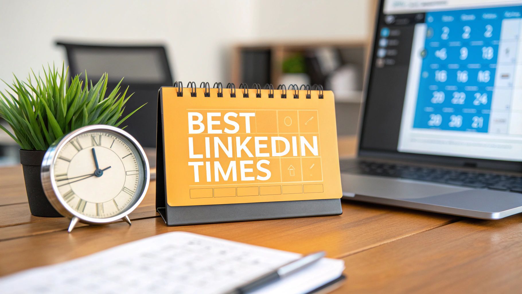
How Can I Make My Images Look Good on Both Mobile and Desktop?
The secret is to design for the recommended sizes, especially the 1200 x 627 pixels rectangle or the versatile 1080 x 1080 pixels square. These dimensions are LinkedIn's sweet spot and are built to adapt gracefully across different devices.
Here's a pro tip: always leave a "safe zone" around the edges. Keep your logo, text, or any other can't-miss element away from the absolute borders of the image. This little buffer prevents important details from getting clipped by user interface elements or odd screen sizes.
Never forget that a huge chunk of LinkedIn users are scrolling on their phones. What looks perfect on your big monitor might be a cramped mess on a small screen. When in doubt, design for the mobile experience first.
Does Image Resolution Really Matter That Much?
Oh, absolutely. Resolution is everything. It's the difference between a crisp, professional graphic and a blurry, pixelated mess that screams "amateur." On today's high-definition screens, a low-resolution image sticks out like a sore thumb and can instantly damage your credibility.
Always, always start with a high-quality, high-resolution source image and then scale it down to LinkedIn's recommended dimensions. Never try to stretch a small image to make it bigger—that just magnifies the imperfections and guarantees a poor-quality result.
Ready to stop worrying about design and focus on your message? RedactAI helps you create high-impact LinkedIn posts in minutes. Our AI analyzes your unique style to generate post ideas and drafts that sound just like you, so you can build your brand without the writer's block. Start creating for free at RedactAI.