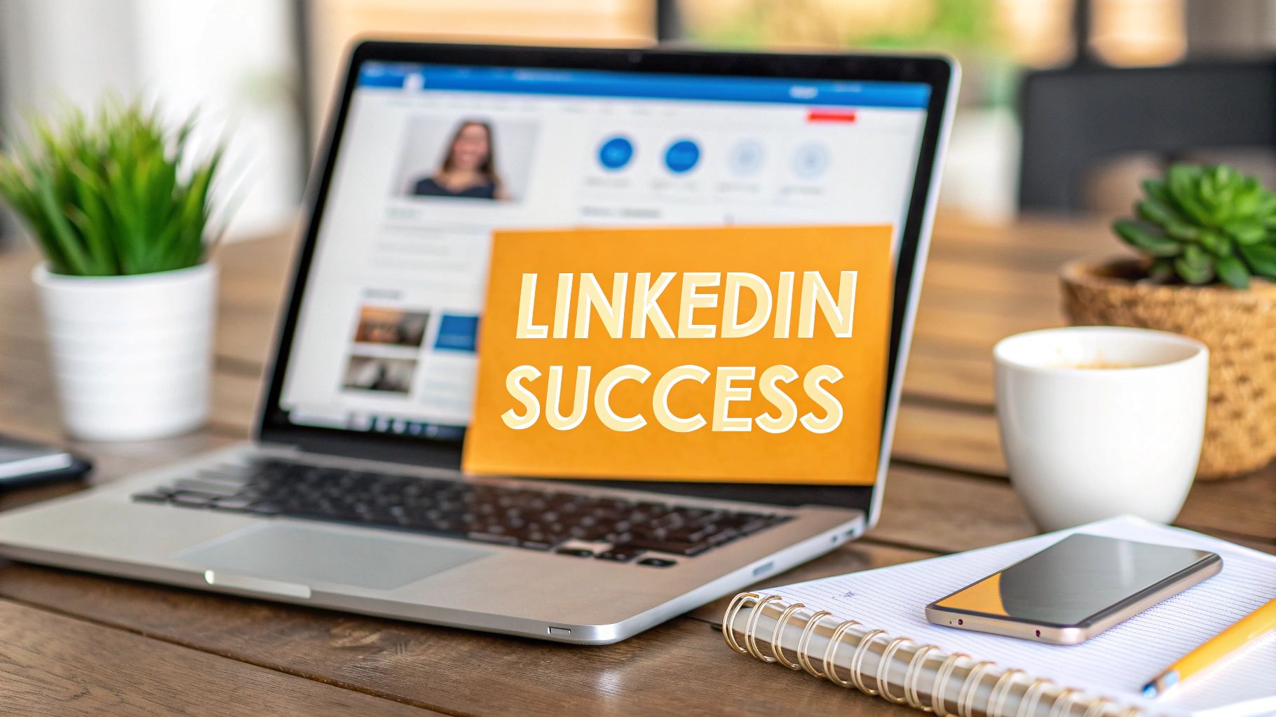
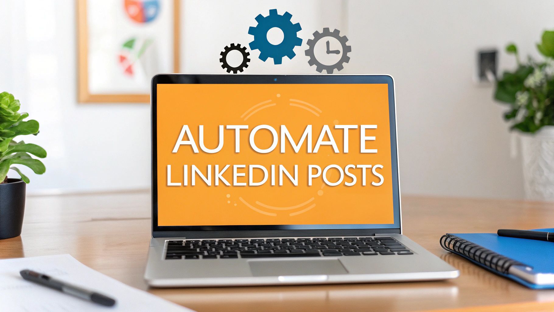
Tired of your images getting awkwardly cropped on LinkedIn? Let’s put an end to the guesswork. When you’re sharing a standard image post, you'll want to aim for 1200 x 627 pixels. That’s a 1.91:1 aspect ratio, which works beautifully on desktop.
However, square images (1080 x 1080 pixels) often perform even better, especially since so many people are scrolling on their phones. Nailing these dimensions from the start is a simple way to make your content look polished and professional.
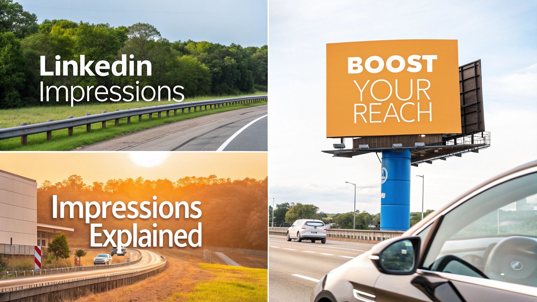
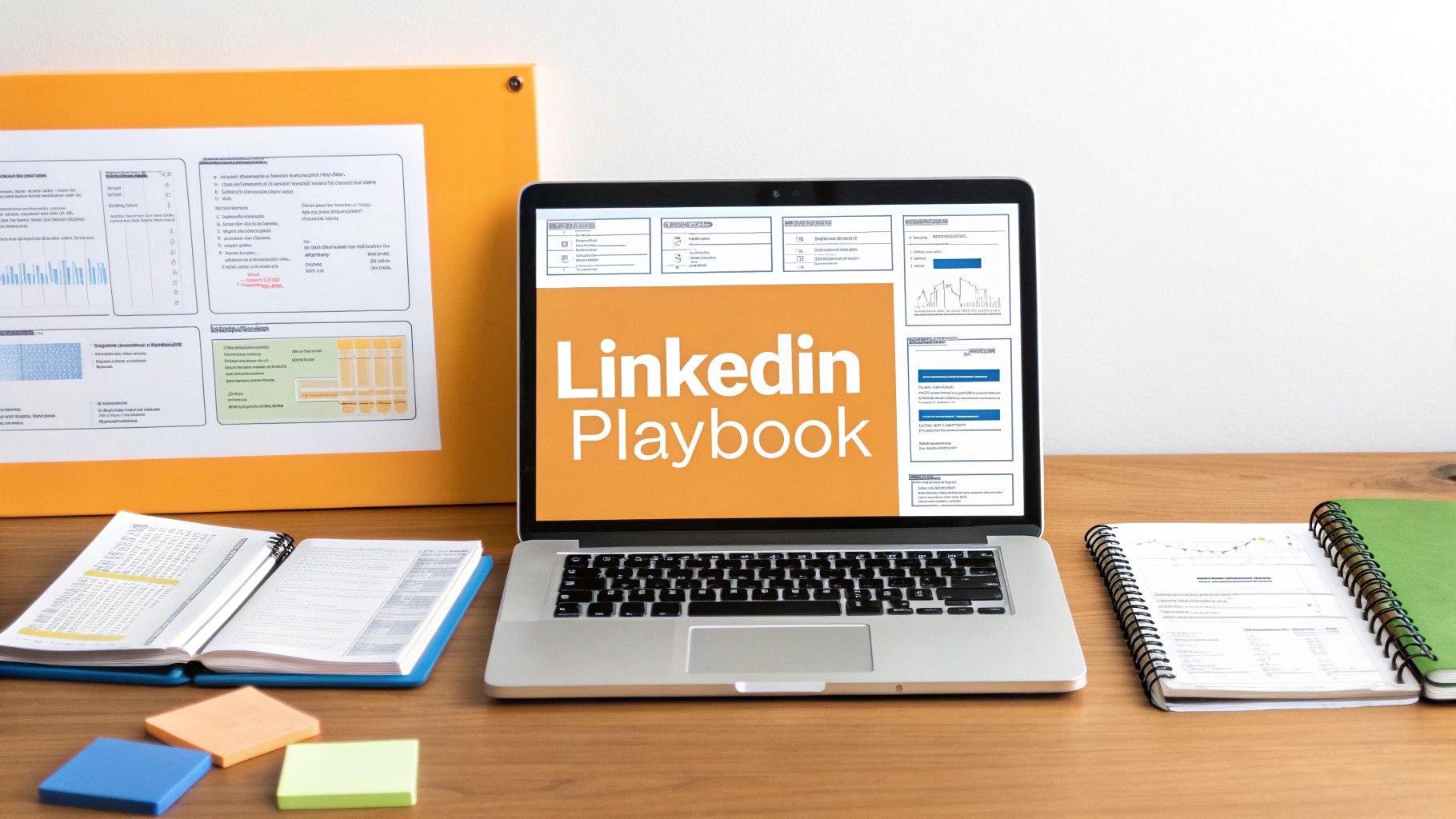
Your Quick Reference Guide to Every LinkedIn Post Size
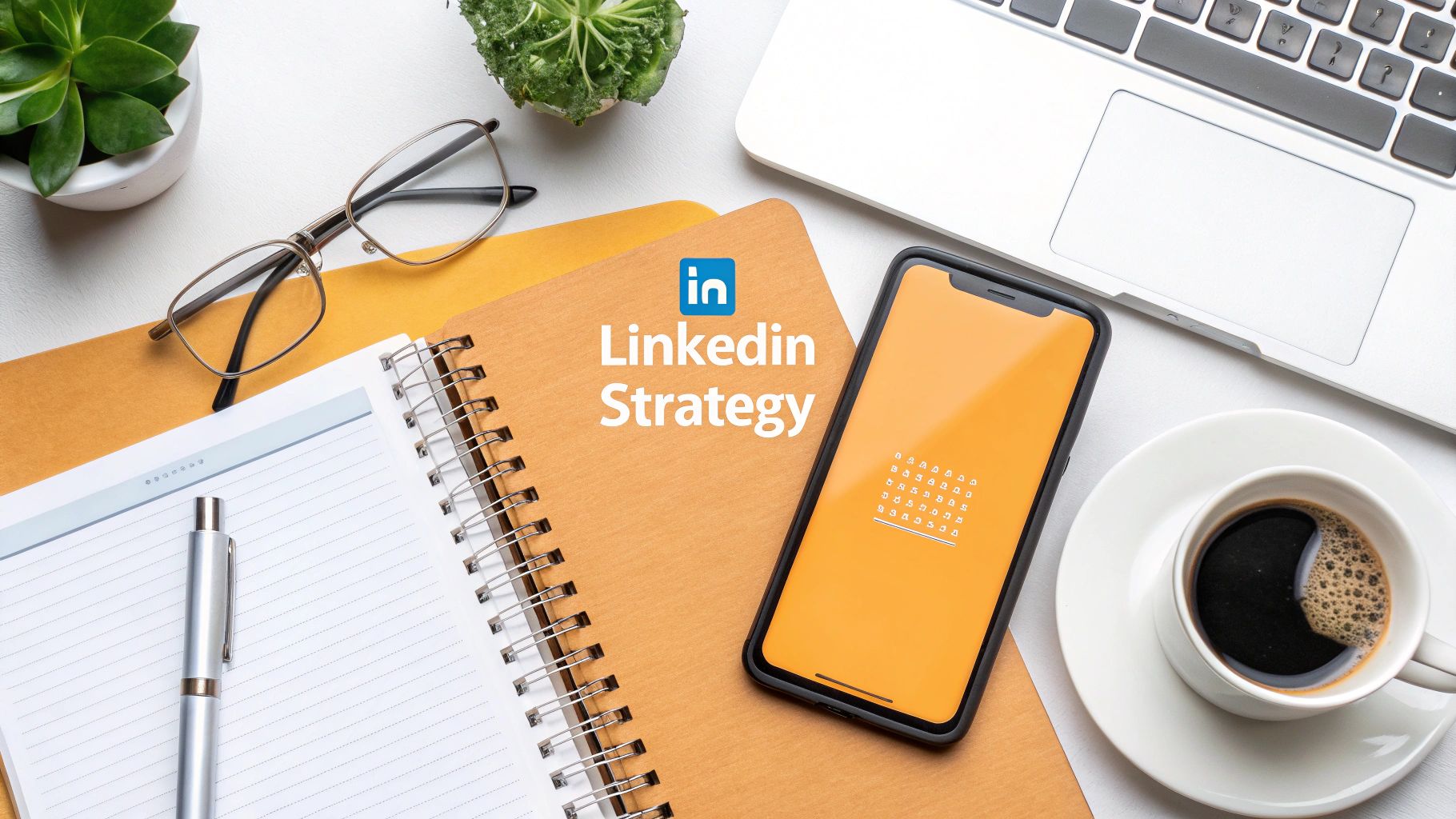
Figuring out the right dimensions for all your LinkedIn visuals can feel like trying to hit a moving target. The platform has a whole range of content types, from your profile picture to company page banners and video ads, and each one comes with its own specific requirements.
If you use the wrong size, you risk blurry photos, weird cropping, or your key message getting cut off—none of which helps your brand. This guide is your new go-to cheat sheet. Forget sifting through old, unreliable blog posts; we've gathered all the latest pixel sizes, aspect ratios, and file limits right here.
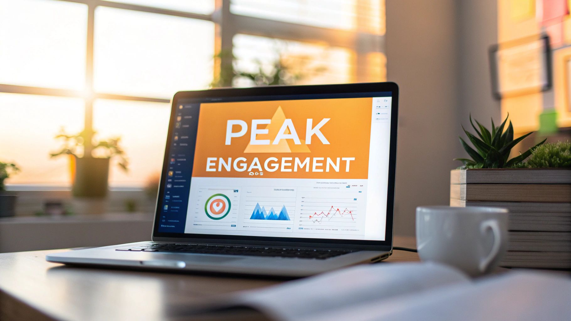
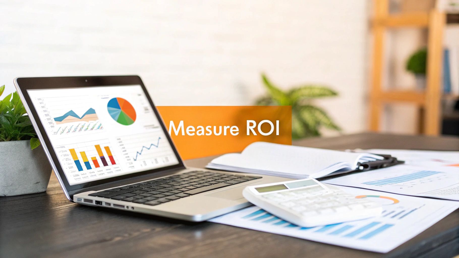
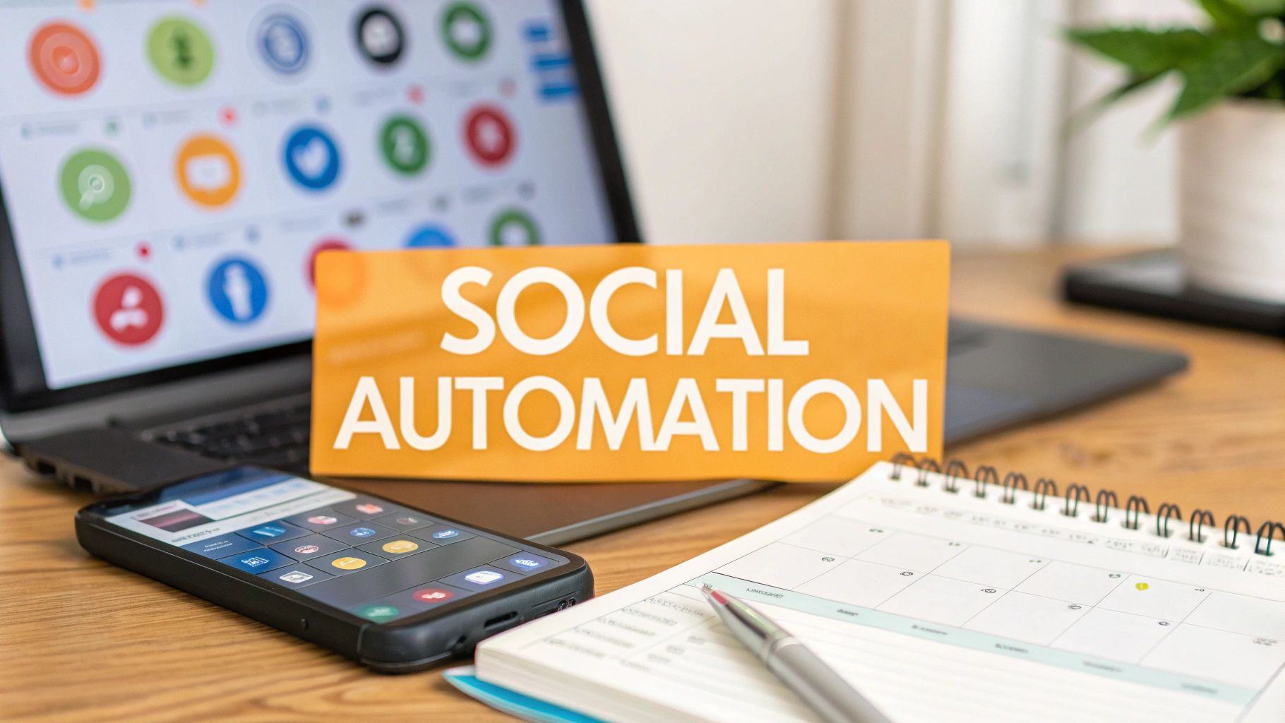
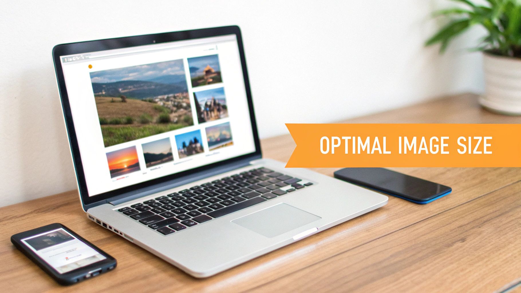
Key Visuals at a Glance
For a quick look at the most common assets, this infographic breaks down the essential sizes for your profile picture, cover photo, and a standard image post.
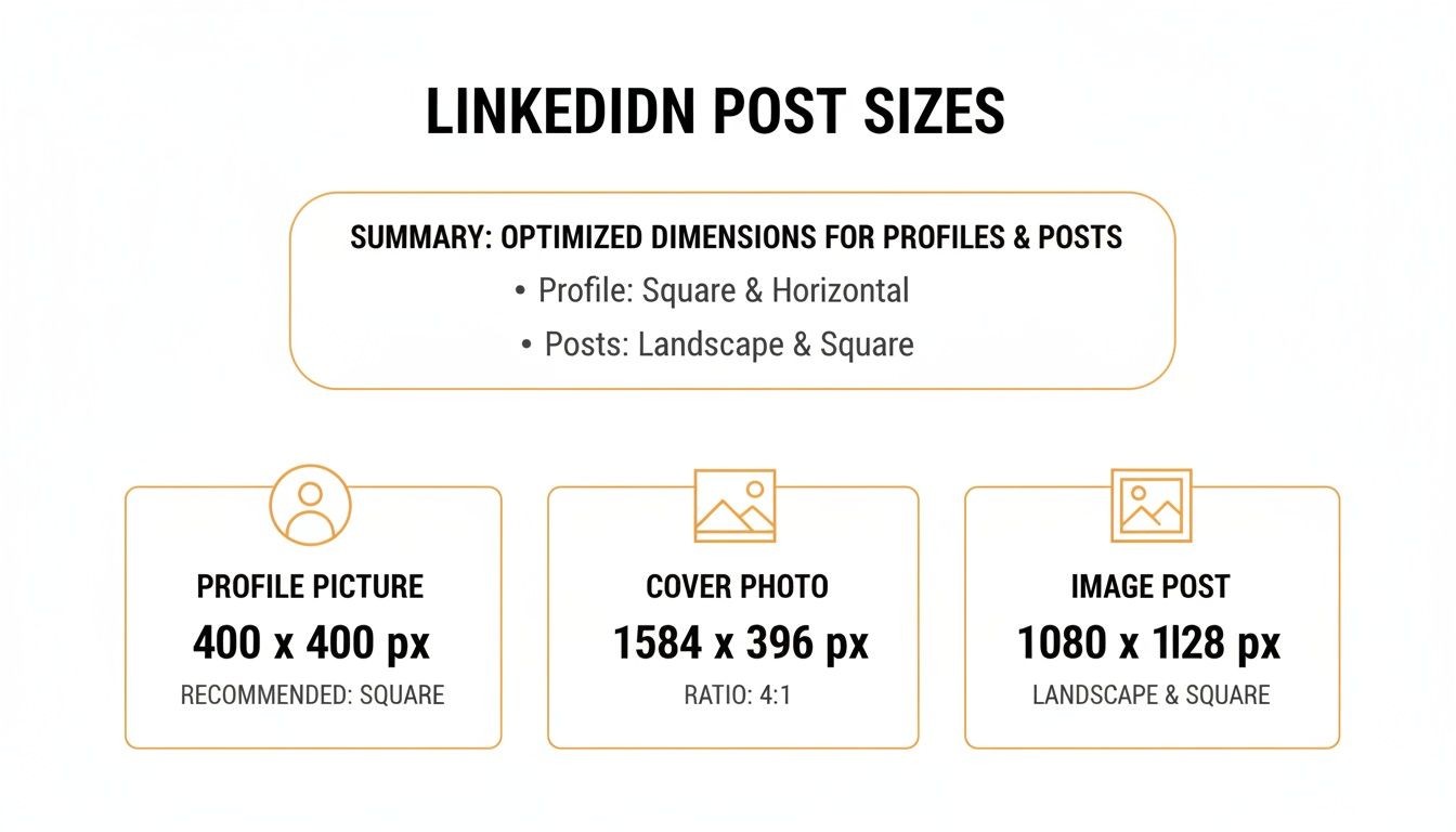
As you can see, each piece of the puzzle—from the perfectly square profile photo to that wide, panoramic cover image—is designed for a different purpose.
To make things even easier, I've put together a handy table that summarizes the specs for pretty much everything you'll need. Bookmark this page and use it as your quick reference to get every visual looking just right.
LinkedIn Image and Video Size Quick Reference Chart
| Asset Type | Recommended Pixel Dimensions (WxH) | Supported Aspect Ratio | Max File Size |
|---|---|---|---|
| Profile Picture | 400 x 400 pixels | 1:1 | 8 MB |
| Personal Cover Photo | 1584 x 396 pixels | 4:1 | 8 MB |
| Company Logo | 400 x 400 pixels | 1:1 | 4 MB |
| Company Cover Photo | 1128 x 191 pixels | 5.9:1 | 4 MB |
| Image Post (Square) | 1080 x 1080 pixels | 1:1 | 5 MB |
| Image Post (Vertical) | 1080 x 1350 pixels | 4:5 | 5 MB |
| Shared Link Image | 1200 x 628 pixels | 1.91:1 | 5 MB |
| Native Video | 256x144 to 4096x2304 | 1:1, 4:5, 16:9, 9:16 | 200 MB |
| Carousel/Document Post | 1080 x 1080 pixels (Square) | 1:1 | 100 MB (10MB per image) |
This chart is your shortcut to making sure every visual you upload is optimized for maximum clarity and impact, every single time.
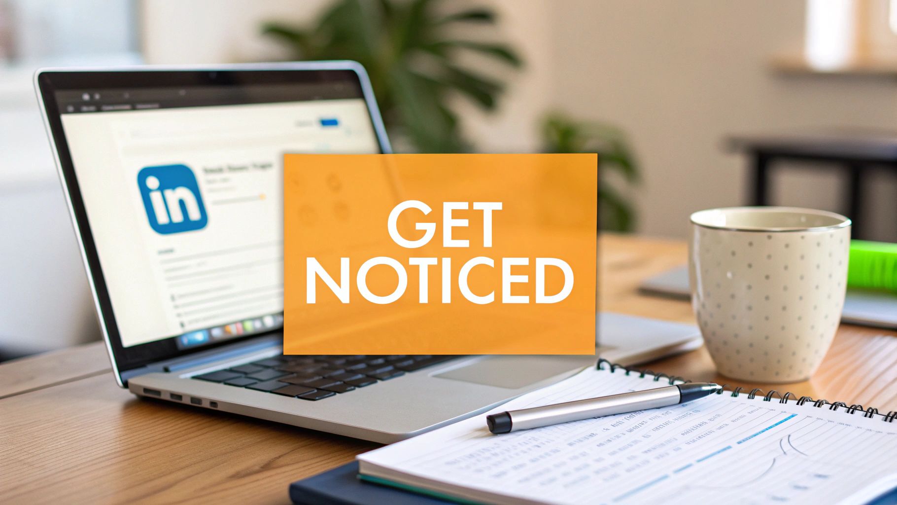
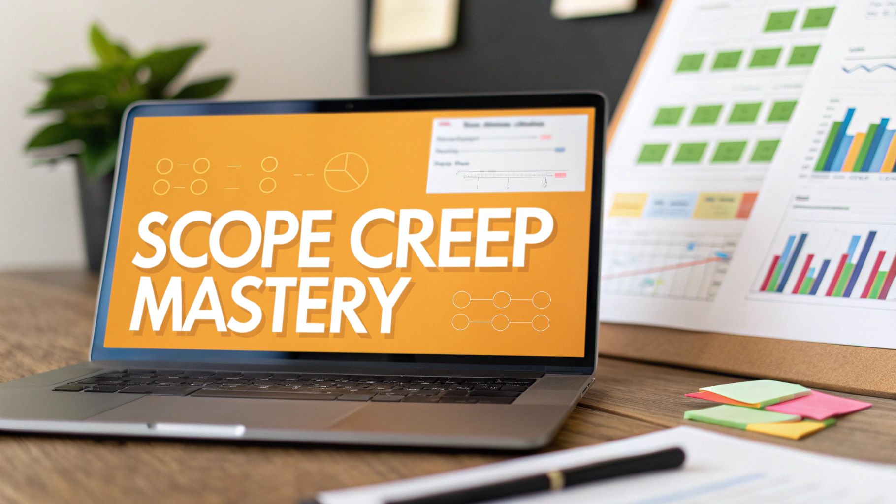
Getting Your LinkedIn Image Post Dimensions Just Right
When you're posting an image on LinkedIn, the whole point is to make people stop scrolling and pay attention. You can slap up any old landscape photo, sure, but that's not the best way to use the screen space—especially since most people are scrolling on their phones.
This is where knowing the right dimensions gives you a real leg up. Nailing the size means your pictures look sharp and professional, not awkwardly cropped or fuzzy.
Why You Should Go Vertical
If you're posting a single image, vertical is the way to go. Trust me on this. An image with a 4:5 aspect ratio, specifically 1080 x 1350 pixels, takes up a ton more room on a mobile screen.
That extra height pushes other posts down and out of sight, forcing the user to linger on your content just a little longer. A standard square post (1080 x 1080 pixels) is still a solid, safe choice, but that 4:5 ratio really helps you stand out in a busy feed.
Pro Tip: I always tell people to think of the LinkedIn feed as a vertical canvas. The taller your image, the more of that canvas you fill. It makes your message bigger, bolder, and a lot harder to just scroll past.
Nailing Multi-Image and Link Posts
Collages are another great tool in your toolbox for telling a story or showing off different parts of a project. LinkedIn will automatically arrange multiple images into a grid, but the layout can get weird depending on how many you upload and whether they're horizontal or vertical. For a clean, predictable look every time, stick with all square images (1:1 ratio).
Don't forget about the thumbnails for links you share. When you drop a URL into a post, LinkedIn grabs a preview image. You should always customize this to keep your branding on point. The perfect size for a shared link image is 1200 x 628 pixels, which is a 1.91:1 ratio. To really dig into how these different formats can improve your reach, you can learn more about image size for LinkedIn post strategies in our deep-dive article.
Staying in the Safe Zone
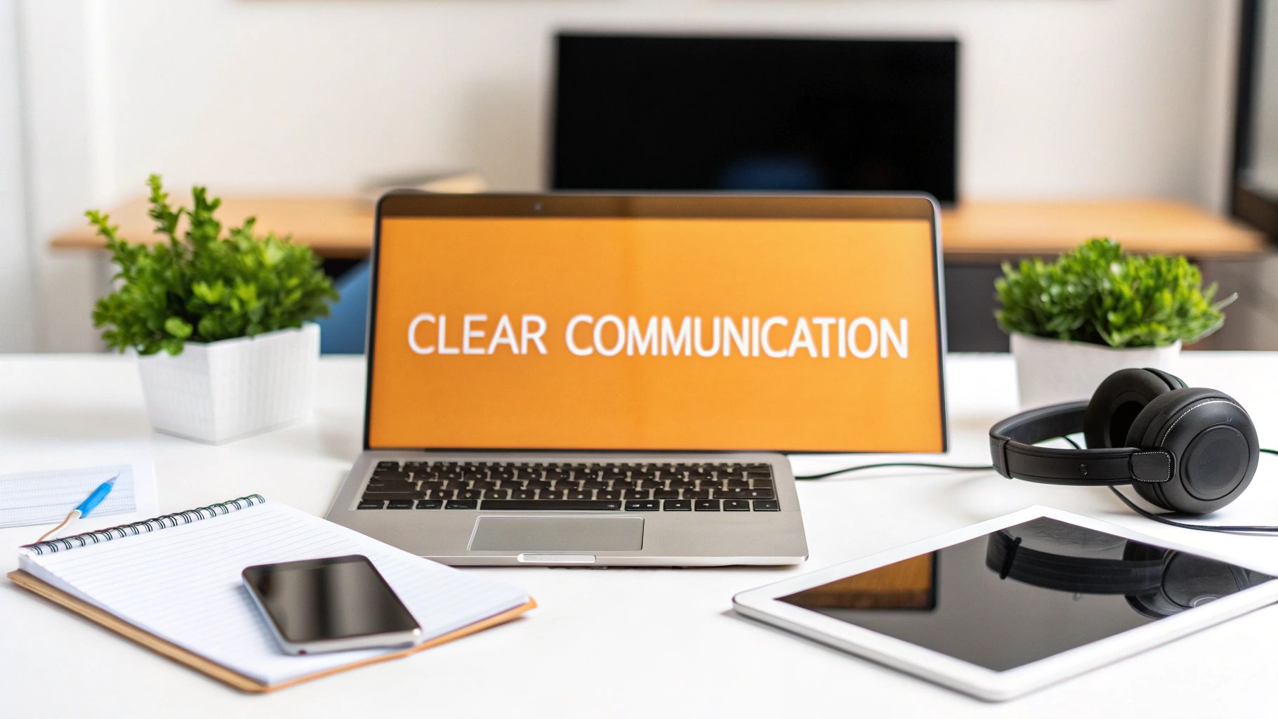
No matter what dimensions you're working with, you've got to be mindful of the "safe zones." This is simply the middle part of your image where all the important stuff—like text, your logo, or the main subject—needs to live.
Why is this so important? Because LinkedIn's own interface elements and the huge variety of screen sizes out there can end up cropping the edges of your image. Keeping your key content away from the very top, bottom, and sides ensures your message gets across loud and clear. It’s a bit like knowing the best export settings for Instagram to keep your photos looking crisp; each platform has its own quirks. By planning for these safe zones, you'll look polished and professional on any device.
Nailing Your Profile and Company Page Images
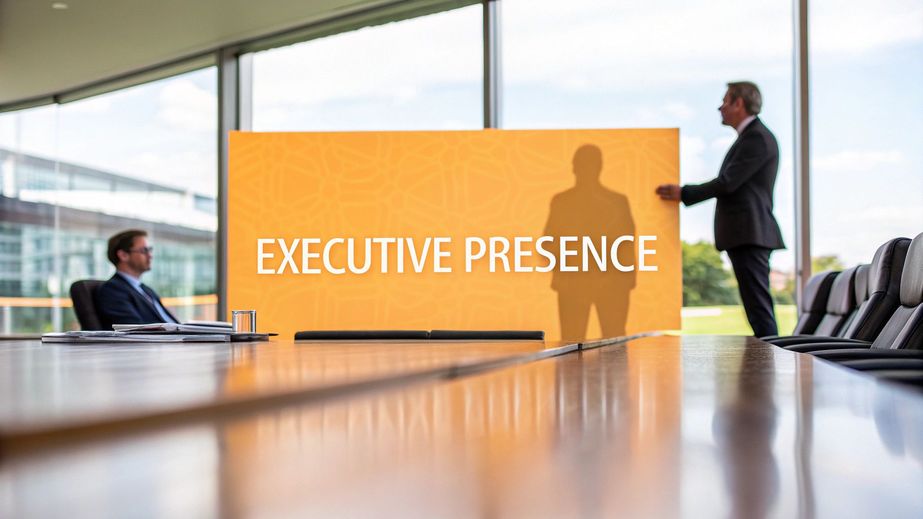
Think of your LinkedIn profile and company page as your digital storefront. It's often the very first impression you make, and you know what they say about those. A fuzzy logo or an awkwardly cropped cover photo can instantly kill your credibility before anyone even bothers to read a single word. Getting these foundational images right isn't just a "nice to have"—it's an absolute must for building a professional brand.
This goes way beyond just looking good. It’s about building trust from the get-go. When your visuals are crisp, well-composed, and sized correctly, you're sending a clear signal: you pay attention to detail. It tells people you care about how your brand is perceived, which subtly suggests you'll bring that same care to your business.
Let's dive into the nitty-gritty specs for each of these core assets. Sticking to these guidelines will guarantee your page looks sharp and professional, no matter what device someone is using.
Personal Profile Picture and Cover Photo
Your personal profile is where you make those crucial one-on-one connections, so your images really need to set the right tone. These two visuals are a team, working together to create a quick, compelling snapshot of who you are.
- Profile Picture: The sweet spot is 400 x 400 pixels. Make sure you use a high-quality headshot where your face is easily recognizable. After all, this little circle is your avatar across the entire platform, showing up next to every comment, post, and connection request you make.
- Cover Photo (Background Banner): You'll want to aim for 1584 x 396 pixels. This wide banner is basically your personal billboard. It's the perfect place to show off your value proposition, highlight your area of expertise, or just add a bit of personality that backs up the rest of your profile.
One of the most common blunders people make is forgetting how the profile picture cuts into the cover photo. On a desktop, your photo sits on the left side, but on the mobile app, it’s smack in the center. This creates a tricky "safe zone" you have to design around.
Key Takeaway: Play it safe. Always stick your most important info—like text, logos, or contact details—in the upper-right area of your cover photo. This is the only spot that's guaranteed to be visible and clear, whether someone is on their laptop or their phone.
Company Page Logo and Cover Image
When it comes to a business, brand consistency is the name of the game. Your company page images are the foundation of your professional presence and need to be instantly recognizable.
- Company Logo: The recommended size here is 400 x 400 pixels, with a minimum of 268 x 268. This square logo is your brand’s primary identifier across LinkedIn, popping up in search results and next to every single post your page shares.
- Company Cover Image: The dimensions for this one are 1128 x 191 pixels. It's a lot narrower than a personal banner, but it's still prime real estate for a brand tagline, a shot of your product in action, or imagery that captures your company culture.
It helps to think of your company logo as the digital handshake and the cover image as the welcome mat to your office. One establishes who you are, and the other invites people in and gives them a feel for what you're all about. By getting these sizes right, you ensure your brand's first impression is always a powerful one.
A Guide to LinkedIn Native Video Specs
Video is an absolute monster for driving engagement on LinkedIn, but only if you get the technical stuff right. Uploading your video natively—meaning directly to LinkedIn instead of just dropping a YouTube link—almost always gets you better reach and more views. To make sure your hard work pays off, you need to know the rules of the road for resolution, aspect ratio, and file size.
Following these guidelines is the difference between a video that looks sharp and professional versus one that's a pixelated mess with weird black bars. Nobody wants that. LinkedIn is surprisingly flexible, supporting resolutions from a tiny 256x144 pixels all the way up to a massive 4096x2304 pixels. This wide range means you can upload high-quality footage without worrying about it getting butchered by compression.

Picking the Right Aspect Ratio
The aspect ratio you choose is probably the single most important decision for your video's success. It literally determines how much real estate you occupy on someone’s screen.
- Square (1:1): This is my go-to for mobile. It strikes the perfect balance, taking up a ton of vertical space in the feed without forcing people to rotate their phones.
- Vertical (4:5 or 9:16): If you want to dominate the mobile screen, go vertical. A 4:5 ratio is a solid choice, but a full 9:16 (think Instagram Stories) is an absolute showstopper. It’s impossible to ignore.
- Landscape (16:9): The classic widescreen format is really best for desktop viewing. It works on mobile, sure, but it looks tiny compared to square and vertical videos, making it easy to scroll right past.
Bottom line: If you want to grab attention where it matters most, create your videos in a square or vertical format.
The Nitty-Gritty Technical Limits
Before you smash that "post" button, there are a few hard limits you've got to keep in mind. LinkedIn puts these in place to keep the platform running smoothly for everyone.
Your video file size needs to land somewhere between 75 KB and 200 MB. As for length, it must be at least three seconds long and can be a maximum of ten minutes. That’s a pretty generous window, giving you room for everything from quick-hit tips to deeper, more explanatory content. For some more advanced tactics, check out our full guide on how to post a video on LinkedIn.
Crucial Tip: A huge number of people watch LinkedIn videos with the sound off. Always burn your captions directly onto the video or upload an SRT file. A video without captions is a wasted opportunity—most people will just keep scrolling.
Of course, the video is just one piece of the puzzle. You also need a killer caption to go with it. Fun fact: LinkedIn bumped up its post character limit from 1,300 to a massive 3,000 characters back in 2023. This gives you so much more room to tell a story, add context, and really hook your audience. The first 210 characters are pure gold since that's what shows up before the "See more" cut-off. Nail that opening, and your engagement will thank you. You can learn more about the evolution of LinkedIn's character limits on gopostflow.com. When you combine a perfectly optimized video with a compelling caption, you’ve created a post that’s almost impossible to ignore.
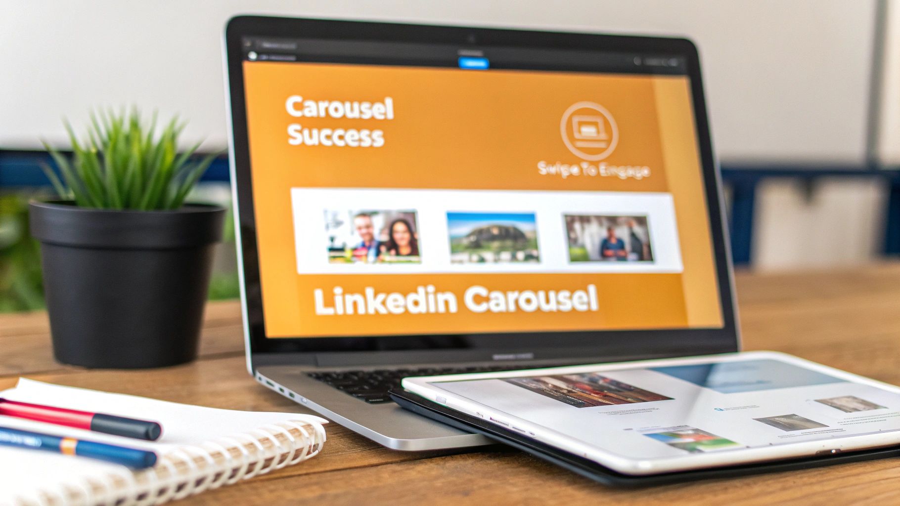
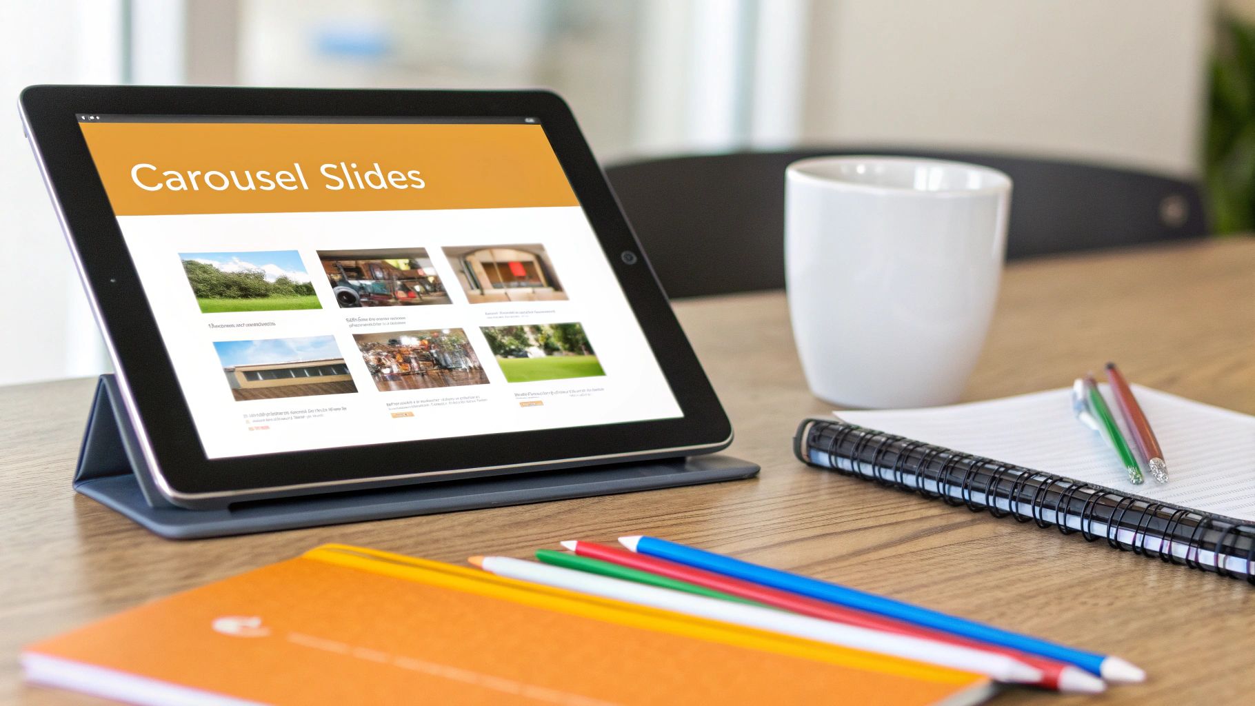
Nailing Your LinkedIn Carousel and Document Posts
If you're not using carousel posts on LinkedIn yet, you're missing out. You might hear them called "document posts," but they're the same thing: a PDF or PowerPoint you upload that LinkedIn turns into a slick, swipeable presentation right in the feed. This format is a game-changer for walking people through complex ideas, sharing tutorials, or even showing off portfolio work.
What makes carousels so effective? They get people to stop scrolling and start swiping. Every swipe keeps a user hooked on your content for longer, which the LinkedIn algorithm absolutely loves. That extra "dwell time" can give your post's reach a serious boost compared to just a single image.
Recommended Carousel Post Dimensions
To get that polished, professional look, you need to get your slide dimensions right from the start. Nobody wants their hard work getting awkwardly cropped. There are two go-to sizes that work perfectly for carousels.
- Square (1:1 Ratio): Your safest bet is 1080 x 1080 pixels. It’s the most common size for a reason—it looks fantastic on both desktop and mobile, so you know everyone's getting a great experience.
- Vertical (4:5 Ratio): If you want to really own the mobile feed, go with 1080 x 1350 pixels. This taller format takes up more screen real estate, making your post impossible to ignore.
Just a heads-up: pick one size and stick with it for every single slide. If you mix and match dimensions, LinkedIn will slap ugly black bars around the smaller slides, and it just looks messy.
Technical File Specifications
Before you dive into designing, make sure you know LinkedIn's rules for document uploads. Keeping these specs in mind will save you from annoying upload errors later.
- Supported File Types: PDF, PPT, PPTX, DOC, DOCX
- Maximum File Size: 100 MB
- Maximum Page Count: 300 pages
Now, just because you can upload 300 pages doesn't mean you should. I've found the sweet spot for keeping people engaged is usually somewhere between 5 and 15 slides. That's enough room to tell a good story without your audience getting swipe fatigue.
Expert Tip: Your first slide is everything. It needs a strong hook—a killer headline or an eye-catching graphic—that makes people need to see what's next. And don't forget the last slide! Always end with a clear call-to-action that tells your reader what to do next.
Getting these dimensions and technical details right is half the battle. If you want to get into more advanced strategies, check out our complete guide on how to post a carousel on LinkedIn. It's an incredible format for packing a ton of value into a bite-sized package that really performs.
Nailing Your LinkedIn Ad Creative Sizes
Running ads on LinkedIn is a whole different ballgame compared to your everyday organic posts. To really get your money’s worth, you have to play by a specific set of creative rules. Every ad format has its own quirks, and getting the LinkedIn post size for your ads just right is the absolute first step to grabbing attention and, more importantly, getting those conversions.
Think about it: an ad that’s perfectly sized just looks more professional. It builds trust instantly and stops people from scrolling right past it. You wouldn't show up to a big meeting in a wrinkled suit, right? The same logic applies here. Let's dig into the main ad formats so you can build creatives that actually work, every single time.
Single Image Ad Specifications
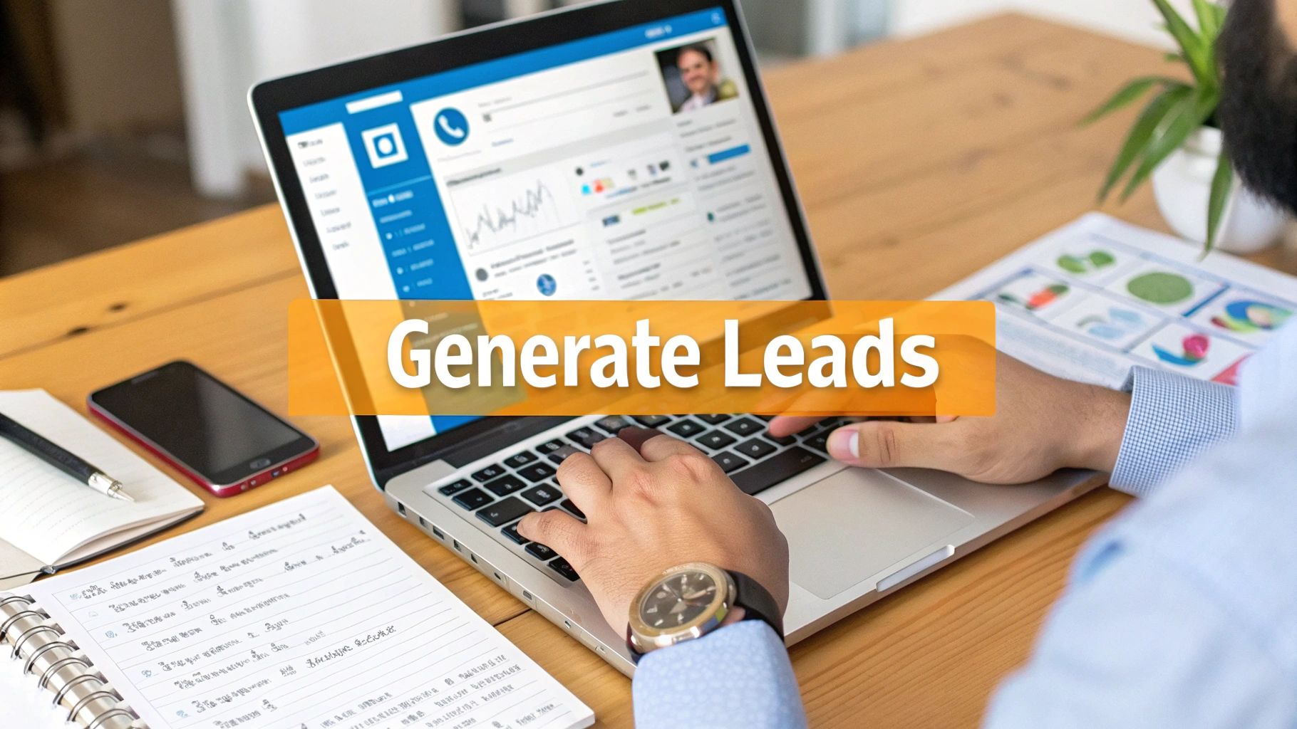
The classic single image ad is a staple for a reason—it’s simple, direct, and gets the job done when you need to drive traffic or generate leads. To make sure your image looks crisp and doesn't get awkwardly cropped, you'll want to stick to the recommended dimensions.
- Recommended Dimensions: 1200 x 627 pixels is the gold standard. This gives you a clean 1.91:1 aspect ratio.
- File Type: You can use JPG, PNG, or even GIF files.
- Maximum File Size: Make sure your image is under 5 MB to avoid any upload headaches.
This format is perfect when you have one strong visual, like showcasing a product, announcing a webinar, or promoting a new blog post. The real magic happens when you pair a killer image with ad copy that stops the scroll.
Carousel Ad Guidelines
Carousel ads are brilliant for telling a story or showing off multiple products or features in one neat, interactive package. They naturally pull people in, encouraging them to swipe through each card to see what's next.
For carousels, consistency is everything. Each card in the series needs to have the same dimensions to create a smooth, uninterrupted flow for the user.
- Recommended Dimensions: The sweet spot is 1080 x 1080 pixels. This gives you that perfect 1:1 square ratio for every single card.
- Number of Cards: You can use anywhere from two to ten cards.
- Maximum File Size: The total size of all your images can't go over 10 MB.
If you're looking to really master your multi-image posts, understanding the differences between Reels and Carousels can offer some great insights. The core principles of visual storytelling often translate surprisingly well between platforms.
LinkedIn Video Ad Requirements
Video is an absolute powerhouse for cutting through the noise in a busy LinkedIn feed. Since videos often autoplay on mute, your visuals need to be compelling from the very first frame. LinkedIn is pretty flexible with video sizes, but some formats just plain work better than others.
Key Insight: Vertical video is king on mobile. A 4:5 or 9:16 aspect ratio takes up way more screen real estate, making your ad much harder to ignore as someone is scrolling.
Here are the technical specs you need to know:
- Supported Ratios: 16:9 (Landscape), 1:1 (Square), 4:5 (Vertical), and 9:16 (Vertical).
- File Size: Keep it between 75 KB and 200 MB.
- Duration: Your video can be as short as 3 seconds or as long as 10 minutes.
To give you a quick reference, here’s a breakdown of the most common ad formats and their must-know specs.
LinkedIn Ad Formats and Key Specifications
This table offers a quick comparison of the creative requirements for some of the most popular LinkedIn ad formats, making it easy to see what you need at a glance.
| Ad Format | Recommended Dimensions (WxH) | Supported Ratios | Max File Size | Key Use Case |
|---|---|---|---|---|
| Single Image Ad | 1200 x 627 pixels | 1.91:1 | 5 MB | Driving traffic, lead generation with a single strong visual. |
| Carousel Ad | 1080 x 1080 pixels | 1:1 | 10 MB (total) | Storytelling, showcasing multiple products or features. |
| Video Ad | Varies (e.g., 1080x1920) | 16:9, 1:1, 4:5, 9:16 | 200 MB | Brand awareness, product demos, dynamic storytelling. |
| Document Ad | N/A (PDF, DOCX, PPTX) | N/A | 100 MB | Sharing in-depth content like whitepapers or case studies. |
Choosing the right format and sticking to these specs ensures your ads not only look great but are also optimized to perform their best from the moment they go live.
Tools and Templates for Perfect LinkedIn Visuals
Nailing the perfect dimensions for every LinkedIn post doesn't have to be a headache. Thankfully, you don’t need to be a design guru to get the LinkedIn post size right every single time. Plenty of easy-to-use tools are out there to handle the technical side of things for you.
Tools like Canva are a lifesaver for most professionals. It's packed with a massive library of pre-sized LinkedIn templates for just about anything you can think of, from your profile's cover photo to those slick carousel slides. Just pick a design you like, drop in your own branding, and you're good to go—no guesswork needed.
Quick-Export Settings and Templates
If you're more comfortable working in programs like Adobe Photoshop or Illustrator, setting up your own templates is the smartest move you can make. It's a bit of work upfront, but you can build a whole library of files with the correct dimensions and safe zones already marked out.
Here are the essential templates you'll want to have on hand:
- Square Post: 1080 x 1080 pixels
- Vertical Post: 1080 x 1350 pixels
- Link Thumbnail: 1200 x 628 pixels
- Cover Photo: 1584 x 396 pixels (make sure to add your own safe zone guides!)
Having these presets ready to roll seriously speeds up your workflow. Think of it as your personal toolkit for keeping your brand looking consistently sharp and professional without wasting a ton of time.
Of course, a great image is only half the battle; the words you pair with it matter just as much. While we're focused on image specs here, don't forget that LinkedIn's character limits have changed, too. The 2023 update bumping posts to 3,000 characters gives you a lot more room for storytelling. Plus, studies show that headlines between 40-49 characters tend to get the most eyeballs. If you want to dive deeper into how post length affects engagement, you can discover more insights about ideal social media post lengths on Hootsuite's blog.
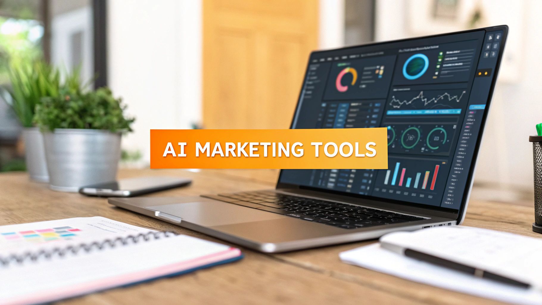
Pro Tip: If you're using RedactAI, our platform gives you a major shortcut. It automatically drafts posts that are already optimized for both the visual and text-based best practices. By analyzing over 300,000 real-world posts, it figures out what works in your specific niche, helping you write compelling content in a fraction of the time.
Frequently Asked Questions About LinkedIn Post Sizes
Even when you think you've got LinkedIn's image specs memorized, some weird, specific questions always seem to come up. Nailing the perfect LinkedIn post size can feel like a moving target, so I've put together this quick FAQ to give you straight answers to the most common headaches.
Think of this as your go-to guide for fixing fuzzy images, taming those unruly link previews, and making sure your content looks sharp every time.
What Is the Best Image Size for a LinkedIn Post?
Honestly, for grabbing the most attention, go with a vertical image at 1080 x 1350 pixels. That’s a 4:5 aspect ratio. It just takes up more space on the mobile feed, which forces people to slow their scroll and actually look at your post.
That said, you can never go wrong with a classic square at 1080 x 1080 pixels (1:1 ratio). It's a super reliable format that looks clean and professional on both desktop and mobile. While LinkedIn's old-school recommendation was 1200 x 627 pixels, these taller, mobile-friendly sizes almost always get better engagement.
Why Do My Images Look Blurry on LinkedIn?
This is a classic—and super frustrating—problem. Blurry images on LinkedIn usually boil down to one of two things: either the original image was low-quality, or LinkedIn’s compression algorithm just squashed it a little too hard.
Here’s how to avoid it:
- Start with a great image. You can't upscale a tiny, pixelated photo and expect it to look crisp. Quality in, quality out.
- Export at the right size. Make sure your final image is at least 1080 pixels wide.
- Try PNG instead of JPG. For graphics with sharp lines, text, or logos, a PNG file will often keep things looking much cleaner than a JPG.
- Keep an eye on the file size. LinkedIn gets aggressive with compression on big files. Stay under the 5MB limit to be safe.
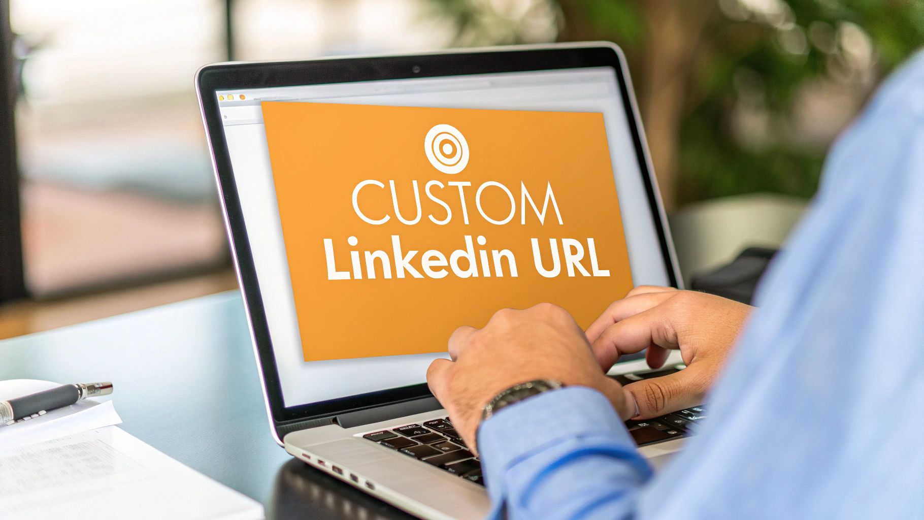
Can I Edit a Link Preview Image on LinkedIn?
Yes, and you absolutely should! When you paste a link into a new post, LinkedIn scrapes the page and pulls in a thumbnail image. Nine times out of ten, it’s not the one you want.
After the preview loads, just click the little "Image" icon that appears over the thumbnail. This lets you upload your own custom graphic. The best size for that is 1200 x 628 pixels. Taking a moment to do this makes your post look way more professional and on-brand, which can seriously boost your click-through rate.
Key Takeaway: Don't just accept the default link preview. A custom thumbnail is your chance to make a first impression and give people a real reason to click. Treat it like a tiny billboard for your content.
What Is the LinkedIn Cover Photo Safe Zone?
The "safe zone" is the part of your cover photo that won't get cut off or hidden behind your profile picture, no matter what device someone is using. This is a big deal because your profile photo moves around—it's on the bottom-left on desktop but smack in the center on mobile. The recommended size for a personal cover photo is 1584 x 396 pixels.
To be safe, keep all your important stuff—like your name, title, logo, or contact info—in the upper-center-right area of the banner. That’s the one spot that’s guaranteed to be visible everywhere, ensuring your main message always gets through.
Stop wasting time guessing your post dimensions and let AI handle the heavy lifting. RedactAI helps you generate perfectly crafted LinkedIn content—from viral hooks to compelling visuals—in just minutes. See how over 21,000 creators are building their brands faster by visiting the RedactAI website.