Tired of guessing which image size to use for your next LinkedIn post? Let's get it right, every time. For shared links, you'll want to aim for 1200 x 627 pixels. If you're posting a native image directly to the feed, a square 1080 x 1080 pixels format works best.
When it comes to video, LinkedIn gives you a generous 5GB maximum file size, while carousels have a cap of 100MB. Knowing these numbers is half the battle.
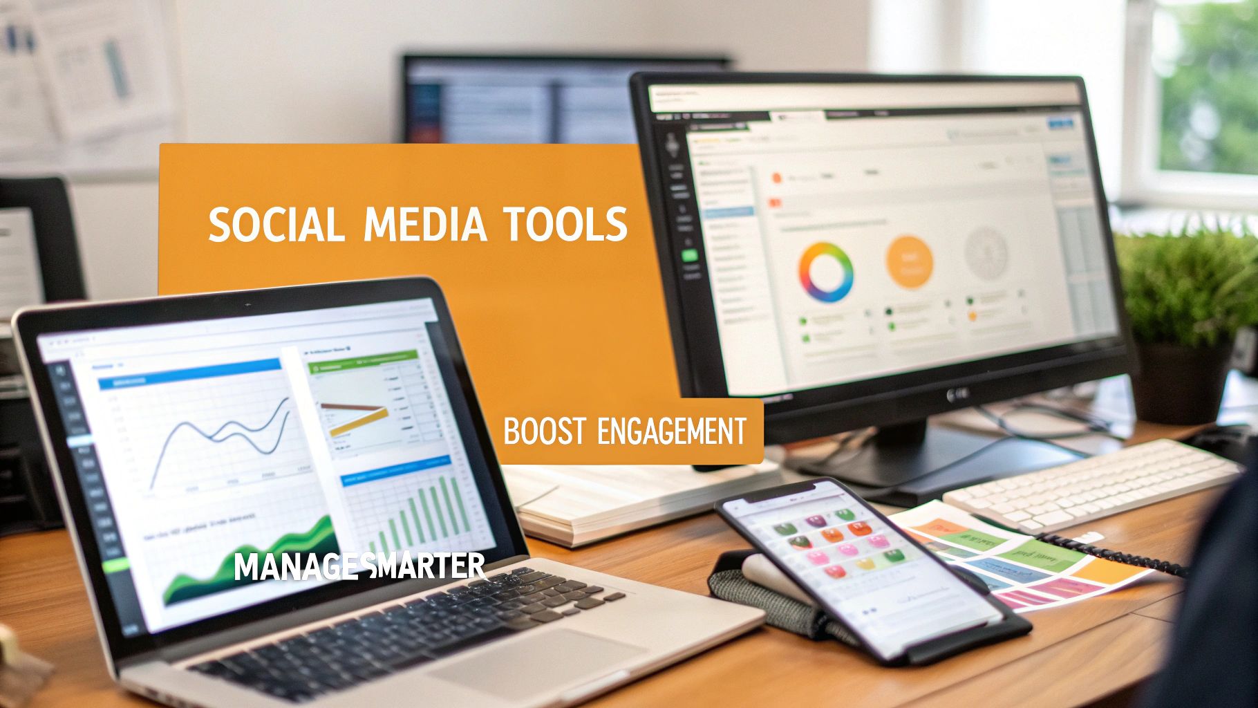
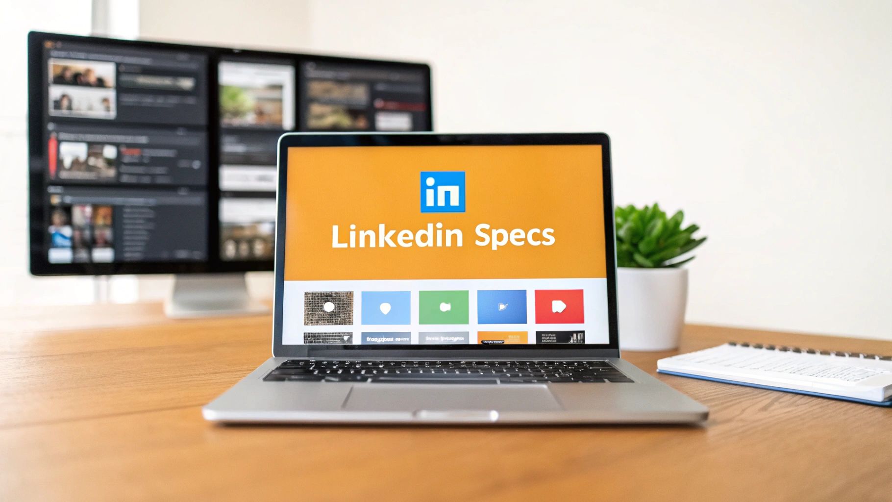
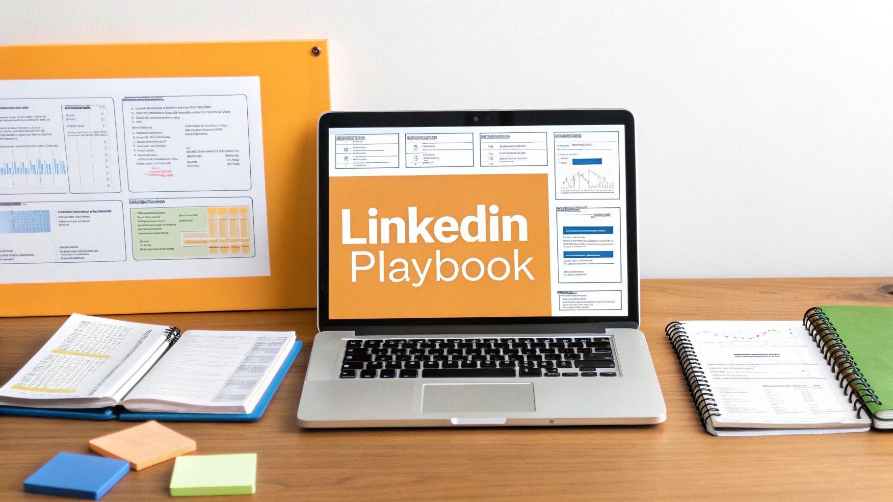
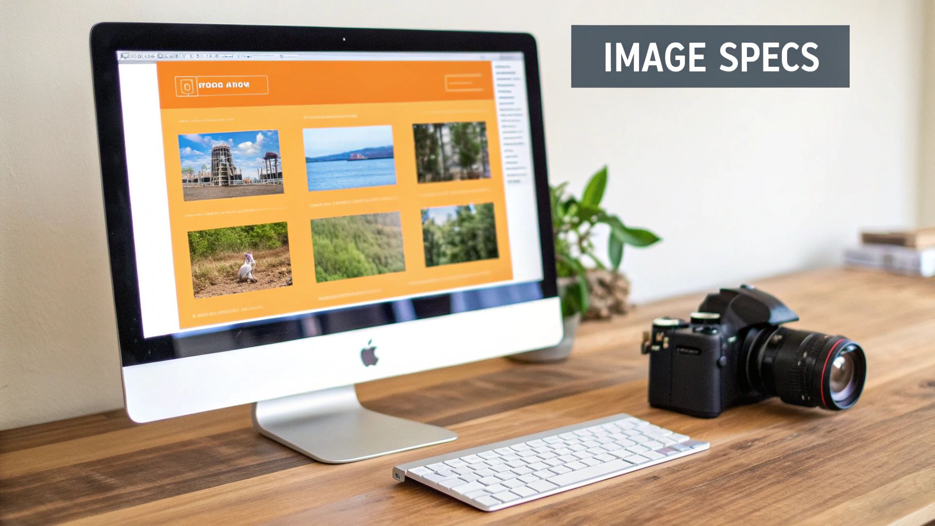
Your Quick Guide to LinkedIn Post Specs
Nothing tanks a great post faster than a poorly cropped image or a video that won't upload. Getting the technical specs right is the first step to making sure your content looks sharp, professional, and actually gets seen. Think of this as your pre-flight checklist before hitting "post."
Whether you're sharing a single image, a quick video, or a detailed carousel document, keeping these numbers handy will save you a ton of headaches. It's the small details that prevent those frustrating formatting errors that can kill your engagement.
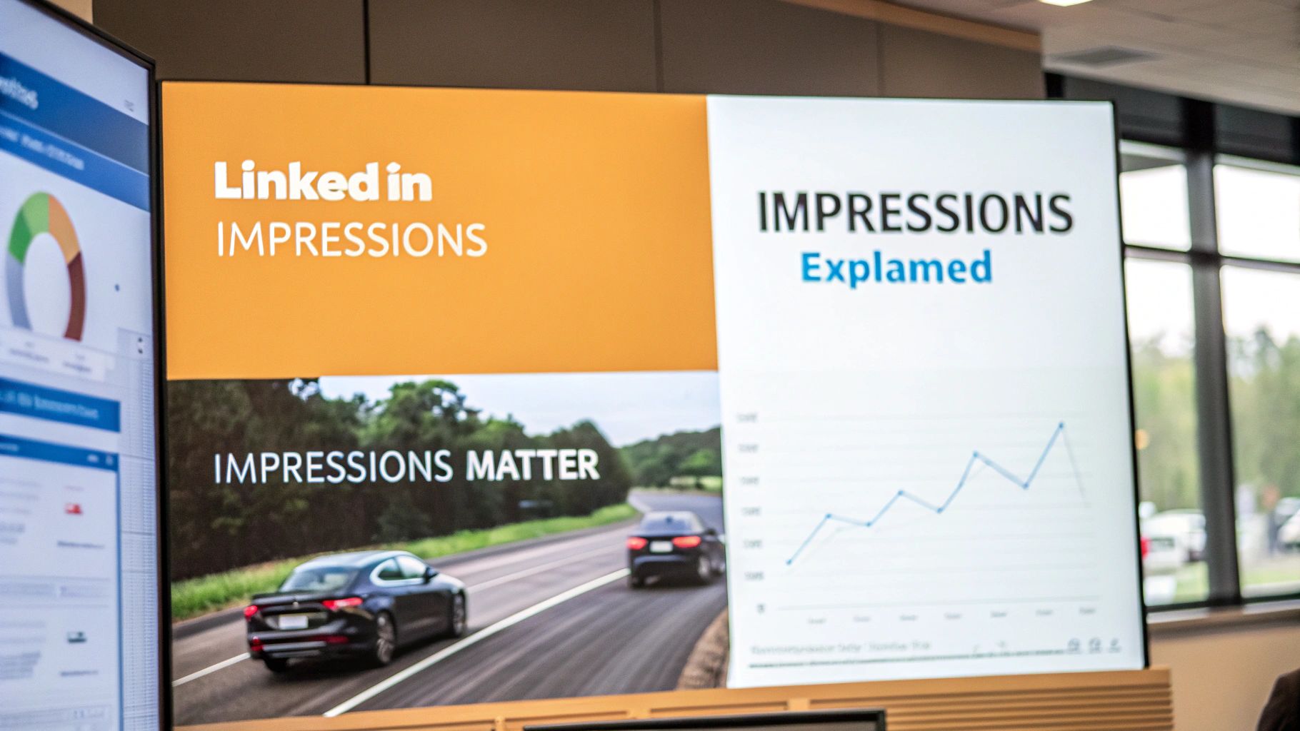
This quick visual breaks down the key formats so you can see exactly what you're working with.
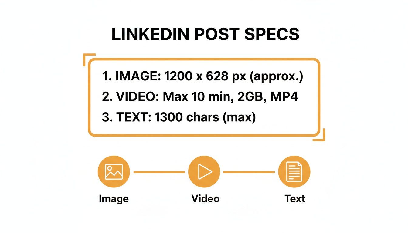
As you can see, images, videos, and text-only posts each have their own lane. Fitting these technical details into a bigger picture is what a modern B2B social media strategy is all about, helping you make the most of what the platform offers.
LinkedIn Post Specs At a Glance
For a quick summary, I've put together a simple table with the most common specs you'll need. This is your foundation for creating polished, high-performing content every single time.
| Post Type | Recommended Dimensions (Pixels) | Aspect Ratio | Max File Size / Length |
|---|---|---|---|
| Image (Shared Link) | 1200 x 627 | 1.91:1 | 5 MB |
| Image (Feed Post) | 1080 x 1080 or 1080 x 1350 | 1:1 or 4:5 | 5 MB |
| Video | 1920 x 1080 (or other standard) | 16:9, 1:1, 9:16 | 5 GB (10 min max) |
| Carousel (Document) | 1080 x 1080 (recommended) | 1:1 (recommended) | 100 MB (300 pages max) |
Keep this table bookmarked. It’s the kind of reference that’ll save you from having to search for the right numbers right before a big post goes live.
Getting Your LinkedIn Image Specs Just Right
Images are the lifeblood of a good LinkedIn feed. They're what stop the scroll and pull people into what you have to say. But if your images are poorly cropped or fuzzy, it just looks unprofessional and tanks your message. Getting the specs right is the first, most critical step.
For a regular, single-image post you upload directly, your go-to should be a square 1:1 aspect ratio. I always recommend 1200 x 1200 pixels because it looks fantastic and consistent on both desktop and mobile feeds.
But here’s where people get tripped up: sharing a link to an article or your website. LinkedIn pulls a preview image for those, and that requires a completely different shape. You'll need a landscape 1.91:1 aspect ratio, specifically 1200 x 627 pixels. Using this ensures nothing important gets lopped off the sides.
The Two Main Image Types: Single Post vs. Link Preview
It's super important to understand that LinkedIn treats an image you upload yourself very differently from one it scrapes from a URL you share. Nailing this distinction is key. Get it wrong, and you're left with blurry, awkwardly framed visuals that scream amateur.
Single Image Post: You've got the most control here. Stick to a 1:1 square ratio (like 1200 x 1200 px). It’s a solid choice because it takes up a nice chunk of screen space, especially on phones.
Shared Link Preview: This one is less flexible. It must be a 1.91:1 landscape ratio (like 1200 x 627 px). If your blog's featured image isn't this size, LinkedIn will try to crop it, and the results are rarely pretty.
Honestly, knowing these little details has become standard practice for anyone serious about getting seen on the platform. For example, while LinkedIn gives you recommendations, I've found from experience that carousel images do best when every slide is at least 1080 pixels wide. It helps fight back against the platform's aggressive compression. Following these rules isn't just about looking good; it tells the algorithm your content is high-quality. If you're curious about the data behind this, it's worth checking out some broader social media benchmark data to see how these small tweaks affect performance.
Pro Tip: My number one rule? Always upload images with a minimum width of 1200 pixels. LinkedIn’s compression algorithm is way kinder to higher-resolution source files. This simple step is your best defense against your images looking grainy or soft.
Getting Your LinkedIn Video Specs Just Right
Video is a powerhouse for engagement on LinkedIn, but if it's formatted incorrectly, it can stop scrollers in their tracks for all the wrong reasons. Let's make sure your video looks sharp and professional by nailing the core technical specs.
First off, your video file can be pretty hefty—up to 5GB, which gives you plenty of room to play with high-quality footage. The sweet spot for length is between 3 seconds and 10 minutes for any video you upload directly to the platform. While LinkedIn is flexible with file types, MP4 with AAC audio is your best bet for avoiding any playback headaches.
Essential Video Dimensions and Ratios
The shape and size of your video, or its aspect ratio, can make or break the viewing experience, especially on mobile. You’ve got a few great choices here, and the best one really depends on what you're trying to achieve.
- 16:9 (Landscape): This is your classic, widescreen format. It's perfect for professionally shot content and looks great on desktop. Aim for dimensions of 1920 x 1080 pixels.
- 1:1 (Square): A fantastic all-rounder that performs well in just about any feed, mobile or desktop. The ideal size here is 1080 x 1080 pixels.
- 9:16 (Vertical): This one is king for mobile-first video. It fills the entire phone screen, grabbing maximum attention. Go with 1080 x 1920 pixels.
Key Takeaway: Don't forget captions! A huge chunk of LinkedIn users watch videos with the sound off. Uploading an .SRT (SubRip Subtitle) file is a game-changer for accessibility and keeping people watching.
Getting these technical details right is a non-negotiable part of a solid content strategy. For a more in-depth look, our complete guide on how to post a video on LinkedIn walks you through the entire process. Sticking to these specs makes sure your hard work looks polished and professional, avoiding any frustrating upload errors or weird cropping.
Getting the Words Right: LinkedIn Text and Article Specs
When you're crafting a LinkedIn post, the words you choose matter just as much as the flashy visuals. The platform gives you a pretty generous 3,000-character limit for a standard post, but let's be real—you shouldn't always use every last one. Sometimes, a short, punchy message is exactly what you need to stop someone from scrolling.
The real trick is in the structure. You absolutely have to nail the first line; it's your hook. From there, think about making your post easy on the eyes. Use plenty of whitespace, add line breaks, and sprinkle in a few emojis to break up the text. Nobody wants to read a giant wall of words on their feed.
How Long Should Your Post Really Be?
While quick, snappy posts have their place, don't shy away from longer, more detailed content. It’s all about finding that sweet spot that gets people talking, because genuine interaction is what the LinkedIn algorithm loves to see.
Data shows a pretty clear pattern here. Even though you have a massive character count to play with, posts that land between 150 and 300 words (that’s about 900–1,800 characters) tend to get the most comments and hold a reader's attention longer.
My two cents: Stop focusing on the character count and start focusing on creating value. A thoughtful, 250-word post that sparks a real conversation is a thousand times better than a rambling 3,000-character monologue that gets crickets.
Posts vs. Articles: Knowing the Difference
It’s also super important to understand that a regular post is not the same as a LinkedIn Article. Think of Articles as full-blown blog posts living right on your profile. They have headlines, banner images, and are designed for much deeper, long-form content.
Mastering the LinkedIn post character limit is key for your day-to-day updates. But when you want to dive deep into a topic and really establish yourself as an expert, Articles are the way to go.
If you’re ready to explore that side of things, this guide on how to post an article on LinkedIn effectively is a fantastic resource. It's a different format with a different strategic purpose, allowing you to explore ideas with a level of detail a standard post just can't handle.
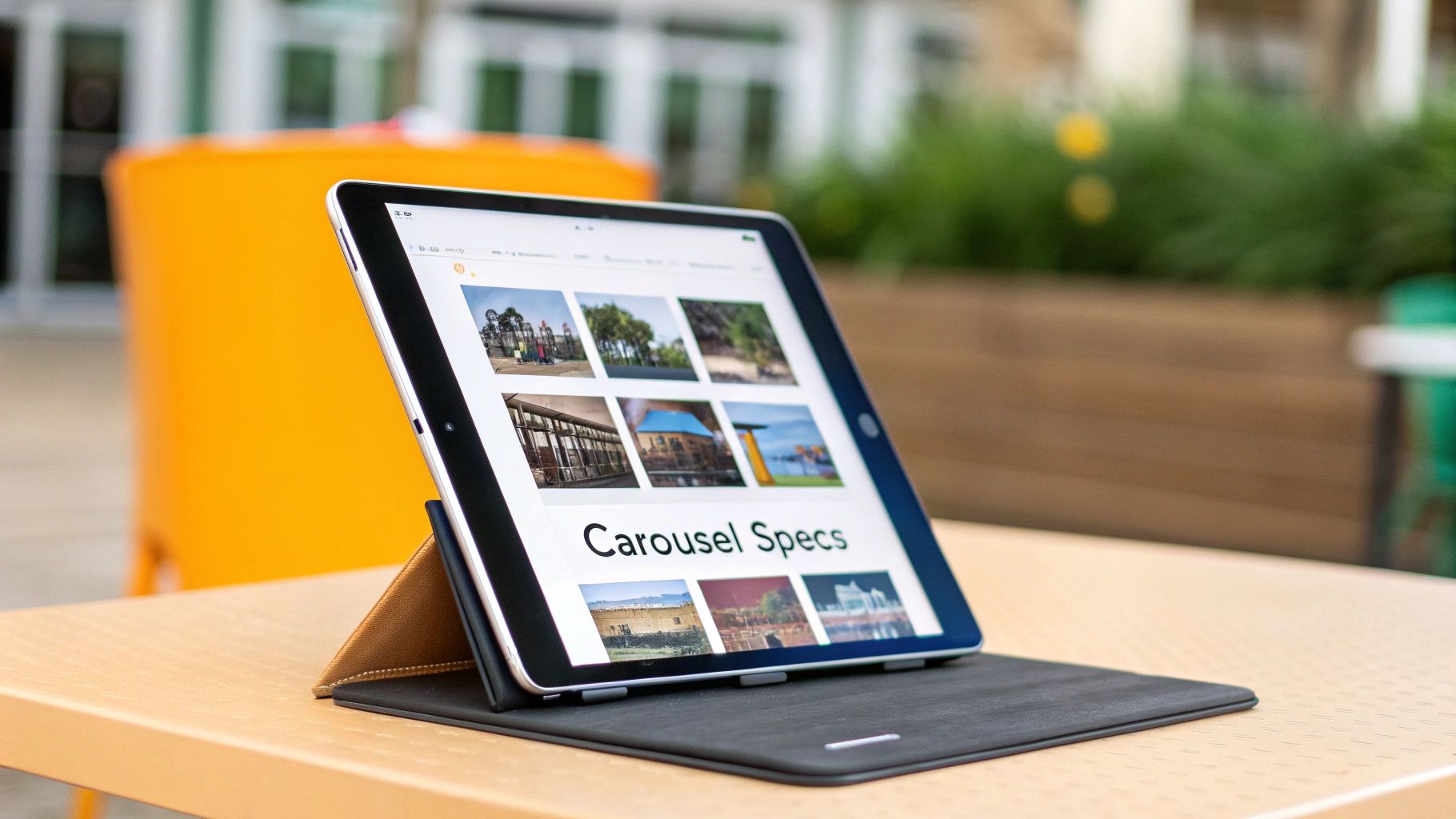
Your Guide to Carousel and Document Post Specs
Carousels, which you'll also hear called Document Posts, are hands-down one of the best ways to share deep knowledge and really build your authority on LinkedIn. They're a fantastic tool for turning a presentation or a detailed guide into a super engaging, swipeable format that makes people stop scrolling.
Before you dive in, you just need to get the basic technical rules down. LinkedIn is pretty good about accepting different file types, but your safest and most common options are PDF, PPT, and DOC.
The two main numbers to burn into your memory are the file size and the page count. You're working with a maximum file size of 100MB and a cap of 300 pages. Honestly, that’s a ton of space to work with, so you can pack in high-quality images and plenty of detail without worry.
Best Dimensions for Carousel Slides
Sure, you can just upload a standard presentation deck and call it a day, but if you really want your carousel to perform well, you need to think about the dimensions. The trick is to take up as much screen space as possible, especially on mobile, which is where most people will see your content.
Here are the two formats that work best:
- Square (1:1 Ratio): Go with 1080 x 1080 pixels. This is a solid, all-around choice that looks clean and professional on any device.
- Vertical (4:5 Ratio): Use 1080 x 1350 pixels. This is my personal favorite for a mobile-first approach because it fills up more of the vertical space in the feed, making it harder to ignore.
Remember, the specs are just the start. A great carousel tells a compelling story. You need a killer cover slide to grab attention, a clear narrative that flows from one slide to the next, and a strong call-to-action on that final page. For a more detailed walkthrough, check out our guide on how to post a carousel on LinkedIn.
Getting Your LinkedIn Ads Specs Right
If you're running paid campaigns on LinkedIn, getting the ad specs right isn't just a good idea—it's everything. These rules are way stricter than for organic posts. Mess them up, and you're looking at rejected ads and wasted money.
Think of this as your pre-flight checklist before you launch anything.
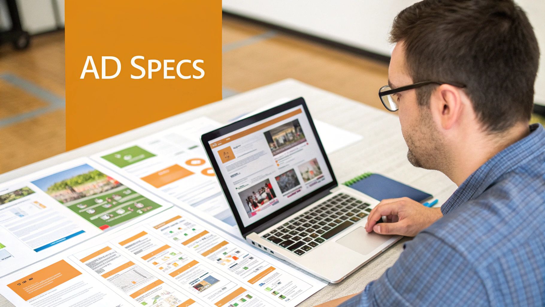
Knowing these numbers inside and out is the key to getting your ads approved fast and seeing a real return on your spend.
Key Ad Format Specifications
Every ad type plays by its own rules for images, video, and text. Nail these details, and your creative will look crisp and professional scrolling through the feed.
Single Image Ads: The classic go-to. You'll want a 1.91:1 aspect ratio, which translates to 1200 x 627 pixels. Try to keep your intro text under 150 characters—any longer and it will get cut off, especially on mobile.
Video Ads: You've got options here, but for mobile, stick to 1:1 (1080 x 1080 px) or 9:16 (1080 x 1920 px) for the best performance. Your video file needs to land somewhere between 75 KB and 200 MB.
Carousel Ads: These are great for telling a story or showing off multiple products. Each card in the carousel needs to be a perfect 1:1 square at 1080 x 1080 pixels. You can include anywhere from 2 to 10 cards, and each image file can be up to 10 MB.
Pro Tip: Watch your headline length like a hawk. While you technically have up to 200 characters for most ad headlines, the sweet spot is usually around 70 characters. Short and punchy almost always wins.
Got Questions? We've Got Answers
Even with all the right specs in hand, sometimes LinkedIn just doesn't cooperate. Let's walk through some of the most common headaches people run into and get them figured out once and for all.
One of the biggest culprits is blurry images. I see this all the time, and it almost always comes down to LinkedIn's aggressive image compression. To sidestep this, give it a high-quality JPG or PNG file that’s already sized perfectly—think 1080 x 1080 pixels. When you upload a sharp, correctly sized image from the start, you give LinkedIn’s algorithm less to mess with.
What Formats Work Best on Mobile?
On mobile, it's all about grabbing as much screen space as you can. You need a format that fills the feed and makes someone stop scrolling.
- Square (1:1): This is your trusty, all-purpose option. An image at 1080 x 1080 pixels looks fantastic on both desktop and mobile, so you never have to worry about awkward cropping.
- Vertical (4:5): For mobile, this is the undisputed champion. A 1080 x 1350 pixel image or video takes up significantly more of the screen, making your content that much more commanding.
A question I get asked constantly is, "Can I edit an image or video after I've posted it?" The short and slightly frustrating answer is no. Once your media is live, it’s locked in. You can edit the text that goes with it, but you can't swap out the file itself.
The only way around this is to delete the entire post and start over with the correct media. It’s a pain, for sure, but it beats leaving a glaring mistake on your profile.
Stop guessing and start creating high-impact content with RedactAI. Generate personalized, on-brand LinkedIn posts in minutes and never run out of ideas again. Try RedactAI for free and see the difference.