Alright, let's get one thing straight: LinkedIn's old "carousel" feature is a thing of the past. But the strategy? It's more alive and kicking than ever. The new game is all about uploading a multi-page PDF as a 'document post.' It’s a simple, brilliant workaround that gives you that same swipeable, slide-by-slide experience people love to engage with.
And trust me, the LinkedIn algorithm is a huge fan of this approach.
So, Why Are These Document Carousels Taking Over My Feed?

If you’ve been scrolling through LinkedIn lately, you’ve probably noticed more of these slick, swipeable presentations. There’s a good reason for that. When LinkedIn officially retired its native carousel feature in late 2023, the smart creators didn’t miss a beat. They immediately pivoted to the "document post" method to share tutorials, deep-dive insights, and compelling stories.
This wasn't just a clever hack; it turned out to be an even better way to share content. Instead of just a few static images, a PDF lets you build a real narrative, one slide at a time. This keeps people on your post longer—a key metric known as "dwell time."
When someone spends more time on your content, it sends a powerful signal to LinkedIn that you've shared something valuable. The platform then rewards you with more reach. You can get the full scoop on these ranking factors in our guide to the https://redactai.io/blog/linkedin-algorithm.
The Numbers Don't Lie
The proof is right there in the engagement data. Even though the original feature is gone, the PDF carousel format consistently pulls in fantastic interaction.
Just a quick history lesson: After December 14, 2023, you could no longer directly upload a native carousel post. But savvy marketers quickly figured out that uploading a multi-page PDF creates the same swipeable experience, and it's been a go-to strategy ever since.
On average, these carousel-style document posts hit an impressive 5.85% engagement rate. That’s significantly better than plain text posts and right up there with multi-image posts. It has become an essential tool in my own LinkedIn marketing playbook. For more on this, the folks at Superpen.io have a great breakdown.
LinkedIn Content Format Engagement Snapshot
Here's a quick look at how different content types stack up on LinkedIn. It really puts into perspective why document-based carousels have become such a popular choice for driving interaction.
| Content Format | Average Engagement Rate | Best For |
|---|---|---|
| Multi-Image Posts | ~6.0% | Grabbing visual attention, event highlights |
| Document Carousels (PDFs) | ~5.85% | Storytelling, tutorials, in-depth guides |
| Video Posts | ~4.5% | Demonstrations, personal brand building |
| Text-Only Posts | ~2.5% | Quick thoughts, starting conversations |
| Single Image Posts | ~2.2% | Announcements, simple tips, quotes |
As you can see, the engagement you get from a well-crafted carousel is hard to beat, making it one of the most effective ways to share high-value content on the platform.
What's the Secret Sauce?
So, why does this format work so well? It boils down to a few core strengths:
- Powerful Storytelling: You can take your audience on a journey. Start with a strong hook on slide one and guide them all the way to a clear call-to-action on the final slide.
- Built for Education: It’s the perfect way to break down complex ideas. You can turn a tricky subject into easy-to-digest, bite-sized pieces of information.
- Stops the Scroll: In a sea of text, a visually appealing carousel just pops. It grabs attention and invites people to stop and swipe.
Ultimately, this isn't just about getting your post seen. It's about creating something that people genuinely want to interact with.
Crafting Your Carousel Content From Scratch
A great carousel isn't just a bunch of pretty slides thrown together—it’s a story. Before you jump into Canva or your favorite design tool, you need to map out the narrative. The most effective carousels I've seen take the reader on a journey, starting with a hook that stops them dead in their scroll and ending with a powerful takeaway.
Think of it like a mini-presentation. Your first slide is your title slide, and it has one job: to be bold, intriguing, and promise real value. Instead of something generic like "Marketing Tips," try a headline like "3 Marketing Mistakes Costing You Customers." That immediately hits on a pain point your audience wants to solve.
From there, each slide should tackle just one core idea. Keep it simple. Use a strong headline, a single point, and plenty of white space. This isn't the place for dense paragraphs or information overload.
Building Your Narrative Slide by Slide
Let's get practical. Imagine you want to turn a successful client project into a carousel. The story arc is practically begging to be told.
- Slide 1 (The Hook): Start with the client's biggest challenge or pain point.
- Slides 2-4 (The Journey): Walk through the specific strategies you used to solve it.
- Slides 5-7 (The Climax): This is where you show off. Present the awesome results with hard numbers and clear data.
- Slide 8 (The Takeaway): What’s the one key lesson your audience can apply to their own work?
- Slide 9 (The CTA): End with a thought-provoking question or a clear call-to-action to spark a conversation.
This problem-solution-result formula is a classic for a reason—it works. It transforms a dry case study into a story people actually want to follow. And the numbers back this up. Engagement rates for carousels have skyrocketed, averaging a massive 24.42% per post, easily beating standard text updates. You can dig into more of this data in the latest LinkedIn marketing statistics on Postnitro.ai.
The goal is to make swiping feel like turning the pages of a great book. Each slide should build curiosity for the next, keeping your reader invested until the very end.
Here’s a simple storyboard you can use as a template for an educational post.
Carousel Slide-by-Slide Structure Idea
| Slide Number | Content Focus | Example |
|---|---|---|
| 1 | The Hook (Title) | "Steal My 5-Step Framework for Viral Content" |
| 2 | The Problem | "Why Most Content Fails to Get Noticed" |
| 3 | Step 1: The Idea | "Find Your 'Spiky Point of View'" |
| 4 | Step 2: The Outline | "Structure Your Content Like a Story" |
| 5 | Step 3: The Draft | "Write Fast, Edit Slow" |
| 6 | Step 4: The Polish | "Read It Out Loud to Catch Mistakes" |
| 7 | Step 5: The Visuals | "Use Simple Graphics to Boost Retention" |
| 8 | The Big Takeaway | "Recap: Consistency Beats Perfection" |
| 9 | Engage the Reader | "Which step is your biggest challenge?" |
| 10 | Final CTA | "Follow me for more daily content tips!" |
Storyboarding your content like this first makes the whole process so much smoother. Once you have the flow down, designing the slides becomes a breeze. This planning stage is also the perfect time to start thinking about what you'll write in the post's caption. For a little help with that, check out our guide on how to write a LinkedIn post.
Designing Slides That Actually Get Noticed
Let's be honest, your carousel's design is what stops the scroll. If it looks like a boring PowerPoint deck from 2005, people are just going to fly right past it. We’re aiming for something sharp, professional, and visually engaging, even if you don’t consider yourself a designer.
Thankfully, you don't have to start from scratch. There are some fantastic tools out there with tons of templates ready to go.

Just look at that. Platforms like Canva have massive libraries of templates built specifically for LinkedIn. This takes all the guesswork out of the formatting and gives you a huge head start on a great-looking design that matches your brand.
But even with a template, the fundamentals matter. The biggest one? Consistency. Sticking to your brand’s fonts and color scheme is non-negotiable. It’s how people instantly recognize your content in a crowded feed.
Getting the Visuals Right
Before you type a single word, you need to get your dimensions set. This is a small detail that makes a huge difference. While you can technically use a few different sizes, two formats really stand out for performance:
- Square (1080x1080 pixels): This is the classic, safe bet. It’s mobile-friendly and looks solid on every device without any weird cropping.
- Portrait (1080x1350 pixels): My personal favorite. This taller format grabs more vertical real estate on mobile screens, making your post much harder to ignore.
If you want to get really granular with sizing, our guide on https://redactai.io/blog/linkedin-image-sizes has you covered.
Beyond the dimensions, think about balance. Don't just throw up a wall of text. Use high-quality photos, custom icons, and other visuals to break things up and add context to your message.
Here’s the golden rule I always follow: one main idea per slide. If a slide feels cluttered, it is. Cut the text, add more white space, and make sure the font is big enough to read on a phone without squinting.
Finally, don't forget the last slide! It needs a job to do. This is your call-to-action (CTA) slide. Never just end your carousel abruptly; tell your audience what to do next. Ask a question to spark conversation, tell them to comment with their thoughts, or point them to a link in the comments.
And if you’re getting fancy and adding video clips to your slides, make sure they’re compressed properly. Nothing kills engagement faster than a video that won't load. It’s worth learning how to optimize your videos for social media so they play smoothly for everyone.
How to Upload Your Carousel to LinkedIn
Alright, you've got your multi-page PDF ready to go. Now for the fun part: getting it live on LinkedIn. The process is pretty simple, but there are a couple of small details that can really make or break your post's performance.
First things first, head over to your LinkedIn homepage and click on the "Start a post" box right at the top. This opens up the editor where you'll craft your post. You'll see a few little icons at the bottom for adding different kinds of media.
Ignore the photo and video options. You're looking for the button that says Add a document. Give that a click, and your computer's file finder will pop up, ready for you to grab the PDF you just made.
Finalizing Your Post
Once you've selected your file, LinkedIn takes a moment to process it and then shows you a preview of your carousel slides. Don't just rush past this screen! Take a second to click through and make sure everything looks right—no weird formatting glitches or typos that slipped through.
Next, you'll see a field to give your document a title. This is a step I see people skip all the time, and it’s a huge mistake. The text you put here becomes the bold, clickable headline that sits right under your carousel.
Your document title is basically a second headline. Make it count. Instead of a generic filename, write something compelling and clear, like "5-Step Framework for Viral Content." It grabs attention and tells people exactly what they're getting.
This handy infographic breaks down the simple, three-part process.
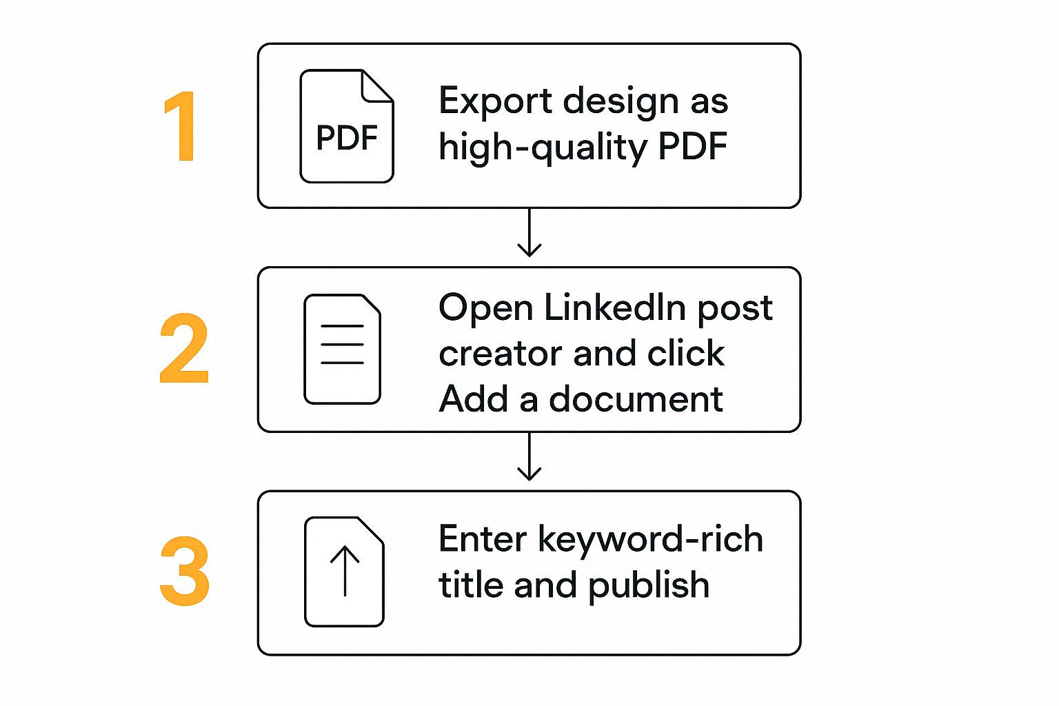
As you can see, the key is exporting a clean file, using the right upload option (the document one!), and nailing that document title. After that, all that's left is to write a great caption for the post itself, sprinkle in some relevant hashtags, and hit that "Post" button.
Writing a Caption That Fuels Engagement
Alright, your masterpiece of a carousel is designed and ready to go. But hold on—the job's not finished. A boring, afterthought of a caption can absolutely kill the reach of even the most beautiful slides. Your caption is where you inject personality, provide context, and tell people exactly what you want them to do next.
Think of the first two lines as prime real estate. LinkedIn cuts off longer captions with a "...see more" link, so your opening has to be a scroll-stopper. Seriously, treat it like a headline for your headline. Hit them with a bold claim, a relatable pain point, or a wild statistic that makes them have to click.
Once you’ve hooked them, give a quick rundown of what’s inside. Don't just say, "Here are some tips." Instead, frame it around a result. Something like, "Inside, I'm breaking down the 3-step framework that helped me double my inbound leads last quarter." See the difference? You're telling them why it's worth their time to start swiping.
Sparking Conversation and Expanding Reach
Want comments? Ask for them! A simple, open-ended question is one of the easiest ways to get a conversation started. Try something like, "Which of these mistakes have you made before?" It's a low-effort way for people to share their own experiences.
Now, let's talk about getting more eyeballs on your post. Hashtags are your friend here, but don't just spam a dozen random ones. I've found the sweet spot is 3-5 super-relevant hashtags. You want a good mix of broad industry terms (#ContentMarketing) and more specific, niche topics (#CarouselTips).
Tagging people or companies can also give your post a nice boost, but only do it when it feels natural. If you mentioned a specific tool in one of your slides or quoted an industry expert, it’s a great idea to give them a shout-out in the caption.
Pro-Tip: Your caption should always support the call-to-action on your final slide. If your last slide asks a question, repeat that question in the copy. Make it dead simple for your audience to engage.
While posts with multiple images are getting a slight edge in engagement right now, document carousels are still incredibly powerful. To keep your momentum going, try to get at least one solid carousel post out the door each week. If you want to dive deeper into the data, there are some great insights on LinkedIn carousel performance at expandi.io.
Your Top LinkedIn Carousel Questions, Answered

Even with a solid plan, you're bound to have a few nagging questions. I've been there. Let's clear up some of the most common hangups about posting carousels so you can get yours out there without a second thought.
The first question I always get is about length. LinkedIn lets you upload a document with up to 300 pages, but trust me, you never want to do that. The real sweet spot for keeping people swiping is somewhere between 5 and 15 slides. That’s enough real estate to tell a good story without your audience dropping off.
File size is another one. Your final PDF needs to be under 100MB. This is usually plenty, but if you're working with a ton of high-quality images, it’s a good number to keep in the back of your mind.
Editing and Scheduling Your Carousel
This next point is a big one, and it trips up a lot of people: you cannot edit a document once it's posted. Seriously. If you spot a typo after hitting "Post," your only option is to delete the whole thing and start over. So, proofread it once, then proofread it again.
This is exactly why scheduling is your best friend. It gives you that crucial buffer to review your work with fresh eyes and catch any little mistakes. If you’ve got a few carousels queued up and want to check on them, you can learn how to find scheduled posts on LinkedIn to stay organized.
Remember this key takeaway: Your carousel’s design and content are locked in once published. A thorough final review is your best defense against having to delete and repost your hard work.
Finally, let's talk dimensions. For the best results, especially on mobile where most people are scrolling, go with a portrait size of 1080x1350 pixels. It takes up more of the screen and does a much better job of stopping the scroll compared to a simple square.
Feeling overwhelmed by the idea of creating and scheduling all this content? RedactAI can help. Our tool helps you generate high-impact post ideas and drafts in your own voice, making it easier to maintain a consistent presence on LinkedIn. Start for free and see how it works.