So, what exactly is a LinkedIn carousel post? Think of it as a multi-slide document—usually a PDF—that people can swipe through right in their feed. It turns a static post into an interactive, almost story-like experience. This format is a game-changer for breaking down complex ideas, sharing how-to guides, or presenting data without overwhelming your audience.
Why LinkedIn Carousel Posts Are an Engagement Goldmine
If you're still not using LinkedIn carousels, you're seriously missing out on a huge opportunity for engagement. In a feed cluttered with single images and text-only updates, carousels are a pattern interrupt. They practically beg for interaction.
That simple act of swiping is a powerful psychological hook. It creates an active, lean-in moment for the user instead of a passive scroll-by.
This extra interaction is exactly what the LinkedIn algorithm loves to see. It keeps a close eye on dwell time—the amount of time someone spends on your post. Every single swipe signals to the algorithm that your content is valuable, which in turn gets it pushed out to a wider audience. It's this built-in advantage that makes carousels a go-to for founders and marketers looking to share deep insights and build authority.
The Undeniable Data Behind Carousels
The numbers really speak for themselves. Carousel posts consistently blow other formats out of the water on LinkedIn.
Just look at the stats: these multi-slide documents pull in about 278% more engagement than video posts, 303% more than image posts, and an incredible 596% more than plain text posts.
This chart puts that performance gap into perspective.
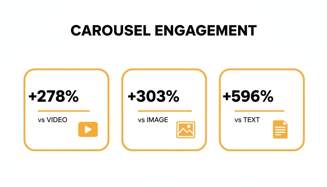
The takeaway here is pretty clear: carousels aren't just a little bit better. They’re in a completely different league. For anyone serious about growing their presence on LinkedIn, they are a must-use tool.
To make it even clearer, here’s a quick breakdown of how the different post types stack up.
LinkedIn Post Format Engagement Comparison
| Post Format | Engagement Lift vs. Text-Only Posts | Key Benefit |
|---|---|---|
| Carousel Posts | +596% | High dwell time and interaction |
| Image Posts | +293% | Quick visual appeal |
| Video Posts | +318% | Strong for storytelling |
| Text-Only Posts | Baseline | Fast to create, but low visibility |
As you can see, while images and videos offer a solid boost over text, carousels provide an unmatched level of engagement, making them the superior choice for driving visibility and interaction.
More Than Just Pretty Pictures
At the end of the day, the real power of a great LinkedIn carousel is its ability to tell a compelling story. It transforms a simple update into a mini-presentation, guiding your audience through a narrative one slide at a time.
This makes the format perfect for a few key things:
- Breaking down complex ideas: You can take a dense, technical concept and simplify it into a series of easy-to-digest slides.
- Showcasing step-by-step guides: Teach your audience a valuable skill or process.
- Sharing key takeaways: Repurpose a long-form article, report, or webinar into bite-sized highlights for a much broader audience.
By getting people to actively participate in consuming your content (with a simple swipe), you create an experience that's far more memorable and impactful. It feels less like an ad and more like a genuinely helpful resource.
Mastering this format is a strategic move that pays huge dividends in reach and authority. If you’re looking to up your game, exploring other content creation strategies can also provide some fantastic insights to round out your approach.
Mapping Out Your Carousel Story
Before you even think about opening Canva or Figma, you need a plan. A great LinkedIn carousel isn't just about slick design; it's built on a rock-solid idea and a simple, compelling story. Honestly, this is where most people go wrong. They try to stuff too much in or have no clear point.
The best carousels solve one specific problem for one specific person.
So, start by thinking about your ideal audience. What keeps them up at night? What are their biggest frustrations at work? What questions are they secretly typing into Google? Your sweet spot is where your expertise meets their urgent needs.
For example, a financial advisor isn't going to post a generic carousel about "money tips." They're going to create something like, "5 Costly Mistakes First-Time Homebuyers Make," because that hits a real, tangible fear for the exact people they want to attract.
The Hook, Story, Offer Framework
Once you’ve got your topic, you need a structure. The one I swear by is the Hook, Story, Offer framework. It’s simple, it’s powerful, and it just works for turning a bunch of slides into a narrative that people actually want to read.
The Hook (Slide 1): This is your title slide. Its only job is to stop the scroll. You need a bold headline that piques curiosity and promises a clear benefit. Ditch "Tips for Better Marketing" and go for something like, "Your Marketing Isn't Working. Here’s Why (and How to Fix It)." See the difference? One is passive, the other creates urgency and a promise.
The Story (Slides 2-8): This is the meat of your carousel. Here, you deliver on the promise you made in the hook. Break your main point down into tiny, easy-to-digest pieces. Each slide should logically flow from the one before it, guiding the reader on a journey from problem to solution. Pack these slides with quick stats, mini-case studies, or super-actionable tips.
The Offer (Final Slide): This is your call-to-action (CTA). Please, don't just let your carousel fizzle out. Tell people exactly what to do next. An "offer" doesn't have to mean a sales pitch. It can be as simple as asking a question to get comments rolling, inviting them to follow you for more content, or linking to a freebie.
Think of your carousel like a mini-story. The first slide is the attention-grabbing opening scene. The middle slides are the plot, taking them on a journey. And the final slide is the conclusion with a clear next step. This is how you turn passive scrollers into engaged followers.
Building Your Narrative, Slide by Slide
With the Hook, Story, Offer framework as your guide, you can start roughing out the content for each individual slide. The trick is to maintain momentum from one slide to the next.
You want to create little "information gaps" or subtle cliffhangers that make someone feel like they have to swipe to see what's next. If one slide outlines a common challenge, the next should tease the solution.
This is the secret sauce. A little bit of planning upfront is what separates a carousel that gets ignored from one that gets liked, commented on, and shared all over LinkedIn.
Designing Slides People Want to Read
Let's be honest, design can feel intimidating. But here's the good news: you don't need to be a graphic design wizard to create a killer LinkedIn carousel. The goal isn't to win a design award; it's to make someone stop scrolling, get curious, and start swiping.
You can pull this off with free tools like Canva or go pro with something like Figma. The tool doesn't really matter. It’s the simple, fundamental principles you apply that will make your carousels look polished and professional.

Nail the Technical Specs First
Before you even think about dropping in text or icons, get your canvas set up correctly. This one small step saves you from the nightmare of blurry text or images getting awkwardly chopped off after you upload.
Here are the settings I stick to for every carousel:
- File Type: This is non-negotiable. You have to export as a PDF. It’s the "document" format that LinkedIn uses to create the swipeable carousel effect.
- Dimensions: You can use a square (1080x1080 pixels), but I almost always recommend a portrait orientation (1080x1350 pixels). Why? It gives you more vertical screen real estate, especially on mobile, which is where most people are scrolling.
- Page per Slide: It's simple—one page in your PDF equals one slide in your carousel.
Your design choices should serve one purpose: clarity. If an element doesn't make your message easier to understand, it's probably just clutter. Think less about adding more and more about taking things away.
Getting these specs right from the get-go will save you a world of hurt. If you want to go deeper on all the different formats, we've got a complete guide on the perfect LinkedIn post size for everything.
Your Brand Colors and Fonts
Consistency is how you become recognizable in a crowded feed. Your carousel should scream "you" before anyone even glances at your profile picture.
Don't go crazy with colors. Stick to two or three from your brand palette. I like to use one main color for backgrounds and an accent color to make key stats or quotes pop. And please, for the sake of everyone's eyes, make sure your text has high contrast with the background (think dark text on a light background).
When it comes to fonts, simpler is always better.
- Pick one or two brand-aligned fonts that are easy on the eyes. You can't go wrong with a clean sans-serif like Inter, Poppins, or Montserrat for the main text.
- Create a clear visual hierarchy with font weight and size. Your slide headlines should be the biggest, boldest thing on the page, instantly telling the reader what the slide is about.
Embrace Whitespace and Simplicity
The number one mistake I see people make? They try to cram a novel onto a single slide. It’s overwhelming, and it makes people swipe away instantly.
Whitespace (or negative space) is your best friend. It’s all that empty area around your text and images. It’s not "wasted" space; it's what gives your content room to breathe and guides your reader’s eye exactly where you want it to go.
Break up big chunks of text with icons, simple graphics, or even just old-school bullet points. A slide with a big, bold headline and two short bullet points is infinitely more powerful than a dense paragraph.
Remember the golden rule: one core idea per slide. Keep it simple, scannable, and you'll keep them swiping.
Writing Copy That Hooks and Holds Attention
A killer design makes people stop scrolling, but it's the words on your slides that will get them to swipe. Your copy is the engine driving the whole thing forward, turning a simple PDF into a compelling story that people actually want to read.
Let's be real: people on LinkedIn are busy. They're skimming, not reading novels. You have to deliver value fast. That means short, punchy sentences and easy-to-scan bullet points. Think headlines, not paragraphs. Each slide should nail one simple, powerful idea.

Crafting a Compelling Narrative Flow
The best carousels feel like a natural conversation. Each slide pulls you smoothly into the next one. The secret? Think of each slide as a mini-cliffhanger.
You can end a slide with a question or a hook that builds just enough curiosity to make that next swipe irresistible.
For example, if you lay out a common industry problem on one slide, the next could kick off with something like, "So, what’s the fix? It's simpler than you think." This little trick keeps the momentum up and gets people to stick around to the very end.
This is the magic of carousels. When people spend more time swiping through your content than they would on a static image, it tells the LinkedIn algorithm your post is valuable. In fact, sparking just one comment on an engaging carousel can boost your next post’s visibility by a whopping 80%. You can dive deeper into the latest LinkedIn trends to see why this works.
Writing the Crucial Post Copy
Don't sleep on the text that appears above your carousel. That post copy is your first impression and sets the stage for everything inside the slides. If it's weak, most people won't even bother clicking on your document.
Your post copy really only has three jobs:
- Hook them immediately. Start with a bold claim, a relatable pain point, or a stat that makes them do a double-take. That first line is your audition for their attention.
- Tell a mini-story. Give them the "why." What problem are you solving? What will they learn if they swipe through?
- Prompt them to engage. Finish with a clear call-to-action or a question that gets a conversation started in the comments.
Treat your post copy like the back cover of a book. It should give a juicy preview of what’s inside without spoiling the plot, making the reader eager to dive in.
Strategic Use of Hashtags
Finally, let's talk hashtags. They're your ticket to getting discovered, but you have to be smart about them. A wall of random, spammy-looking hashtags can kill your credibility.
A good rule of thumb is to stick to three to five highly relevant hashtags.
The sweet spot is a mix of broad and niche tags. For instance, if you made a carousel about email marketing for SaaS startups, your mix could look something like this:
- #EmailMarketing (Broad, high-volume)
- #SaaSMarketing (Niche, more targeted)
- #DemandGen (Topic-related)
This balanced approach helps your content find both a wide audience and the specific people who will get the most value from it, all without looking desperate.
You’ve done the hard work and designed a killer LinkedIn carousel. Now for the moment of truth: publishing it for the world to see.
This is where a little strategy goes a long way. Just hitting the 'post' button and hoping for the best isn't enough. How you publish can make or break your carousel's performance.
First, and this is a big one, you have to upload your carousel as a document. I can't stress this enough. If you upload it as a series of images, you'll just get a standard gallery post, not the swipeable document that makes carousels so engaging. Always export your design as a PDF for this.
Another pro-tip? Keep links out of the post's main text. LinkedIn’s algorithm is pretty clear about this—it wants to keep users on the platform. Any post with an external link right in the caption is likely to have its reach throttled. If you need to share a link, just pop it in the first comment and tell people where to find it. It's a simple tweak that makes a real difference.
Give Your Post a Nudge
Timing is everything, or at least, it’s a big part of the puzzle. You’ll see plenty of data suggesting mid-mornings on Tuesdays, Wednesdays, and Thursdays are prime time, but that's just a starting point. The best answer is hiding in your own LinkedIn analytics. Go look at when your audience is most active and post then.
Once it's live, don't just sit back and wait. You've got to give it a little push.
- Get the ball rolling: Send your post to a few friends or colleagues and ask them to drop a genuine comment. That initial burst of engagement is a powerful signal to the algorithm that your content is worth showing to a wider audience.
- Reply to every single comment: Someone took the time to engage, so return the favor! Responding to comments doesn't just build a community around your content; it also doubles your comment count, which is a fantastic visibility booster.
That first hour after you hit publish is pure gold. Your goal is to spark as much real conversation as you can in that initial window to give your carousel the best shot at trending.
Consistency Is the Real Secret Sauce
One brilliant carousel is great, but a steady stream of them is what builds a loyal following. It's all about momentum.
Think about it: accounts that post at least weekly tend to see double the engagement. It's a proven way to keep your audience coming back for more. In fact, some studies show this consistency can lead to a 7x increase in follower growth. And if you're in the HR space, get your team involved. Employees are 14x more likely to share company content than other post types, and their shares can account for up to 30% of total engagement.
Don't let your hard work go to waste, either. A great carousel can be repurposed into an Instagram post, a series of tweets, or even a short video. To dig deeper into boosting visibility, check out these insights on unlocking reach with carousel posts.
And for a full step-by-step guide, don't forget to review our complete walkthrough on how to post a carousel on LinkedIn.
Before you make your next carousel live, run through this quick checklist. It’s a simple way to double-check your work and make sure you’ve set yourself up for success.
Your LinkedIn Carousel Post Checklist
This checklist is your final review before you hit the publish button. It ensures every element is fine-tuned to grab attention and drive engagement.
| Check Point | Best Practice | Why It Matters |
|---|---|---|
| File Format | Uploaded as a PDF document. | This is the only way to create the native, swipeable carousel experience. |
| Hook Slide | Compelling title and visuals. | You have seconds to stop the scroll. Make the first slide irresistible. |
| Content Flow | Story is logical and easy to follow. | A clear narrative keeps people swiping from one slide to the next. |
| Visual Consistency | Consistent branding (colors, fonts). | Reinforces your brand identity and makes the post look professional. |
| Copywriting | Text is concise, clear, and valuable. | People skim on LinkedIn. Short, punchy text is more likely to be read. |
| Call to Action | A clear, direct CTA on the final slide. | Tells your audience exactly what you want them to do next (comment, follow, etc.). |
| Post Caption | Engaging copy with no external links. | Links in the caption can hurt your reach. Put them in the comments instead. |
| Hashtags | 3-5 relevant, targeted hashtags. | Helps LinkedIn categorize your content and show it to the right audience. |
| Initial Push | Plan to engage with comments immediately. | The first hour is critical. Quick replies boost visibility and build community. |
Taking a minute to review these points can be the difference between a post that gets a few likes and one that truly takes off.
Got Questions About LinkedIn Carousels? We've Got Answers.
Even with a solid plan, you're bound to run into a few tricky questions when it's time to actually build and post your LinkedIn carousel. It happens. Let's walk through some of the most common hurdles I see people face so you can publish your next carousel with complete confidence.

We'll cover everything from the "perfect" number of slides to dealing with that dreaded typo you only spot after hitting publish.
How Many Slides Should I Actually Use?
This is probably the number one question I get asked, and the honest answer is... it depends. But there's definitely a sweet spot. While you can technically cram in a ton of slides, you'll probably just annoy your audience.
The real goal is to keep people swiping, not to test their endurance. From my experience, the magic number is somewhere between 5 and 10 slides. That’s usually enough real estate to build a compelling narrative without triggering "swipe fatigue." A short, punchy carousel always beats a long, rambling one.
Focus on telling one complete, concise story. If you can nail it in 6 slides, don't pad it out to 12. Clarity and value always win.
Help! My Carousel Has a Typo. What Now?
Ah, the classic nightmare scenario. You post your masterpiece, and then you see it—a glaring typo on slide three. It’s painful, but here’s the tough news: once that document is live on LinkedIn, you cannot edit the PDF itself.
So, you have two choices:
- Own it and move on. If it's a minor slip-up that doesn't ruin your message, just drop a correction in the first comment. It shows you're human.
- Delete and re-upload. If the mistake is major or misleading, your only real option is to take it down, fix the PDF, and post it again. Just try to do it quickly to regain any early traction.
This is exactly why that final, eagle-eyed proofread is a non-negotiable step before you publish.
Why Does My Carousel Look So Blurry?
Blurry carousels are a dead giveaway of an export issue. The usual suspect? Designing your slides, exporting them as low-res JPGs or PNGs, and then mashing them all together into a PDF. That process murders your quality.
To keep things looking sharp, always design your slides at the right dimensions (1080x1350 pixels works beautifully on mobile) and export your project directly to PDF from whatever tool you're using, like Canva or Figma. This keeps all your text and graphics in their original high-quality format, so they look crisp on any screen.
Why Didn't My Carousel Get Any Engagement?
It’s a tough pill to swallow when a post you poured hours into gets nothing but crickets. But don't just feel defeated—treat it as a learning opportunity. First, dig into your analytics to understand what happened (it helps to know the https://redactai.io/blog/impression-vs-view and what each metric means).
When a carousel bombs, it usually comes down to one of these culprits:
- A Weak Hook: Your first slide and the text in your post simply didn't stop the scroll.
- Bad Readability: The font was too tiny, the slides were a cluttered mess, or the color contrast was off.
- Zero Value: The content just wasn't useful, interesting, or relevant enough for the people you wanted to reach.
Whatever you do, don't delete the post! It's valuable data. Analyze what went wrong and use those insights to make sure your next carousel is a certified hit.
Feeling inspired but short on time? RedactAI can help you generate dozens of high-impact LinkedIn post ideas and drafts in minutes, perfectly matching your unique voice and style. Never run out of content ideas again. Start creating with RedactAI for free.