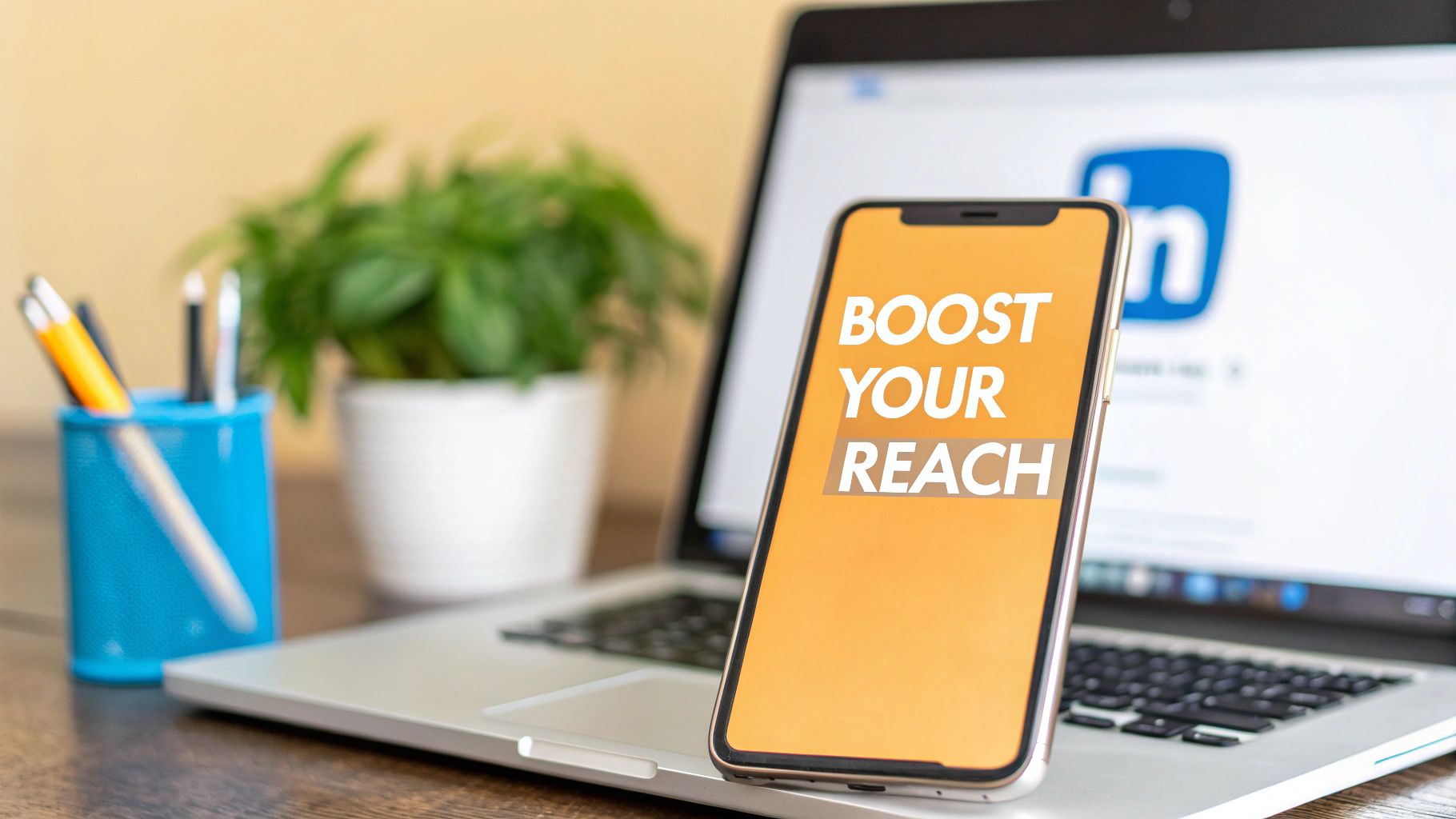
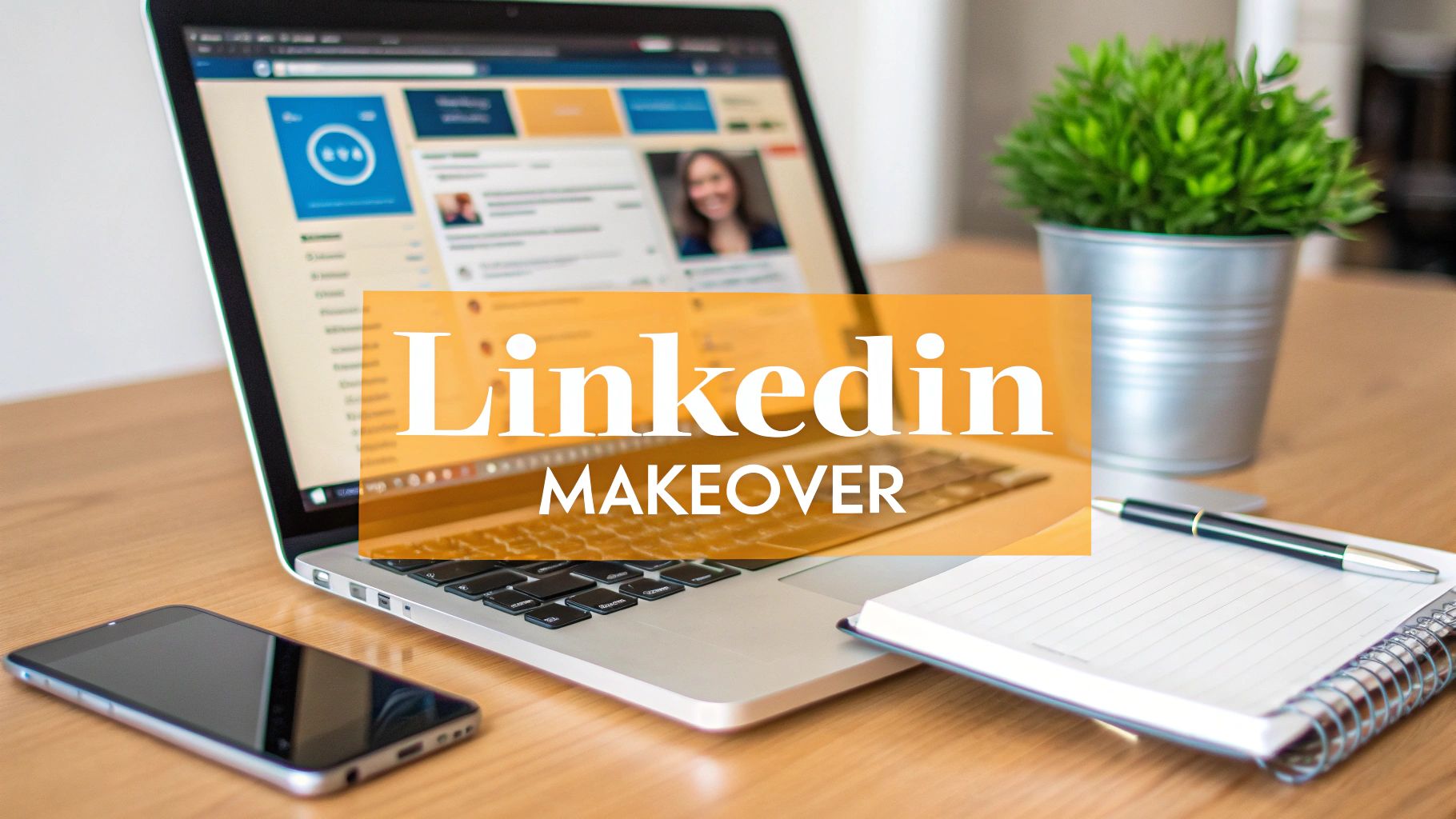
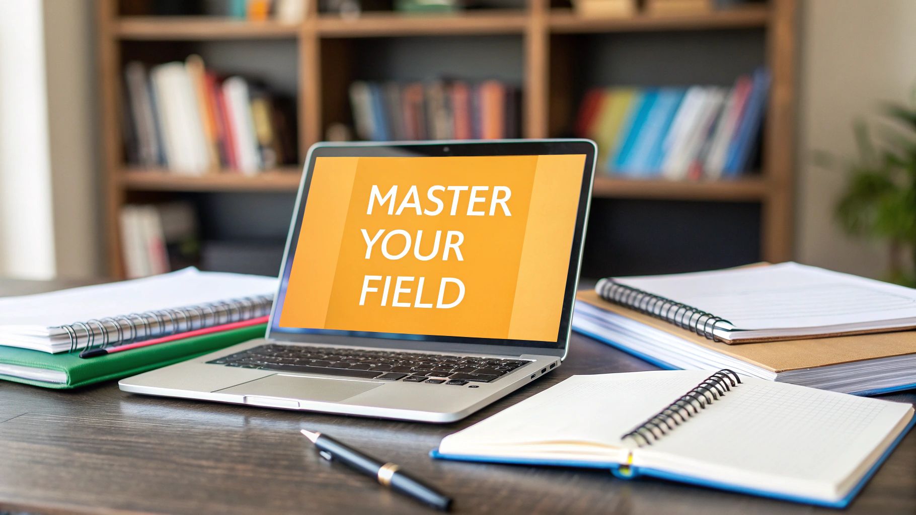
Is Your Profile Picture Blending In or Breaking Through?
Most LinkedIn photos aren’t bad. They’re forgettable. Same gray background, same stiff smile, same cropped conference badge shot, same “I guess this is professional enough” energy. If you’re job hunting, building a client pipeline, recruiting, or trying to become known for what you know, that’s a problem.
Your profile picture usually gets judged before your headline does. In fact, 74% of first impressions are formed based solely on the profile picture. That’s why cool linkedin profile pictures work best when they’re still strategic. You’re not trying to look flashy. You’re trying to look clear, credible, current, and like someone people want to engage with.
And yes, the payoff is real. Profiles with professional photos get more visibility, more connection activity, and more direct outreach. But the bigger win is brand consistency. The photo should match the person who shows up in your posts, comments, DMs, and calls.
Here are 8 styles that work. Each one includes a DIY setup, a brief you can hand to a photographer, and a simple way to connect the image to your content so your visual identity and your professional voice reinforce each other.
1. Professional Headshot with Strategic Lighting
You open LinkedIn after posting a strong insight, and the first thing a new viewer checks is your face. If your photo is hard to read, poorly lit, or cropped awkwardly, your credibility takes a hit before your headline gets a chance to work. That is why this style remains the safest high-performing choice for professionals in sales, recruiting, consulting, leadership, and client-facing roles.
A strong headshot is not about looking corporate. It is about reducing friction. People should understand you in one glance: clear face, steady expression, good eye contact, and lighting that makes you look alert rather than washed out or severe.
What makes it cool instead of generic
Strategic lighting is the difference. Flat office lighting can make even a good photo look dated. Soft front light, placed slightly above eye level, gives shape to the face without creating harsh shadows under the eyes or nose. That reads as current, capable, and easy to trust.
Framing matters just as much. Keep your face dominant in the image, with enough space around the head and shoulders to survive LinkedIn’s circular crop. If you want the rest of your profile to carry the same level of clarity, use these ideas to optimize your LinkedIn profile.
Practical rule: If someone has to study the image to read your expression, the photo is doing extra work you do not need.
DIY setup and photographer brief
For a DIY version, stand facing a large window and turn your body slightly, then bring your eyes back to the camera. Use the rear camera on your phone, clean the lens, and shoot at chest-to-head height. Wear clothing one step sharper than your day-to-day work look. Solid colors usually photograph best, and the right tones can elevate your professional image without pulling attention away from your face.
If you hire a photographer, give a brief that is specific enough to avoid the default corporate look:
- Framing: Head-and-shoulders, with room for a circular crop
- Lighting: Soft front light, slightly above eye level, no harsh side shadows
- Background: Clean, simple, and lightly textured or neutral
- Expression: Warm, composed, confident
- Deliverables: Tight crop, medium crop, and a few expression variations for testing
The strategic advantage of this photo style is range. It works across industries, and it pairs well with educational posts, hiring commentary, client lessons, founder updates, and practical how-to content. Your image signals professional clarity. Your posts should sound like the same person.
2. Authentic Candid Lifestyle Photo

Some professionals look better when they stop trying to “look professional.” Not sloppy. Not casual-for-the-sake-of-casual. Just natural, relaxed, and clearly in their working element.
This style is strong for coaches, marketers, founders, creators, consultants, and anyone whose business depends on relatability as much as competence. It shows there’s a real person behind the profile.
Where candid works and where it fails
A candid photo works when the environment supports your story. A tidy desk, a speaking prep moment, a laptop in a bright office, a natural smile. It fails when it looks accidental, distracted, or too editorial.
The strategic tension here is real. There’s an open question around whether more “cool” and authentic-looking photos outperform traditional studio photos across different audiences, especially younger professionals. That tension is part of what makes this format interesting, as noted in this discussion of the authenticity-professionalism balance on LinkedIn.
A candid photo should look intentional, not improvised.
DIY setup and photographer brief
For DIY, don’t stage a fake productivity scene with six props and a dead-eyed stare at a blank laptop. Sit by a window, open your real workspace, turn slightly away from the camera, then glance back with a relaxed expression. Use a clean background and avoid clutter behind your shoulders.
Tell a photographer:
- Setting: Real work environment, not a generic studio
- Mood: Warm, focused, approachable
- Composition: Face still needs to read clearly at a small size
- Wardrobe: Professional but not overly formal
This photo style pairs well with content that sounds conversational. Founder notes, behind-the-scenes posts, lessons from projects, reflections on mistakes, and workplace observations all fit. If your posts feel human, this image strengthens that signal.
3. Personal Brand with Branded Background

If you’re building a visible personal brand, your profile photo doesn’t have to look like everyone else’s. It can carry recognizable visual cues without turning into a mini ad.
This style works best for consultants, agency owners, coaches, creators, and startup founders who already publish consistently. The background might include your brand colors, a subtle texture, or a visual treatment that echoes your banner and post design.
Keep the branding behind you, not on top of you
It is common to overdo this, adding text, logos, taglines, gradients, icons, and then wondering why the photo feels cheap. Your face should still be the first thing people see.
Use branded backgrounds sparingly. If you need to refine a simple image without rebuilding the whole shot, an AI image background changer can help test cleaner variations. Then make sure the profile banner supports the same direction, especially if you're also reworking your professional LinkedIn cover photo.
DIY setup and photographer brief
DIY works if you keep it minimal. Shoot against a plain wall, then add a restrained brand-colored backdrop in editing. Don’t place text near the corners, because LinkedIn’s circular crop can make the whole thing look awkward.
Ask a photographer or designer for:
- Visual identity: Two or three brand colors max
- Background treatment: Minimal and clean
- Priority: Face first, brand second
- Consistency: Match the style to your banner and post graphics
This kind of photo should connect directly to your content system. If your posts have a recognizable voice and visual structure, the branded photo helps people remember you faster. If you barely post, the branding will feel unsupported.
4. Action Shot Speaking or Presenting
A recruiter clicks your profile after seeing your comment on a panel clip or a sharp post about your industry. If your profile photo shows you actively teaching, presenting, or leading a room, that impression lands faster than a standard headshot can.
This option works best for people whose credibility depends on communication in public. Speakers, trainers, consultants, founders, executives, educators, and subject-matter experts all benefit when the photo confirms, at a glance, that they can hold attention and explain ideas clearly.
Here’s an example of the kind of visual energy many speakers want to capture:
What makes this style work on LinkedIn
The best action shot is not the most dramatic one. It is the one that still reads clearly inside LinkedIn’s small circular crop.
That changes the selection process. A wide stage photo may look great on your website and fail as a profile image. A tighter frame, with your face visible, eyes open, and one natural gesture, usually performs better. If a microphone, lectern, slide deck, or audience angle hides your expression, the image loses its value fast.
I usually advise clients to judge these photos at thumbnail size first, not full size. If the face is clear in a small preview, the image has a real chance of working.
Your best event photo may be a strong memory and a weak profile picture.
DIY setup and photographer brief
A true live speaking photo usually requires an event photographer. But you can create a presentation-style version yourself if you need the signal without waiting for your next conference.
For a DIY setup, stand near a clean screen, whiteboard, workshop table, or neutral event backdrop. Use a tripod or ask someone to shoot from chest height. Wear what you would wear to lead a session. Then take several versions while explaining a real point out loud. Fake “speaker hands” look staged. Real explanation creates better posture, better facial expression, and a more believable frame.
If you hire a photographer, give a clear brief:
- Crop priority: Capture tight and medium options that keep the face readable
- Expression: Alert, engaged, outward-looking
- Body language: One natural gesture, shoulders open, posture upright
- Avoid: Shots blocked by a mic, lectern, slide text, or audience heads
- Editing: Keep skin texture and lighting natural. Clean up distractions only
Connect the photo to your content
This style works best when your profile activity supports it. If you publish webinar clips, workshop takeaways, keynote lessons, presentation frameworks, or opinion posts on industry trends, the image reinforces the same professional identity.
That is the strategic value here. The photo does more than look cool. It tells people what kind of content to expect from you, and it gives your visual brand a direct link to your professional voice.
5. Industry-Specific Visual
This is one of the most underused options in cool linkedin profile pictures. Done right, it tells people what kind of professional you are before they read a word.
A designer can be photographed with a sketch wall or interface mockup in the background. A developer might use a clean workstation setup. A product leader might use a prototype review setting. A chef, architect, therapist, photographer, or researcher can all signal expertise through subtle context.
Make the work visible, but secondary
The tool, product, or work sample should support the story, not hijack it. If people notice the whiteboard or the camera or the product box before they notice your face, the image is doing too much.
Many niche professionals often go wrong. They build a “look at my job” picture instead of a “this is me in my professional world” picture. The second one is stronger.
A few smart ways to approach it:
- Show environment, not clutter: One meaningful visual cue beats a messy backdrop full of gear
- Use current context: Outdated tools or irrelevant props make you look behind
- Protect face clarity: Keep your face as the anchor, especially after cropping
- Match your expertise: The background should support the work you want more of
DIY setup and photographer brief
For DIY, choose one object or one setting that signals your field. Don’t overstage. If you’re a designer, your monitor can show a real project. If you’re in operations or strategy, a well-composed whiteboard or planning wall can work. If you’re a maker, creator, or builder, place your product in the background but don’t hold it up like a trophy.
Tell a photographer:
- Story: Capture me in context, not in costume
- Focus: Face sharp, environment supportive
- Mood: Competent and natural
- Usage: Must still read well in a small circular crop
This style works best with educational content. Share breakdowns, process posts, teardown threads, creative rationale, or lessons from shipping work. The image shows your world. The content explains how you think inside it.
6. Book Thought Leadership Photo
A recruiter clicks your profile after seeing your post, your podcast clip, or a quote from your latest report. If your photo matches that body of work, the profile feels coherent right away. If it does not, you lose some of that authority you already earned.
This style works well for authors, researchers, consultants, academics, and senior operators whose reputation comes from clear thinking turned into tangible work. A book, report, or signature framework gives people a fast cue: you do more than comment on ideas. You publish them.
Let the work support the portrait
The strongest version of this photo keeps your face first and your intellectual property second. Hold the book lower in frame. Place it on a desk. Stack a few copies in the background. Use a portrait from the same visual campaign as your launch materials if the branding is current and understated.
The trade-off is simple. The more aggressively you sell the object, the less credible the image feels. On LinkedIn, a profile photo should signal authority, not act like an ad.
This is also one of the best styles for tying your visual identity to your content system. If your profile photo references a book or framework, your headline, featured section, and posts should keep developing that same point of view. A stronger approach to personal branding on LinkedIn helps turn the image from a nice detail into part of a clear professional narrative.
DIY setup and photographer brief
DIY can work well here because the setup is simple. Use window light, a clean background, and one copy of the book or report. Keep the item low enough that your eyes stay dominant in the crop. If the title is readable, good. If not, the image can still work as long as the overall impression is thoughtful and credible.
For a photographer, give a brief with three deliverables:
- Primary shot: Clean portrait with the book, report, or framework asset visible but secondary
- LinkedIn crop: Tight version that still reads well in a small circle
- Content library option: One wider frame for banners, article headers, podcast thumbnails, or launch posts
Direction matters here. Ask for a calm expression, strong posture, and styling that matches how you show up in your writing and speaking. This photo should feel like the visual front door to your ideas, then your content does the heavier lifting.
7. Minimalist Modern Professional

A recruiter opens your profile on a phone between meetings. They have two seconds to decide whether you look current, credible, and worth clicking. Minimalist styling helps because the frame stays focused on your face, not the background, props, or visual effects.
This style works well for tech, startups, product, consulting, design, and digital-first leadership roles. It signals judgment. You know what to leave out, which is often as important as what you include.
Minimalist does not mean bland. The trade-off is simple. The cleaner the image, the more small decisions matter. Fit, grooming, posture, background color, and crop all carry more weight because there is nothing else in the frame to hide weak choices.
Why this style works
LinkedIn profile photos are viewed small, often as a circular crop on mobile. A minimal setup usually survives that compression better than a busy scene because the face stays clear and the composition reads fast.
File quality matters too. Start with a sharp image and enough resolution for LinkedIn to resize it cleanly. Soft focus, aggressive filters, and heavy editing tend to show up faster in this style because there is so little else to distract the eye.
Clean, current, and precise usually outperform clever.
DIY setup and photographer brief
For a DIY version, stand in front of a plain wall with indirect window light. Wear one solid color with structure, such as a jacket, knit, or crisp shirt. Keep the expression relaxed but alert. Check the crop before you shoot. If the face does not read clearly at thumbnail size, adjust distance and framing before you take fifty more photos.
For a photographer, give a brief with three clear outcomes:
- Primary LinkedIn portrait: Tight crop, strong eye contact, simple background, modern wardrobe
- Alternate crop: Slightly wider version for profile refreshes, speaking announcements, or press mentions
- Content library frame: Clean horizontal or vertical option for post graphics, article headers, or quote cards
Be specific about the mood. Ask for restrained, confident, and current. Request light retouching that keeps skin texture and avoids the over-polished corporate look.
This style connects well to a sharp content voice. If you post concise takes on product strategy, hiring, operations, market shifts, or leadership decisions, the image and the writing support the same message. Clear photo. Clear thinking.
8. Diverse Multicultural Representation with Context
A recruiter opens your profile after reading a thoughtful post on leadership or industry change. Your photo should confirm the voice they just heard. If your work is shaped by culture, community, language, or lived experience, your image can show that without slipping into costume, cliché, or corporate flattening.
This style works because context adds meaning. A headwrap, turban, natural hair, traditional fabric, religious jewelry, or a location tied to your work can all strengthen recognition when they are photographed with intent. The goal is not to make identity the whole message. The goal is to present a professional image that looks true to your life and your work.
What separates a strong photo from a token-looking one is restraint. Keep the face as the focal point. Include only enough environment or styling to add context. If viewers notice the prop, outfit, or background before they notice your expression, the photo is doing too much.
Use identity with professional control
Good representation on LinkedIn looks integrated, not staged for approval. That usually means clean composition, strong eye contact, and details that feel lived-in rather than selected just to signal diversity.
Memorability still matters here, as noted earlier in the article. People tend to remember a clear face faster than a line of profile text. When the image also reflects your real identity, recognition and credibility support each other.
DIY setup and photographer brief
For a DIY version, start with one identity marker that already belongs in your professional life. Choose a clean background or a real setting connected to your work, such as an office, studio, library, clinic, or neighborhood space that makes sense for your field. Use soft daylight, keep the crop fairly tight, and check that your expression reads as confident and approachable at thumbnail size. A good test is simple. If the photo still works after you remove the backstory, you have the balance right.
For a photographer, give a brief like this:
- Context: Include cultural or personal identity in a natural, professional way
- Framing: Face-first portrait with light environmental detail
- Tone: Warm, credible, self-assured
- Styling: Real wardrobe and accessories, not symbolic add-ons
- Retouching: Keep skin texture, hair texture, and fabric detail intact
This style also gives you more to work with in your content. One shoot can produce a strong profile photo, a wider crop for article headers, and a few contextual images for posts about leadership perspective, career growth, inclusion, global teams, or cross-cultural work. That is the bigger advantage. Your photo does not sit apart from your personal brand. It becomes part of the same professional story your writing tells.
8-Style Comparison of LinkedIn Profile Photos
| Style | Implementation Complexity 🔄 | Resource Requirements ⚡ | Outcomes & Advantages 📊⭐ | Ideal Use Cases | Tip 💡 |
|---|---|---|---|---|---|
| Professional Headshot with Strategic Lighting | Moderate–High 🔄🔄🔄 | High ⚡⚡⚡ (studio + photographer) | Highest credibility and trust; timeless professional image 📊⭐ | Corporate roles, sales, recruitment, consulting | Invest in pro photography; update every 2–3 years |
| Authentic Candid/Lifestyle Photo | Moderate 🔄🔄 | Low–Medium ⚡⚡ (natural light or phone/pro mix) | High engagement and relatability; better feed performance 📊⭐ | Content creators, personal brands, professionals wanting warmth | Use natural light; keep background uncluttered; refresh every 6–12 months |
| Personal Brand with Branded Background | High 🔄🔄🔄 | High ⚡⚡⚡ (designer + photographer) | Strong memorability and brand recognition across platforms 📊⭐ | Entrepreneurs, coaches, consultants, course creators | Keep text minimal; use 2–3 brand colors; ensure face remains focal |
| Action Shot / Speaking or Presenting | High 🔄🔄🔄 | Medium–High ⚡⚡⚡ (event/pro photography) | Conveys authority, leadership, and expertise; attention-grabbing 📊⭐ | Speakers, executives, thought leaders, consultants | Use professional event images; ensure face is clearly visible |
| Industry-Specific Visual (Tools / Creative Work) | Moderate 🔄🔄 | Medium ⚡⚡ (staging, props, good lighting) | Communicates specific expertise and tangible skills; memorable 📊⭐ | Designers, developers, makers, product professionals | Showcase best work; keep tools secondary to face |
| Book / Thought Leadership Photo | Moderate 🔄🔄 | Medium ⚡⚡ (published work + pro photo) | Signals credibility and authorship; strong authority cue 📊⭐ | Authors, researchers, consultants, academics | Make publication readable; update with new releases |
| Minimalist / Modern Professional | Low–Moderate 🔄🔄 | Medium ⚡⚡ (simple pro shoot) | Contemporary, clean, versatile; fits digital-forward industries 📊⭐ | Tech founders, startups, creatives, digital execs | Use solid muted backgrounds; minimize accessories for a timeless look |
| Diverse / Multicultural Representation with Context | Moderate 🔄🔄 | Medium ⚡⚡ (sensitive, quality execution) | Authentic identity signaling; fosters inclusive connections 📊⭐ | Professionals valuing DEI, community leaders, multicultural networks | Ensure authenticity; avoid stereotypes; use professional photography |
From Picture to Post Complete Your Profile's Story
A strong profile picture gets you noticed. It doesn't finish the job.
The photo opens the door. Then people scan your headline, your featured section, your recent activity, and your posts. If the image says polished and credible, but your content is inconsistent or empty, the impression falls apart. If the image says warm and thoughtful, but your posts sound generic or forced, people feel the mismatch.
That’s why the best cool linkedin profile pictures aren't just aesthetically better. They make a promise. A strategic headshot promises credibility. A candid lifestyle shot promises approachability. A branded image promises consistency. A speaking photo promises visible expertise. An industry-context image promises depth. A thought-leadership portrait promises substance. A minimalist modern photo promises clarity. An identity-rich portrait promises honesty and presence.
Then your content has to meet that promise.
There’s also a practical side to this. LinkedIn is crowded, and small differences in presentation compound over time. A strong image makes people more likely to click. Clear positioning makes them understand you faster. Useful posts give them a reason to remember you and come back. That combination matters whether you’re trying to get hired, attract clients, build a founder brand, recruit talent, or become known for a niche.
If you’re updating your profile picture soon, don’t treat it like a standalone task. Revisit your banner. Tighten your headline. Check whether your featured section supports the same story. Look at your last few posts and ask a simple question: does my content sound like the person in this picture?
For a lot of professionals, that’s the harder part. They know they need a better image. They’re less sure what to say after the image starts bringing more attention. That’s where a workflow helps. RedactAI is one option if you want help turning your expertise, tone, and profile positioning into LinkedIn post ideas and drafts that feel consistent with the professional identity you’re building.
The best result isn’t just a better photo. It’s a profile that feels coherent. When your picture, profile, and posts all support the same impression, people trust you faster. And on LinkedIn, that’s often what moves a scroll into a connection, a message, a meeting, or an opportunity.
If you've updated your photo but your posting still feels inconsistent, RedactAI can help you turn that new first impression into a steady content rhythm with LinkedIn post ideas and drafts customized for your profile, voice, and expertise.