LinkedIn users make a keep-scrolling decision in a fraction of a second. Carousel dimensions influence that decision more than many teams realize.
That is why linkedin carousel size deserves more attention than the usual 1080x1080 checklist. Size affects how much visual space your first slide takes in the feed, how readable your copy feels on a phone, and whether detailed visuals still hold up on a desktop monitor.
I have seen strong carousel concepts underperform for a simple reason. The slides were built with generic social specs instead of LinkedIn reading behavior in mind. A square deck can work well. It is not always the best choice.
For example, square slides usually give you the safest cross-device layout. Horizontally oriented slides can still be the smarter option if your audience reads dense charts, screenshots, or side-by-side comparisons on desktop. That trade-off rarely gets covered in basic guides, but it matters in real campaigns.
The goal is not just to meet LinkedIn's upload requirements. The goal is to choose dimensions that fit the job, then export cleanly so the carousel looks sharp and easy to swipe through.
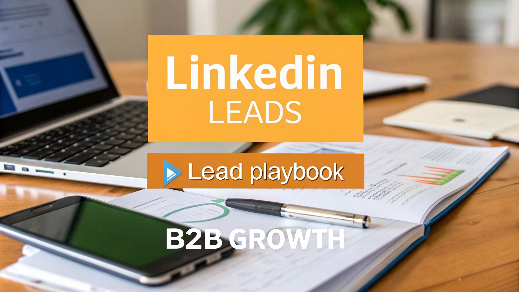
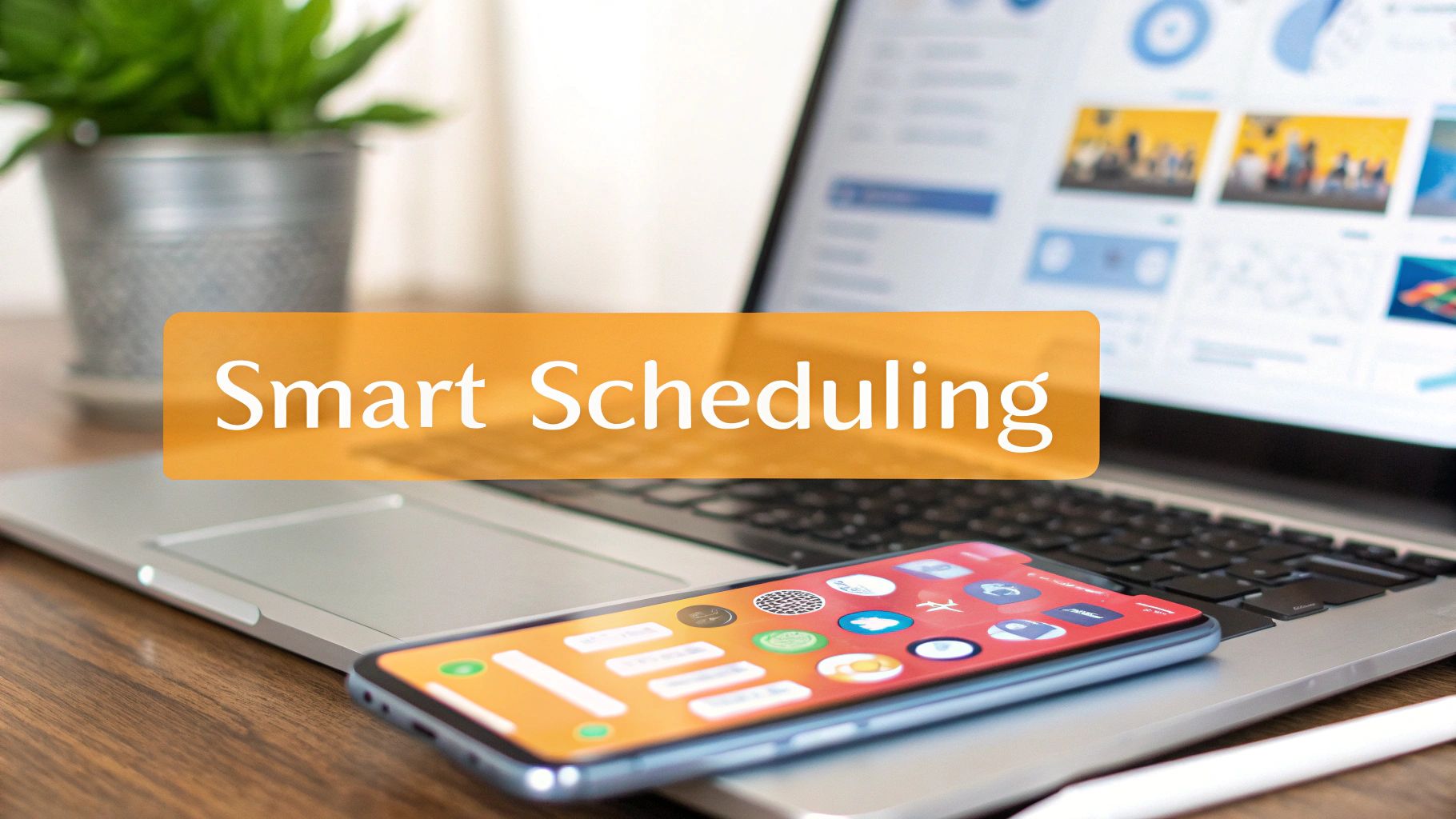
If you build carousels at scale, tools like RedactAI can speed up the production side. They help standardize slide layouts, keep text inside safe zones, and reduce the formatting mistakes that hurt performance.
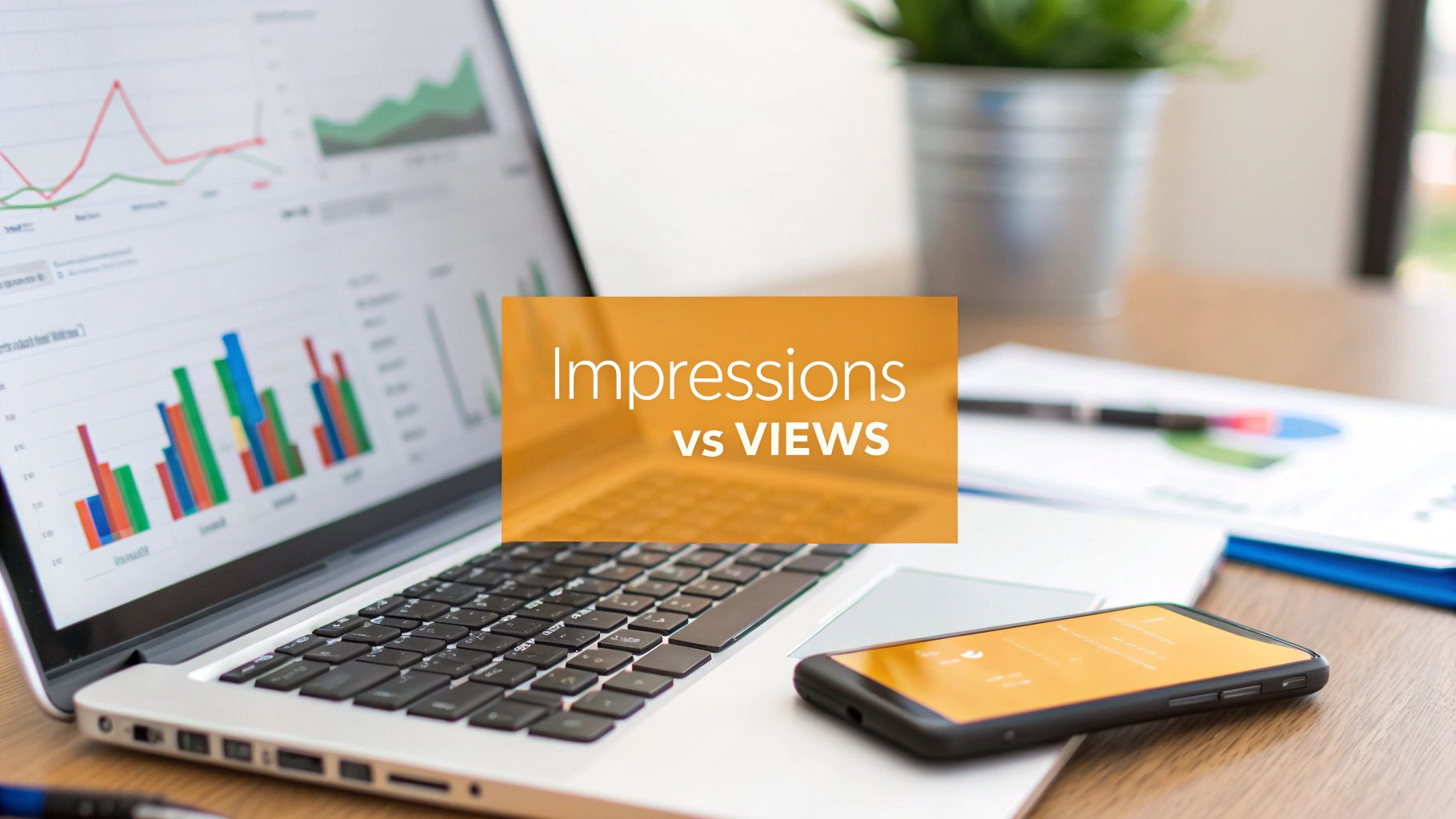
Why Your Carousel Dimensions Are a Secret Engagement Weapon
LinkedIn users judge a post fast. Dimension choices decide how much of your first slide they notice before they scroll past.
This is the core performance consideration. Size affects feed coverage, reading comfort, and whether the deck feels easy to move through. Teams that treat dimensions as a production detail usually end up with carousels that look fine in a design file and underperform in the feed.
I have seen this in testing across thought leadership, lead gen, and product education campaigns. The same core message can produce very different results depending on the canvas. A taller format often gives text-led hooks more room on mobile. A wider format can work better for desktop-heavy audiences reading dashboards, UI screenshots, or detailed comparisons. Square stays the safest default because it holds up across devices and is easier to repurpose.
The key trade-off is simple. Bigger visual presence helps earn the first swipe. Better readability helps earn the second, third, and fourth.
A strong carousel dimension strategy does three practical things:
- Increases first-slide stopping power by giving the opener more visual weight in the feed
- Protects readability so headlines, charts, and captions stay clear on smaller screens
- Keeps swipe momentum high because each slide feels consistent and easy to process
The mistake is building for the design tool instead of the viewing context. LinkedIn is a feed product first. Your carousel has to work inside that environment.
That is why linkedin carousel size should be decided before final copy and layout. If you build at volume, tools like RedactAI help standardize canvases, keep content inside safe zones, and cut the formatting errors that hurt results.
The Ultimate LinkedIn Carousel Size Cheat Sheet
Posts built on the wrong canvas usually fail before slide two. The fix is simple. Set the format first, then design inside it.

| Spec | Best choice | Why it works |
|---|---|---|
| Square size | 1080x1080 px | Safe default for cross-device viewing and easy repurposing |
| Portrait size | 1080x1350 px | Gives text-led slides more space and usually reads better on mobile |
| Wider format size | 1920x1080 px | Useful for desktop-heavy audiences, UI walkthroughs, dashboards, and wide comparisons |
| File type | Keeps slide order, layout, and typography more consistent | |
| Max PDF size | 100MB | LinkedIn upload limit |
| Max slides allowed | Up to 300 | Platform limit, not a performance recommendation |
| Best slide range | 8 to 12 slides | Enough room to teach a point without dragging the sequence |
The standard advice stops at 1080x1080. That is incomplete.
Square is still the safest baseline, but it is not always the best-performing option. For text-forward educational decks, 1080x1350 usually gives the opening slide more room for a strong hook and keeps body copy readable on phones. For desktop-skewed audiences, especially in B2B SaaS, 1920x1080 can outperform cramped square layouts when the slides rely on product screens, tables, or side-by-side comparisons.
A few rules prevent expensive rework:
- Use one aspect ratio per deck. Mixed slide sizes make the carousel feel broken.
- Choose portrait for mobile-first reading. It suits frameworks, tips, and opinion posts.
- Choose square for flexibility. It is easier to reuse on other channels and faster to template.
- Choose a wider format selectively. It works best when width adds clarity, not just novelty.
- Keep slide count disciplined. More slides only help if each one earns the next swipe.
If you need a format overview before you build, this guide to a LinkedIn carousel post covers how the document-style workflow functions in the feed.
In production, I lock the canvas before writing slide copy. That one decision improves spacing, font sizing, and image selection across the whole deck. Teams using RedactAI can standardize those canvases in templates, keep content inside safe zones, and reduce the formatting drift that shows up once a carousel goes from Figma to LinkedIn.
Image Carousel vs PDF Document Which Format Is Right For You
People use the word “carousel” for two different things on LinkedIn, and that creates confusion.
In practice, the format that matters most for thought leadership, educational breakdowns, and swipeable frameworks is the PDF document carousel. You upload one PDF, LinkedIn turns it into swipeable slides, and the deck keeps its structure.
If you’re new to the format, this guide to a LinkedIn carousel post gives a good overview of how the document style works in the feed.
PDF carousels
PDFs are the default choice when the slides carry the message.
They’re better for:
- Text-heavy slides where font consistency matters
- Frameworks and how-to content that needs a clean sequence
- Clickable links embedded in the document
- Polished visual systems where spacing and alignment must stay intact
PDFs also make it easier to create one cohesive deck from Canva, Figma, Illustrator, or PowerPoint. That matters when you want every slide to look intentional instead of stitched together.
Image-based sequences
Image-based posts are simpler, but they’re better suited to lighter visual storytelling.
They make sense for:
- Event recap photos
- Behind-the-scenes image sets
- Product shots
- Visual moodboards
For educational content, I rarely recommend image-first uploads over a PDF deck. Images are fine when the visual is the point. They’re weak when structure, reading flow, and consistency are the point.
Use images when you’re showing. Use PDFs when you’re teaching.
That distinction saves a lot of trial and error.
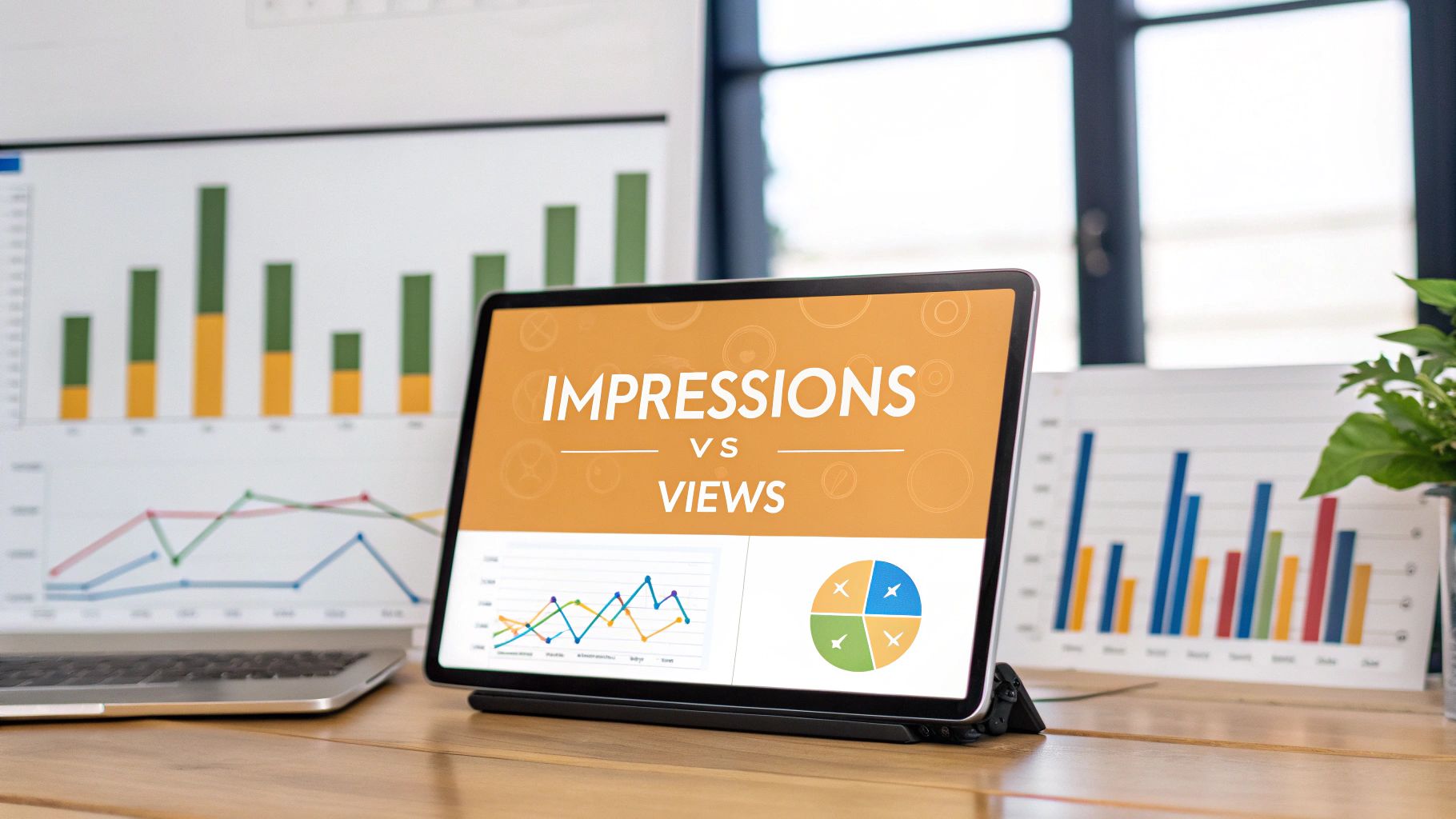
The Gold Standard LinkedIn Carousel Dimensions
Carousel size affects one metric before any copy does. Whether slide one earns the first swipe.
Most LinkedIn PDF carousels that perform consistently use one of two canvases: 1080x1080 px or 1080x1350 px. Those are the practical defaults because they export cleanly from Canva, Figma, PowerPoint, and Google Slides, and they hold up well in the feed without creating avoidable formatting problems.

If you want one answer, start with 1080x1350 px for educational carousels and personal-brand content. Start with 1080x1080 px for brand systems that need easier reuse across channels.
That is the baseline. It is not the whole story.
A lot of guides stop at square versus portrait and leave out the trade-off. Desktop-heavy audiences often behave differently from mobile-first creator audiences. If your carousel is built for founders, operators, or B2B buyers reading at a desk during work hours, a slightly wider visual rhythm can still work well, especially for data slides or side-by-side comparisons. I still would not make a wider format the default, but there are cases where it earns its place.
When square is the right call
Choose 1080x1080 when consistency matters more than feed dominance.
Square works well for:
- repeatable branded series
- quote-led slides
- before-and-after examples
- simple visual frameworks
- posts you plan to adapt into other social formats
It is also more forgiving. Dense charts, logos, and multi-column layouts usually fit more naturally on a square canvas than on a tall portrait slide.
The downside is attention. Square takes up less vertical space, so the first slide has to work harder to stop the scroll.
When portrait usually performs better
Choose 1080x1350 when the deck needs to teach fast and read cleanly on mobile.
Portrait is usually stronger for:
- educational breakdowns
- swipeable frameworks
- step-by-step explainers
- founder storytelling
- carousels with a strong headline and short body copy
This format gives the hook more physical presence in the feed. In testing, that matters. A sharp headline with one visual anchor usually looks more assertive in portrait because the slide occupies more of the screen and gives the text room to breathe.
For teams building carousels at scale, this is also the easiest format to standardize. RedactAI helps speed up that workflow by turning rough ideas into structured slide copy that already fits a carousel logic, which reduces the usual back-and-forth between writing and design.
The advanced reality most guides skip
Square and portrait cover the majority of use cases. They are not the only options worth considering.
If your audience skews desktop and the content depends on wider layouts, such as benchmark tables, UI walkthroughs, or comparison slides, a design with a wider orientation can be useful inside a PDF workflow. The trade-off is obvious. It feels weaker on mobile and usually loses feed presence on slide one. Use it intentionally, not by habit.
The practical rule is simple. Default to portrait for reach and readability. Use square for operational efficiency. Use wider layouts only when the content breaks in the standard formats.
If you need a quick reference for related post formats outside carousels, this guide to LinkedIn post image dimensions is a useful companion.
My default recommendation
For many teams, 1080x1350 px is the best working standard.
It gives you stronger first-slide visibility, better room for hierarchy, and fewer readability issues when the audience is browsing on mobile. Square is still a strong option if your team cares more about template speed, cross-platform reuse, and visual consistency than maximum feed presence.
This walkthrough is useful if you want to see the visual setup in action:
A strong LinkedIn carousel usually underperforms because slide one did not earn the swipe.
The size decision in one glance
| Format | Best for | Watch out for |
|---|---|---|
| 1080x1080 | Flexible layouts, multi-channel reuse, visual balance | Less visual presence in the mobile feed |
| 1080x1350 | Educational content, stronger hooks, mobile readability | Requires tighter spacing discipline |
| Wider or custom layouts | Desktop-first audiences, comparison-heavy slides, detailed charts | Weaker mobile experience and lower feed impact |
Designing for All Devices Mobile and Desktop Safe Zones
Correct linkedin carousel size is only half the job. The second half is where you place content inside the slide.
A slide can be perfectly sized and still fail if the important text sits too close to the edge, gets visually crowded by LinkedIn’s interface, or feels cramped on mobile. If you want a useful companion guide for standard post layouts, this piece on image size for LinkedIn post is worth bookmarking.

What safe zones really mean
Safe zones are the areas where critical content stays readable across devices.
On LinkedIn, that usually means keeping your most important elements away from the outer edges:
- Headlines should sit comfortably inside the frame, not pressed against the top border
- Logos belong in corners only if they’re small and non-essential
- CTAs should never live at the extreme bottom edge
- Page numbers and tiny footnotes often become visual clutter on mobile
Designers who come from presentation software often overuse the full canvas. That works in a boardroom. It doesn’t work as well in a mobile feed.
A cleaner layout habit
I use a simple rule for every first slide. One idea, one focal point, one visual hierarchy.
That usually looks like this:
- Top area for the hook
- Middle area for the core visual or supporting phrase
- Bottom area for a subtle brand mark or continuation cue
This keeps the eye moving naturally. It also makes desktop and mobile versions feel consistent instead of compromised.
If a slide only works when someone zooms in, the slide isn't finished.
What tends to break
These are the layout issues that consistently weaken otherwise solid decks:
- Oversized text blocks that leave no breathing room
- Edge-hugging elements that feel cropped even when they technically fit
- Busy backgrounds behind key copy
- Inconsistent margins from slide to slide
Good carousel design is defensive. You’re planning for different screen sizes, different viewing habits, and a feed environment that’s always competing for attention.
Mastering Your Export Settings File Types DPI and Size Limits
Roughly half of carousel performance gets decided before anyone reads slide two. Export settings are part of that. I have seen strong concepts lose momentum because the PDF was heavy, the text rasterized poorly, or the colors shifted enough to make the deck feel low quality.
The file that leaves your design tool is the file LinkedIn has to render. If that export is sloppy, the platform will expose it fast.
Pick the right file type
For LinkedIn document carousels, PDF is the default choice because it protects the things that usually break during upload:
- typography
- layout
- page order
- spacing
- clickable links
PNG and JPG still matter inside the design workflow. They are useful for photos, textures, charts, and background assets. They are usually the wrong final container for a document carousel. If you need a practical refresher on image trade-offs, this JPEG vs PNG comparison covers the differences clearly.
Export for feed viewing, not print
A LinkedIn carousel is read in a feed, usually on a phone, often in poor lighting, and rarely at full attention. Export settings should reflect that use case.
Use RGB, not CMYK. Keep text vector-based where your tool allows it. Flatten only the elements that need flattening, such as complex effects or image-heavy backgrounds. If every page becomes one giant image, small text usually gets softer than it should.
DPI gets over-discussed here. For social PDFs, the practical target is simple: export at a quality high enough to keep text and charts crisp on modern screens, but not so high that the file becomes bloated. In practice, standard high-quality screen export settings are usually enough. Pushing print-grade resolution rarely improves feed performance.
Size limits matter, but lighter usually wins
LinkedIn imposes a maximum upload size for document posts, as noted earlier in the article. Treat that as a ceiling, not a target.
A 70MB carousel may still upload. It often feels slower to handle, is harder to QA quickly across devices, and gives you less margin for revisions. I aim for a file that stays comfortably below the cap while preserving sharp type and clean visuals. That balance usually comes from compressing oversized images, removing unnecessary textures, and avoiding effects that add weight without improving comprehension.
Small gains add up here. A cleaner export often feels faster and more polished, even when the design itself has not changed.
Tool-specific export choices
Each design tool fails in its own way.
Canva: Export as PDF and review every page outside Canva. Gradients, fine lines, and small text can look acceptable in the editor and softer in the actual file.
Figma: Keep page dimensions consistent, confirm page order before export, and inspect the PDF in a separate viewer. Figma files with mixed frame setups are more likely to produce avoidable errors.
PowerPoint: Export to PDF instead of uploading the presentation file. Embedded fonts, transitions, and slide effects do not always survive cleanly.
RedactAI: If you are producing carousels at volume, RedactAI helps standardize exports and reduce preventable formatting errors across versions. That matters when one weak handoff can undo a strong content system.
Final QA before you post
Open the PDF on your phone first.
Check slide one at normal viewing distance. Then scan the full deck for blurry charts, broken line wraps, missing icons, and pages that feel unusually slow to load or render. This takes two minutes and catches the issues that hurt performance most often.
If the carousel looks sharp on mobile, stays reasonably light, and preserves your hierarchy after export, the handoff is doing its job.
Exploring Advanced and Niche Carousel Formats
Most linkedin carousel size guides stop at square and portrait. That’s good advice for most creators. It’s incomplete for some audiences.

There’s a less common format that deserves more attention: wide-format PDF carousels at 1920x1080 pixels.
According to Contentdrips’ 2026 guide to LinkedIn carousel sizes, this format is gaining traction for desktop-heavy audiences, works well for wide graphs and timelines, and can lift desktop dwell time by 15% to 25% for groups like executives and recruiters. The same source notes that over 60% of LinkedIn views are mobile, which is why this wide format remains a niche choice rather than the default.
When a wide format makes sense
A wide format works best when the content itself is wide.
Examples:
- org charts
- process maps
- timelines
- dashboard-style reporting
- side-by-side comparisons
- presentation-style slides aimed at leadership teams
If your audience spends a lot of time on desktop, shrinking that kind of content into portrait can do more harm than good. You preserve clarity by designing for the actual content shape instead of forcing every story into a vertical frame.
The trade-off you need to accept
A wide orientation is weaker for general feed dominance. It won’t command mobile screen space the way portrait does.
That means you should use it selectively, not casually.
I’d consider a wide orientation if all three conditions are true:
- The content is naturally wide
- The audience skews desktop-heavy
- The goal is clarity over feed takeover
The best format isn't the most popular one. It's the one that matches the content and the audience's viewing context.
For HR leaders, recruiters, consultants, startup founders, and B2B teams sharing charts or operating plans, a wide orientation can be a smart exception to the portrait-first rule.
Common Carousel Mistakes and How to Fix Them
Most carousel failures are mechanical. The strategy is fine. The execution slips.
The biggest mistake is trying to improvise the format slide by slide. LinkedIn rewards consistency. Messy structure breaks trust before the reader even gets to the argument.
Mixing aspect ratios
This is the one that causes the most frustration.
Existing guides confirm that LinkedIn applies the first slide’s dimensions across the entire deck, which leads to inconsistent cropping if you mix portrait and square slides. That issue is documented in PostNitro’s guide on LinkedIn carousel size.
If slide one is portrait and slide four is square, LinkedIn doesn’t politely adapt. It forces alignment based on the opening format. The result is awkward spacing, cropped visuals, and a deck that looks stitched together.
Fix: choose one aspect ratio before you design anything. If you need both layouts, create two separate carousels.
Blurry text
Blurry text usually comes from one of three issues:
- exporting raster-heavy slides instead of a clean PDF
- scaling up low-quality assets
- over-compressing the file before upload
Fix: keep text as text in the design tool for as long as possible, use high-quality source assets, and review the exported PDF on mobile before posting.
Too much content per slide
A carousel is not a whitepaper. Dense slides kill momentum.
Fix: reduce each slide to one primary idea. If a point needs more room, give it another slide instead of shrinking the type.
Weak first slide
A lot of decks bury the interesting point on slide three.
That’s fatal on LinkedIn. People decide whether to swipe almost immediately.
Fix: make slide one do one clear job. It should promise a payoff, not summarize your company, your credentials, and your topic all at once.
Streamline Your Workflow with Templates and Tools
The easiest way to improve carousel quality is to remove repeat decisions.
Build a small template system in Canva, Figma, or PowerPoint. Create a square version, a portrait version, and if your audience needs it, a wide version for chart-heavy posts. Lock in margins, font styles, page numbers, and CTA placement once. Then reuse the structure.
That gives you three benefits:
- faster production
- more consistent branding
- fewer formatting mistakes
Teams that publish often should also standardize how they write hooks, section dividers, and ending slides. Good carousels aren’t just designed well. They’re assembled from repeatable decisions.
If you want a broader stack for writing, design, and scheduling, this list of best tools for content creators is a useful place to compare options.
The workflow that usually holds up best is simple: outline first, design second, export third, review on mobile last. That order prevents the most common quality issues.
Frequently Asked Questions About LinkedIn Carousels
What’s the best linkedin carousel size overall
For most creators, it’s 1080x1350 px if the goal is mobile visibility and 1080x1080 px if the goal is flexibility. The better choice depends on how your audience reads and what your slides need to contain.
How many slides should I use
The strongest practical range is 8 to 12 slides, based on the benchmark guidance cited earlier from Postiv.ai. That’s enough room to make a point without dragging the reader through unnecessary swipes.
Can I use more than 12 slides
Yes. LinkedIn allows far more than that. But allowed and effective aren’t the same thing. If the deck gets long, every extra slide has to earn its place.
Should I always use PDF
For educational carousels, yes. PDF gives you the most control over visual consistency and reading flow.
Can I mix square and portrait slides in one deck
You shouldn’t. LinkedIn uses the first slide’s dimensions across the deck, which creates inconsistent cropping if you mix formats.
Is a wide format worth testing
Yes, but only for specific use cases. It makes the most sense when your audience is more desktop-oriented and your content includes wide visuals like timelines, charts, or comparison tables.
Can I fix a carousel after posting it
Not in the way many users expect. If the file itself needs changes, the clean solution is to revise the deck and publish the corrected version.
If you want to create LinkedIn content faster without sounding generic, RedactAI is built for that. It helps professionals generate post ideas, draft content in their own voice, plan a consistent publishing rhythm, and turn strong ideas into publish-ready LinkedIn posts without the usual blank-page friction.