A post with 10,000 impressions may have reached roughly 2,700 to 6,000 unique people, not 10,000. An analysis of 42,493 LinkedIn posts found that the median post reached only 46.5% as many unique members as its impression total, with most posts falling between 27% and 60% (AuthoredUp's analysis of LinkedIn impressions and views). That gap changes how you should read almost every number in a LinkedIn analytics dashboard.
Impressions are exposure, not audience size. Engagement rate is a ratio, not a grade. Follower growth is useful only when the new audience fits your commercial or professional goals. The dashboard becomes valuable when you stop asking which post got the biggest number and start asking which content expanded relevant reach, created useful interactions, and moved people toward an outcome.
What the LinkedIn Analytics Dashboard Actually Shows
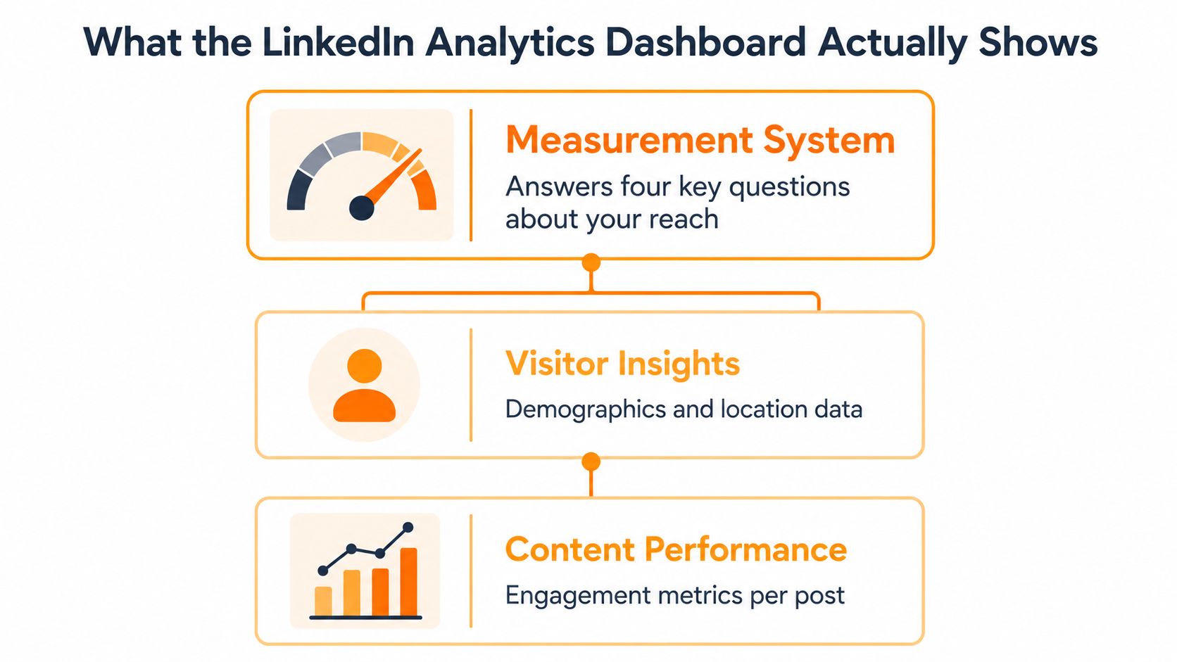
LinkedIn's Page analytics dashboard contains separate measurement areas, not one universal engagement score. Its official structure includes Content, Visitors, Followers, Search Appearances, Leads, Newsletters, Competitors, and Employer Brand. The overview focuses on Page visitors, new followers, post impressions, and custom-button clicks (LinkedIn's Page analytics documentation).
Each module answers a different question:
- Visitors: Which people reached the Page?
- Followers: Did exposure create an ongoing audience?
- Content: What did LinkedIn distribute, and how did viewers respond?
- Search Appearances: How are people finding the Page?
- Leads and custom-button clicks: Did activity produce an action tied to a business objective?
The dashboard becomes useful when these questions remain separate. Impressions measure delivered views, while unique visitors indicate how many distinct people arrived. A post can collect repeated views from a narrow group, or reach people beyond the existing network without converting them into followers. Those outcomes require different decisions.
Use the dashboard as a decision system
Begin with the outcome under review and select the relevant module. For visibility, compare impressions with visitors and unique reach. For audience development, examine new followers and their composition. For acquisition, inspect clicks, search appearances, and leads instead of treating reactions as the endpoint.
LinkedIn's visitor highlights compare the last 30 days with the preceding 30 days, including Page views, unique visitors, and custom-button clicks. The comparison shows direction rather than a single isolated result. It also distinguishes total visits from unique visitors, helping analysts identify repeated attention instead of mistaking it for audience expansion.
Engagement rate needs the same discipline. It is a ratio between interactions and the relevant exposure base, not a quality score. A higher rate may reflect a smaller but more responsive audience, while broader distribution can lower the ratio without making the content ineffective.
Practical rule: Keep impressions, unique visitors, followers, and clicks in separate decision columns. They represent different stages of attention.
Use the dashboard to trace movement from exposure to audience growth and then to action. That sequence shows whether distribution expanded beyond the existing network, whether people chose to stay connected, and whether LinkedIn activity contributed to a measurable business outcome.
The Anatomy of a LinkedIn Analytics Dashboard
A LinkedIn analytics dashboard becomes useful when each module answers a separate business question. The Content, Visitors, Followers, and Search Appearances views describe different stages of attention, so combining their totals can hide whether visibility reached new people, attracted the right audience, or created lasting interest.
Content analytics asks what worked
The Content area evaluates Page updates, including video. Compare formats, topics, and calls to action by examining both distribution and response. Impressions show how often LinkedIn displayed a post, not how many unique members saw it. A post with broad distribution may produce fewer meaningful actions than one shown to a smaller, more relevant audience.
Keep interaction types separate. Clicks, reactions, comments, shares, saves, sends, and reposts represent different levels of intent. A reaction can indicate quick approval, while a save or send suggests that someone considered the material useful enough to keep or pass to another person. Engagement rate is therefore a ratio to interpret alongside its exposure base, not a standalone quality score.
Visitors analytics asks who arrived
The Visitors view covers visitor demographics and sources. LinkedIn identifies dimensions such as job function, location, seniority, industry, and company size in its analytics areas and demographic reporting.
Visitor growth matters only when the arriving audience fits the intended market. A consulting firm targeting senior buyers in one industry should compare visitor composition with that audience, rather than treating a larger visitor total as automatic progress. The same principle applies to unique reach: it indicates audience expansion more clearly than repeated impressions.
Followers analytics asks who stayed
The Followers module reports follower demographics and sources. New followers show that some attention became an ongoing connection with the Page, but follower composition determines whether that connection supports the strategy.
An audience of unrelated viewers can raise the headline total without improving access to buyers, candidates, partners, or decision-makers. Compare follower growth with role, seniority, industry, company size, and location before judging it as strategic progress.
Search Appearances asks how people find you
Search Appearances shows who searched for the Page, which keywords they used, and how often the Page appeared in searches during the last 7 days. This view measures discoverability, not the response to a published post. It can reveal whether the Page is becoming easier to find through the language used by its target market.
The Four Numbers That Actually Matter
A post can accumulate impressions without reaching a larger audience. The LinkedIn analytics dashboard separates that distinction through four metrics, each tied to a different decision about distribution, audience quality, interaction, and retention.
| Metric | What it counts | What it answers | Common trap |
|---|---|---|---|
| Impressions | Content exposures, including repeats | How much potential distribution did the post receive? | Treating exposure as unique audience size |
| Reach | Unique members who saw the content | How many distinct people did the post reach? | Assuming every viewer is commercially relevant |
| Engagement rate | Interactions divided by impressions | How efficiently did exposure produce interactions? | Reading the ratio as a definitive score |
| Follower growth | New followers acquired by the Page | Did attention become an ongoing audience? | Celebrating growth without checking audience fit |
Impressions measure distribution
Impressions count how often LinkedIn displayed a post. They help analysts compare distribution across similar posts and exposure periods, but they do not identify the number of distinct viewers.
Repeated exposure may reinforce familiarity, especially when a message needs several encounters. It can also make distribution look broader than it is. Read impressions beside unique reach to distinguish frequency from audience expansion.
Reach measures audience size more closely
Unique reach answers a narrower question: how many distinct members viewed the content? It is a closer proxy for audience size than impressions, although it says nothing by itself about relevance, seniority, or intent.
A useful dashboard therefore adds an audience-quality check. Compare viewers with the job functions, seniority levels, industries, company sizes, and locations that matter to the account. A post that reaches more people in the wrong market may contribute less than one with lower reach among qualified prospects.
Engagement rate measures efficiency
LinkedIn defines engagement rate as an interaction-to-impression ratio, with interactions including clicks, reactions, comments, and shares. The ratio is useful for comparing similar posts and identifying changes in response, but estimated impressions make it a directional measure rather than an audited count of audience quality.
Follower growth measures conversion into an owned audience
A new follower represents a continuing connection, not merely a single exposure. Its value depends on whether that person fits the intended audience and is likely to benefit from future Page updates.
Read follower growth alongside visitor sources and demographics. Growth without audience fit increases the total while leaving access to relevant buyers, candidates, partners, or decision-makers unchanged.
Use the dashboard's comparison views to examine whether attention, unique visitors, and custom-button clicks rise together or separate. Divergence can identify a weak point in the path from distribution to action. High impressions with flat unique reach suggest repeated exposure; rising reach with little follower growth suggests that awareness is not becoming an ongoing audience.
How to Read Engagement Rate Without Lying to Yourself
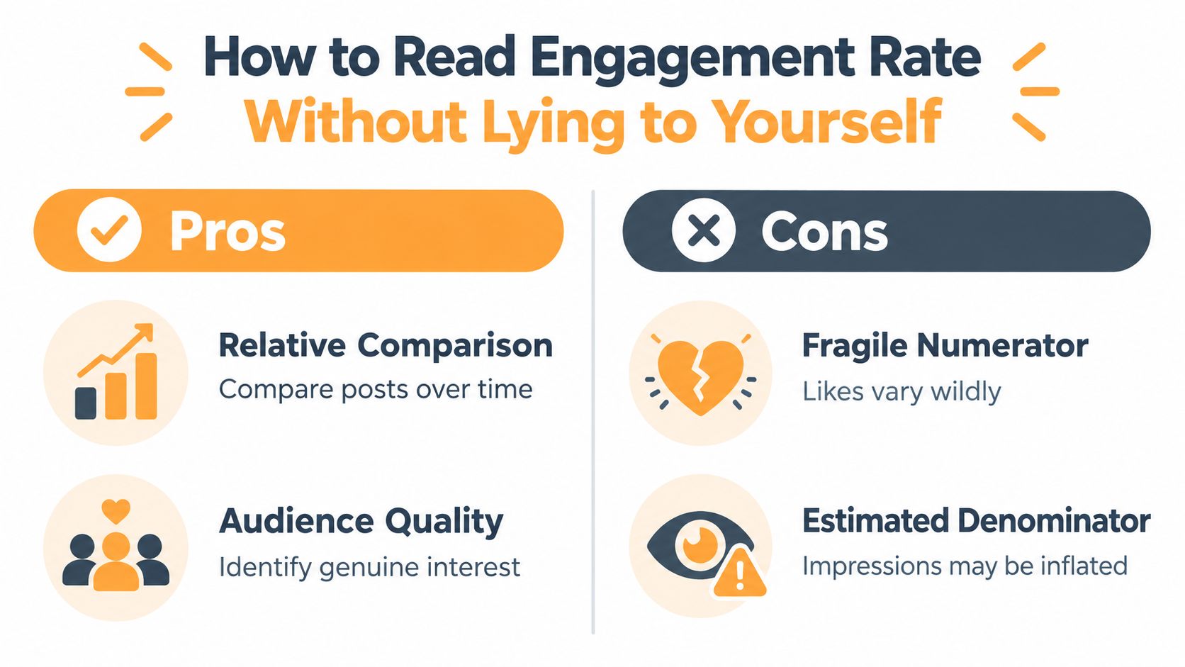
Engagement rate is a percentage, not a verdict. The numerator counts selected interactions, while the denominator uses estimated impressions. That makes the metric useful for comparison, but too unstable to serve as a standalone measure of content quality or audience value.
A high rate can reflect many lightweight reactions. A lower rate may include clicks, comments, saves, or sends that matter more to the business. Treat the ratio as a diagnostic signal. Use it to compare similar posts and identify changes in response, then examine the actions behind the percentage.
Decompose the numerator
LinkedIn's engagement guidance counts clicks, reactions, comments, and shares among the interactions used in its rate (LinkedIn's engagement rate guidance). Combined analytics also includes reactions, comments, saves, sends, and reposts among engagements.
Each action answers a different question:
- Clicks can indicate interest in the content, Page, profile, or destination.
- Comments can reveal conversation quality, disagreement, questions, or possible buyer intent.
- Shares and reposts indicate distribution value because someone chose to expose the post to another audience.
- Saves and sends can signal professional utility, particularly when people want to revisit material or share it privately.
A post with a 6% rate driven mainly by lightweight reactions may be less useful than a post with a 3% rate driven by saves from relevant senior decision-makers. These figures illustrate how the ratio can mislead; they are not benchmark claims. The percentage cannot explain why people interacted.
The B2B influencer partnership playbook offers context for evaluating collaboration content. Judge a partnership post by audience fit, conversation quality, and actions that support the relationship, not by visible reactions alone.
Compare like with like
Build a rolling engagement view grouped by:
- Format, such as text, video, or document.
- Topic, such as product education, industry analysis, or recruiting.
- Audience, based on the professional segments that matter to the account.
- Publication time, adjusted for the audience's local context.
Compare posts with similar exposure windows. A recent post has had less time to accumulate interactions than an older one. Review changes across reporting periods as well, since deleted comments, removed reactions, and other adjustments can alter totals.
For a closer explanation of the calculation, see this guide to LinkedIn engagement rate.
Use the ratio to choose the next test, not to crown a permanent winner. Rising clicks with flat reactions may indicate more serious interest. Rising comments without follower growth may show discussion that has not yet become an ongoing audience. Examine those patterns alongside unique reach and impressions before deciding whether distribution expanded or merely repeated exposure.
In-Network Versus Out-of-Network Distribution
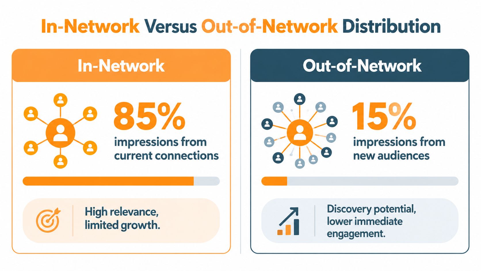
Total impressions become more useful when the dashboard shows where they originated. LinkedIn's combined analytics separates in-network impressions, generated by followers or connections, from out-of-network impressions, generated by people beyond that existing audience (LinkedIn's combined analytics documentation).
That distinction turns distribution into a growth diagnosis:
- In-network distribution measures reinforcement among people already connected to the Page or creator.
- Out-of-network distribution measures discovery beyond the current audience.
- A rising total with a stable in-network share points to stronger circulation within the existing network.
- A growing out-of-network share indicates that the content is reaching potential new audience segments.
Read distribution and response together
Out-of-network exposure is a distribution signal, not a quality score. New viewers may engage less immediately because they lack context or familiarity. Evaluate each post across two dimensions:
| Distribution question | Interaction question |
|---|---|
| Did the post reach beyond the existing network? | Did that exposure produce useful actions? |
| Was the new audience relevant? | Were the actions clicks, comments, saves, sends, or reposts? |
| Did follower composition improve? | Did the post create conversation or support future distribution? |
This comparison separates audience expansion from repeated visibility. Strong in-network performance can deepen authority with an established audience. Strong out-of-network performance can broaden awareness and introduce the account to new professional groups. Neither result is automatically better. The right interpretation depends on whether the current objective is reinforcement, discovery, or audience development.
Treat professional utility as a distribution signal
LinkedIn defines engagements broadly, including reactions, comments, saves, sends, and reposts. Keep those components separate before combining them into an engagement rate or another summary measure.
Saves and sends can indicate practical usefulness more clearly than quick reactions. People save frameworks, checklists, and explanations for later use. They send material when it helps someone else. Compare those actions with network distribution before deciding which topics to recycle, expand, or develop into a series.
A dashboard that reports only total engagement shows how much activity occurred. A dashboard that combines network composition with action type shows whether that activity reinforced the existing audience or supported audience expansion.
Why High Impressions Can Mean Almost Nothing
Raw impressions measure exposure, not audience size. The same member can see a post repeatedly, so a large total may reflect frequency rather than expansion. Unique reach offers a closer estimate of how many distinct members encountered the post, while audience relevance still requires separate analysis.
The analysis of 42,493 LinkedIn posts found that the median post reached 46.5% as many unique members as its impression total, with most posts between 27% and 60% (AuthoredUp's analysis of LinkedIn impressions versus unique views). A post with 10,000 impressions may therefore have reached roughly 2,700 to 6,000 people. The remaining exposure represents repeat views. For a practical comparison, see how impressions differ from views on LinkedIn.
Repeated exposure still has value. It can reinforce recognition among an existing audience and support later action. It changes the claim you can make: the post generated substantial exposure, but it did not necessarily reach 10,000 distinct people.
Replace volume with qualified penetration
Two posts can produce identical impression totals while serving different business objectives. One may circulate repeatedly among current followers. Another may reach people outside the existing network who match the intended industry and seniority profile.
LinkedIn's Page analytics can show demographic trends such as job function, location, seniority, industry, and company size (LinkedIn's audience demographic documentation). Use those dimensions to assess whether distribution reached relevant professional groups, rather than treating every additional view as equivalent.
The stronger question is:
Which posts expand relevant audience penetration, and which merely recycle visibility among existing followers?
A decision-oriented dashboard should therefore examine:
- Unique reach: How many distinct members saw the post?
- Network composition: Did distribution extend beyond followers and connections?
- Audience fit: Did viewers match the intended professional segments?
- Follower conversion: Did relevant viewers choose to follow?
- Action quality: Did the post create clicks, comments, saves, sends, or reposts?
A useful evaluation is unique reach weighted by audience fit. It does not need to become an artificial score. Qualitative categories can guide action: high reach with weak fit, high fit with limited reach, strong discovery with useful actions, or strong reinforcement within the existing audience.
Impressions remain useful for measuring exposure. They become misleading when asked to represent distinct reach, audience quality, or business value.
Turning Dashboard Data into a Posting Strategy
A posting strategy needs a baseline before it needs a reaction. Build a rolling view of recent posts, then group them by format, topic, audience, and publication time. Compare posts with similar exposure windows. A new post should not compete directly with an older post that has had longer to circulate.
Native LinkedIn reporting has capped historical windows, UTC-based reporting, data delays, and limited trend-analysis capability, according to recent analytics commentary (Sociality's discussion of LinkedIn analytics limitations). Short-term changes can therefore produce false conclusions. Normalize time zones, record collection dates, and maintain an external history when the native dashboard lacks context.
Use a decision loop
- Set the objective. Separate awareness, authority, audience growth, and conversion.
- Review the cohort. Compare similar formats, topics, audiences, and exposure windows.
- Inspect quality. Check unique reach, network composition, audience demographics, engagement rate, and interaction type.
- Choose the next action. Reuse useful ideas, expand strong topics, retire weak formats, or publish a follow-up.
- Record the result. Store the decision and its rationale beside the metrics.
Impressions can fall without a corresponding decline in content quality. Commentary on a 2025 shift toward older, more relevant posts rather than pure recency suggests that lower immediate reach can coexist with stronger authority or better engagement quality. Compare unique reach, audience fit, and meaningful actions before changing cadence.
Tools can support judgment. LinkedIn AI detection bypass resources may help teams review whether drafts sound natural, while the dashboard must establish whether the published post reaches the intended audience and generates useful actions. For scheduling, use the LinkedIn Post Time Wizard as a starting point, then test the recommendation against audience data.
RedactAI helps professionals draft, schedule, recycle, and review LinkedIn content while tracking impressions, engagement, follower growth, and content ROI. Visit RedactAI to organize dashboard metrics into a repeatable content decision workflow.